
Unlocking After-Sales Excellence: From Raw Data to Actionable Dashboards
Transform your after-sales service with data-driven insights, optimizing performance and boosting customer satisfaction.
Understanding and leveraging your after-sales data is crucial for enhancing customer experiences, streamlining operations, and making informed business decisions. This guide will walk you through generating a synthetic dataset for after-sales service tickets, analyzing this data for key insights, and conceptualizing useful dashboards to visualize these findings.
Key Highlights
- Synthetic Data Generation: Learn how to create a structured 1000-row dataset with 15 relevant columns, providing a solid foundation for after-sales analysis.
- In-Depth Analysis: Discover critical areas for after-sales data analysis, including resolution time, customer satisfaction drivers, issue trends, and operational efficiency.
- Actionable Dashboards: Explore concepts for various dashboards designed to track Key Performance Indicators (KPIs) and provide clear, visual insights for strategic decision-making.
Crafting Your After-Sales Dataset
Building a Foundation for Insight
To effectively analyze after-sales service, a well-structured dataset is essential. While real-world data is ideal, generating a synthetic dataset can be invaluable for practice, testing, and demonstration. Below, we outline the structure for a 1000-row dataset with the specified columns. This synthetic data aims to mimic realistic scenarios and relationships between different data points.
Dataset Columns and Structure
The dataset will include the following 15 columns, each designed to capture a crucial aspect of the after-sales service process:
- Ticket_ID: A unique identifier for each service ticket (e.g., T0001, T0002).
- Date_Opened: The date when the service ticket was created.
- Date_Closed: The date when the service ticket was resolved.
- Resolution_Time_Days: The difference in days between Date_Closed and Date_Opened.
- Customer_Region: The geographical region of the customer (e.g., 'North', 'South', 'East', 'West', 'Central').
- Service_Center_ID: An identifier for the service center that handled the ticket (e.g., 'SC001', 'SC002').
- Issue_Type: The category of the problem reported (e.g., 'Engine', 'Electrical', 'Bodywork', 'Software', 'Maintenance').
- Issue_Severity: The urgency or impact of the issue (e.g., 'Low', 'Medium', 'High', 'Critical').
- Vehicle_Model: The model of the vehicle associated with the service ticket (e.g., 'Model A', 'Model S', 'Model X').
- Channel_Received: The channel through which the service request was initiated (e.g., 'Phone', 'Online Portal', 'In-Person', 'Email', 'Mobile App').
- Customer_Satisfaction_Score: A numerical rating (e.g., 1-5 or 1-10) provided by the customer post-resolution.
- Escalated: A boolean value (True/False) indicating if the ticket was escalated to a higher support tier.
- Parts_Availability_Days: The number of days of delay caused by waiting for necessary parts. Can be 0 if no parts were needed or if parts were immediately available.
- Technician_Dispatched: A boolean value (True/False) indicating if a field technician was dispatched for on-site service.
- Warranty_Status: The warranty status of the vehicle at the time of service (e.g., 'Under Warranty', 'Out of Warranty', 'Extended Warranty').
Python Code for Synthetic Data Generation
You can use the following Python script with libraries like Pandas and NumPy to generate a 1000-row synthetic dataset. This code includes logic to create somewhat realistic relationships, such as higher severity issues potentially taking longer to resolve or having a higher chance of escalation.
import pandas as pd
import numpy as np
from datetime import timedelta, datetime
import random

# Configuration
NUM_ROWS = 1000
START_DATE_RANGE = datetime.today() - timedelta(days=730) # Tickets opened in the last 2 years
END_DATE_RANGE = datetime.today() - timedelta(days=1)

# Define possible values for categorical columns
customer_regions = ['North', 'South', 'East', 'West', 'Central']
service_center_ids = [f"SC{str(i).zfill(3)}" for i in range(1, 11)] # 10 Service Centers
issue_types = ['Engine', 'Transmission', 'Electrical', 'Bodywork', 'Software', 'HVAC', 'Brakes', 'Suspension']
issue_severities = ['Low', 'Medium', 'High', 'Critical']
vehicle_models = ['SedanAlpha', 'SUVBeta', 'TruckGamma', 'HatchDelta', 'VanEpsilon']
channels_received = ['Phone', 'Email', 'Website', 'Mobile App', 'In-Person']
warranty_statuses = ['Under Warranty', 'Out of Warranty', 'Extended Warranty', 'Recall']

# Seed for reproducibility
np.random.seed(42)
random.seed(42)

data = []

for i in range(1, NUM_ROWS + 1):
    ticket_id = f"T{str(i).zfill(4)}"

    # Date Opened
    days_offset_opened = random.randint(0, (END_DATE_RANGE - START_DATE_RANGE).days)
    date_opened = START_DATE_RANGE + timedelta(days=days_offset_opened)

    # Issue Severity and Type (correlated for realism)
    issue_severity = np.random.choice(issue_severities, p=[0.35, 0.35, 0.2, 0.1])
    if issue_severity == 'Critical':
        issue_type = np.random.choice(['Engine', 'Transmission', 'Software'])
    elif issue_severity == 'High':
        issue_type = np.random.choice(['Engine', 'Transmission', 'Electrical', 'Software', 'Brakes'])
    else:
        issue_type = np.random.choice(issue_types)

    # Resolution Time (influenced by severity)
    base_resolution_days = np.random.poisson(lam=3) + 1 # Base time
    if issue_severity == 'Medium':
        base_resolution_days += random.randint(1, 3)
    elif issue_severity == 'High':
        base_resolution_days += random.randint(2, 7)
    elif issue_severity == 'Critical':
        base_resolution_days += random.randint(5, 15)

    # Parts Availability (more likely for mechanical/electrical issues and higher severity)
    parts_needed_prob = 0.1 + (0.15 if issue_type in ['Engine', 'Transmission', 'Electrical', 'Brakes', 'Suspension', 'HVAC'] else 0) + \
                        (0.1 if issue_severity in ['High', 'Critical'] else 0)
    parts_availability_days = 0
    if random.random() < parts_needed_prob:
        parts_availability_days = np.random.poisson(lam=2) # Avg 2 days delay if parts needed
        if issue_severity == 'Critical': parts_availability_days += random.randint(1,5)


    resolution_time_days = base_resolution_days + parts_availability_days
    date_closed = date_opened + timedelta(days=resolution_time_days)

    # Escalation (higher for critical/high severity, long resolution, or parts delay)
    escalated_prob = 0.05
    if issue_severity in ['High', 'Critical']: escalated_prob += 0.3
    if resolution_time_days > 10: escalated_prob += 0.15
    if parts_availability_days > 3: escalated_prob += 0.1
    escalated = random.random() < escalated_prob

    # Technician Dispatched (more likely for escalations or certain issue types)
    dispatch_prob = 0.05
    if escalated: dispatch_prob += 0.4
    if issue_type in ['Engine', 'Transmission', 'HVAC'] and issue_severity in ['High', 'Critical']: dispatch_prob += 0.3
    technician_dispatched = random.random() < dispatch_prob

    # Customer Satisfaction (influenced by resolution time, severity, escalation)
    satisfaction_score = np.random.normal(loc=4.0, scale=0.5) # Base score around 4 (out of 5)
    if resolution_time_days > 7: satisfaction_score -= 0.5
    if resolution_time_days > 14: satisfaction_score -= 0.5
    if issue_severity == 'High': satisfaction_score -= 0.3
    if issue_severity == 'Critical': satisfaction_score -= 0.7
    if escalated: satisfaction_score -= 0.5
    if technician_dispatched and not (issue_severity == 'Critical' and resolution_time_days < 5): satisfaction_score -=0.2 # dispatch can be seen as negative if not critical & fast
    if parts_availability_days > 5 : satisfaction_score -=0.4
    customer_satisfaction_score = max(1, min(5, round(satisfaction_score)))


    data.append([
        ticket_id,
        date_opened.strftime('%Y-%m-%d'),
        date_closed.strftime('%Y-%m-%d'),
        resolution_time_days,
        random.choice(customer_regions),
        random.choice(service_center_ids),
        issue_type,
        issue_severity,
        random.choice(vehicle_models),
        random.choice(channels_received),
        customer_satisfaction_score,
        escalated,
        parts_availability_days,
        technician_dispatched,
        random.choice(warranty_statuses)
    ])

df_after_sales = pd.DataFrame(data, columns=[
    'Ticket_ID', 'Date_Opened', 'Date_Closed', 'Resolution_Time_Days',
    'Customer_Region', 'Service_Center_ID', 'Issue_Type', 'Issue_Severity',
    'Vehicle_Model', 'Channel_Received', 'Customer_Satisfaction_Score',
    'Escalated', 'Parts_Availability_Days', 'Technician_Dispatched', 'Warranty_Status'
])

# Display first few rows
# print(df_after_sales.head())

# To save to CSV
# df_after_sales.to_csv('synthetic_after_sales_data.csv', index=False)
This script provides a starting point. You can further refine the logic for generating each column to better reflect the specific nuances of an actual after-sales environment.
Analyzing Your After-Sales Data: Uncovering Key Insights
Transforming Data into Actionable Knowledge
Once you have your dataset, the next step is to analyze it to extract meaningful insights. This analysis can help identify trends, bottlenecks, areas for improvement, and opportunities to enhance customer satisfaction and operational efficiency. Here are key areas to focus on:
1. Resolution Time Analysis
- Overall Trends: Track average, median, and distribution of
Resolution_Time_Daysover time (monthly, quarterly). - By Segments: Analyze resolution times broken down by
Issue_Type,Issue_Severity,Service_Center_ID,Customer_Region, andVehicle_Model. This helps pinpoint specific areas or products causing delays. For instance, are 'Engine' related issues consistently taking longer? Does 'SC003' have a significantly higher average resolution time? - Influencing Factors: Investigate the correlation between
Resolution_Time_Daysand factors likeParts_Availability_DaysandEscalatedstatus.
2. Customer Satisfaction Drivers
- Overall Satisfaction: Monitor the average
Customer_Satisfaction_Scoreand its trend. - Correlation Analysis: Identify which factors most significantly impact customer satisfaction. Common drivers include
Resolution_Time_Days(shorter times usually lead to higher satisfaction),Issue_Severity, and whether a ticket wasEscalated. - Channel Impact: Compare satisfaction scores across different
Channel_Received. Are customers using the 'Mobile App' more satisfied than those using 'Phone' support? - Warranty Influence: Does
Warranty_Statusaffect customer satisfaction? Are customers with vehicles 'Under Warranty' more or less satisfied?
3. Issue Trends and Patterns
- Frequent Issues: Identify the most common
Issue_TypeandIssue_Severity. Are 'Electrical' problems becoming more prevalent? - Vehicle Model Specifics: Analyze if certain
Vehicle_Models are prone to specific types of issues or higher severity problems. - Regional Variations: Explore if
Customer_Regionshows different patterns in issue types or severities, perhaps due to environmental factors or usage patterns.
4. Operational Efficiency and Bottlenecks
- Service Center Performance: Compare
Service_Center_IDs based on metrics like average resolution time, customer satisfaction, escalation rates, and volume of tickets handled. - Escalation Analysis: Understand the frequency of escalations (
Escalated= True). WhichIssue_Type,Issue_Severity, orService_Center_IDleads to more escalations? What is the impact of escalation on resolution time and satisfaction? - Parts Availability Impact: Quantify the impact of
Parts_Availability_Dayson overall resolution times and customer satisfaction. Which parts or issue types face the most significant delays? - Technician Dispatch Effectiveness: Analyze scenarios where
Technician_Dispatchedwas True. Did dispatch improve resolution times or satisfaction for specific issue types or severities? What are the costs versus benefits? - Channel Effectiveness: Evaluate which
Channel_Receivedleads to the quickest resolution or highest first-contact resolution rates.
5. Warranty and Vehicle Insights
- Warranty Claims: Analyze the volume and types of issues reported under different
Warranty_Statuscategories. - Post-Warranty Trends: Identify common issues that arise after warranties expire, which could inform extended warranty offerings or preventative maintenance advice.
Data mining techniques and statistical analysis can be applied to uncover deeper relationships and predictive insights from this data.
(Overall, By Segment)"] Service_Center_Efficiency["Service Center Efficiency
(Comparison, KPIs)"] First_Contact_Resolution["First Contact Resolution Rate"] Customer_Experience["Customer Experience"] Satisfaction_Scores["Customer Satisfaction Scores
(Overall, By Channel, Drivers)"] Impact_of_Escalation["Impact of Escalation on CSAT"] Channel_Effectiveness_CSAT["Channel Effectiveness on CSAT"] Operational_Efficiency["Operational Efficiency"] Escalation_Patterns["Escalation Patterns
(Frequency, Drivers, Impact)"] Parts_Logistics["Parts Availability & Delays"] Technician_Dispatch["Technician Dispatch Analysis
(Effectiveness, Cost)"] Warranty_Impact_Operations["Warranty Impact on Operations"] Product_Insights["Product & Issue Insights"] Issue_Type_Severity_Trends["Issue Type & Severity Trends"] Vehicle_Model_Analysis["Vehicle Model Specific Issues"] Regional_Issue_Variations["Regional Issue Variations"] Strategic_Outcomes["Strategic Outcomes"] Process_Optimization["Process Optimization Areas"] Resource_Allocation["Improved Resource Allocation"] Service_Strategy_Refinement["Service Strategy Refinement"] Predictive_Maintenance_Indicators["Predictive Maintenance Indicators"]
The mindmap above visualizes the interconnected areas of after-sales data analysis, branching from overarching themes like Performance and Customer Experience down to specific metrics and influencing factors. This holistic view helps in structuring the analytical approach to derive comprehensive insights.
Designing Useful After-Sales Dashboards
Visualizing Data for Actionable Insights
Dashboards are powerful tools for monitoring performance, identifying trends, and making data-driven decisions. Based on the analysis of your after-sales data, here are some concepts for useful dashboards. These dashboards should be interactive, allowing users to filter and drill down into the data.
1. Overall Service Performance Dashboard
- Key Performance Indicators (KPIs):
- Total Tickets Opened vs. Closed (Trend over time)
- Average Resolution Time (Overall and trend)
- Average Customer Satisfaction Score (Overall and trend)
- Overall Escalation Rate (%)
- First Contact Resolution Rate (%)
- Visualizations:
- Line charts for trends of KPIs over time.
- Gauges or scorecards for current KPI values.
- Bar charts for ticket volumes by status (Open, Closed, In Progress).
- Pie chart for issue severity distribution.
- Purpose: Provides a high-level overview of the after-sales service health for executives and managers.
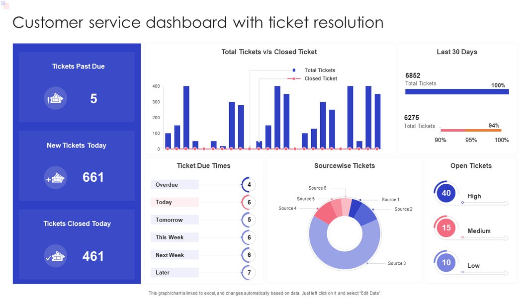
An example customer service dashboard focusing on ticket resolution and satisfaction KPIs.
2. Resolution Time Deep-Dive Dashboard
- KPIs:
- Average Resolution Time by
Issue_Type,Issue_Severity,Service_Center_ID,Vehicle_Model. - Distribution of Resolution Times (e.g., % resolved in <24h, 1-3 days, >3 days).
- Impact of
Parts_Availability_Dayson resolution time.
- Average Resolution Time by
- Visualizations:
- Bar charts comparing average resolution times across different segments.
- Box plots to show distribution and outliers in resolution times.
- Scatter plot showing
Parts_Availability_Daysvs.Resolution_Time_Days. - Filters for Region, Service Center, Issue Type.
- Purpose: Helps identify specific bottlenecks and areas where resolution processes can be improved.
3. Customer Satisfaction Analysis Dashboard
- KPIs:
- Average Customer Satisfaction Score by
Channel_Received,Issue_Type,Resolution_Time_Days(binned),Escalatedstatus. - Distribution of Satisfaction Scores (e.g., % of 5-star, 4-star ratings).
- Correlation between satisfaction and key operational metrics.
- Average Customer Satisfaction Score by
- Visualizations:
- Bar charts for average satisfaction scores across segments.
- Stacked bar chart showing satisfaction score distribution.
- Trend lines for satisfaction scores alongside resolution times.
- Word cloud from customer comments (if available).
- Purpose: To understand what drives customer satisfaction and identify areas to improve the customer experience.

A sample helpdesk dashboard displaying key support metrics like tickets solved and customer satisfaction.
4. Service Center & Technician Performance Dashboard
- KPIs:
- Comparison of Service Centers on: Avg. Resolution Time, Avg. Customer Satisfaction, Escalation Rate, Ticket Volume, Parts Usage.
- Technician Dispatch Rate and its impact on resolution/satisfaction.
- Technician First-Time Fix Rate (if data available).
- Visualizations:
- Comparison tables or bar charts for service center performance.
- Geographical map showing service center locations and key metrics.
- Drill-down capabilities to individual service center performance.
- Purpose: To monitor and compare the performance of different service centers and the effectiveness of technician dispatches.
The radar chart below provides a hypothetical comparison of different service centers based on several key performance indicators. In a real-world scenario, such a chart would be populated with actual data to quickly identify high-performing and underperforming centers across various dimensions.
This radar chart visually contrasts the performance of three hypothetical service centers. 'Service Center SC003' (green) appears to be a top performer with low average resolution times, high customer satisfaction, low escalation rates, high first contact resolution, and minimal impact from parts delays. Conversely, 'Service Center SC002' (blue) shows areas needing improvement, particularly in resolution time and customer satisfaction. Such visualizations enable quick comparative analysis and help focus managerial attention.
5. Warranty & Vehicle Model Insights Dashboard
- KPIs:
- Ticket volume by `Warranty_Status`.
- Common `Issue_Type`s for vehicles under/out of warranty.
- Resolution times and satisfaction scores segmented by `Vehicle_Model` and `Warranty_Status`.
- Frequency of specific issues per `Vehicle_Model`.
- Visualizations:
- Donut or pie charts for warranty status distribution.
- Heatmap of `Vehicle_Model` vs. `Issue_Type`.
- Comparative bar charts for performance metrics across vehicle models.
- Purpose: To identify product-specific trends, understand warranty claim patterns, and potentially inform predictive maintenance or product improvement strategies.
Summary Table: Dataset Column Descriptions
For quick reference, the table below summarizes the columns in our synthetic dataset, their data types, and example values or brief descriptions of what they represent. This structure forms the basis for all subsequent analysis and dashboard creation.
| Column Name | Data Type (Conceptual) | Example Values / Description |
|---|---|---|
| Ticket_ID | String / Alphanumeric | T0001, T1000 |
| Date_Opened | Date | YYYY-MM-DD (e.g., 2023-06-15) |
| Date_Closed | Date | YYYY-MM-DD (e.g., 2023-06-18) |
| Resolution_Time_Days | Integer | Number of days (e.g., 3) |
| Customer_Region | String (Categorical) | 'North', 'South', 'East', 'West', 'Central' |
| Service_Center_ID | String / Alphanumeric | SC001, SC010 |
| Issue_Type | String (Categorical) | 'Engine', 'Electrical', 'Software', 'Bodywork' |
| Issue_Severity | String (Categorical) | 'Low', 'Medium', 'High', 'Critical' |
| Vehicle_Model | String (Categorical) | 'SedanAlpha', 'SUVBeta', 'TruckGamma' |
| Channel_Received | String (Categorical) | 'Phone', 'Email', 'Website', 'Mobile App' |
| Customer_Satisfaction_Score | Integer (Scale 1-5 or 1-10) | 1, 2, 3, 4, 5 |
| Escalated | Boolean | True, False |
| Parts_Availability_Days | Integer | Number of days (e.g., 0, 2, 5) |
| Technician_Dispatched | Boolean | True, False |
| Warranty_Status | String (Categorical) | 'Under Warranty', 'Out of Warranty', 'Extended Warranty' |
Tools like Microsoft Power BI, Tableau, Qlik Sense, or even Excel with PivotTables and PivotCharts can be used to create these dashboards. Python libraries such as Matplotlib, Seaborn, and Plotly are also excellent for creating custom visualizations if a more programmatic approach is preferred.
Visualizing Fleet and Service Data: Practical Dashboard Creation
Step-by-Step Dashboard Building
Creating effective dashboards often involves connecting to data sources, transforming data, and then choosing appropriate visualizations to represent key metrics. The following video provides a practical example of building a fleet management dashboard using Power BI. While focused on fleet management, many principles and techniques shown are directly applicable to creating after-sales service dashboards, especially when dealing with vehicle-related data, service schedules, and performance metrics.
This tutorial demonstrates how to import data, create relationships between tables (if necessary), and use various visual elements like cards, charts, and tables to display information such as total vehicles, maintenance status, and cost analysis. For an after-sales dashboard, you would similarly import your service ticket data and visualize KPIs like resolution times, customer satisfaction scores by vehicle model or issue type, and service center performance. The core idea is to translate raw data into an interactive and easily digestible format that supports quick understanding and decision-making.
Frequently Asked Questions (FAQ)
Recommended Further Exploration
Deepen Your Understanding
- How can predictive analytics be implemented in after-sales service to anticipate customer issues before they arise?
- What are the best practices for setting and tracking Service Level Agreements (SLAs) in after-sales support dashboards?
- How can text analytics on customer feedback from service tickets be used to improve after-sales strategies?
- Explore strategies for optimizing parts inventory management based on after-sales data analysis to reduce delays.
References
Sources and Further Reading
 aws.amazon.com
aws.amazon.com
aws.amazon.com
Last updated May 6, 2025