
Enhancing AppSheet Dashboards with Advanced Filtering
A Step-by-Step Guide to Creating Dynamic and Interactive Experiences
Key Highlights of Enhanced Filtering in AppSheet Dashboards
- Interactive Dashboards: AppSheet allows you to link multiple views within a dashboard, enabling users to interact with one view (like a detail view acting as a filter) to dynamically update others (charts, tables, etc.).
- Slices and Filters: The core of enhanced filtering often involves creating "slices" of your data. These slices use filter expressions to display subsets of your data based on specific conditions, which can be driven by user input or other logic.
- User-Specific Filtering: You can implement filtering mechanisms that are tailored to individual users, ensuring they only see the data relevant to them. This can be achieved through techniques like creating a "Filter" table where each user has a record to define their filtering criteria.
AppSheet's dashboard view type provides a powerful way to present multiple views of your data in a single screen, including calendars, maps, charts, galleries, decks, tables, and detail views. While basic dashboards are useful, enhancing them with dynamic filtering capabilities can significantly improve user experience and data analysis. This guide will walk you through the steps to create a more interactive and filtered dashboard in AppSheet.
Understanding the Core Concepts
The Role of Dashboard Views and Interactivity
A dashboard in AppSheet is essentially a container for other views. The real power of an enhanced dashboard comes from its "interactive mode". In this mode, selecting a row or element in one view (often a detail view or a table acting as a control panel) can filter the data displayed in other linked views on the same dashboard. This creates a dynamic and responsive user interface.
Leveraging Slices and Filter Expressions
Central to creating filtered dashboards are slices and filter expressions. A slice is a subset of your data table defined by a filter condition. This condition is an expression that evaluates to TRUE for the rows you want to include in the slice. By creating slices based on dynamic criteria, you can control which data appears in the views displayed on your dashboard.
The FILTER() expression is a key component here. It returns a list of keys for rows in a specified table or slice that meet a given condition. For example, FILTER("Students", TRUE) would return all rows from the "Students" table, while a more specific condition would return a filtered list.
Example of a Simple Filter Expression:
FILTER("Orders", ([Customer] = [_THISROW].[Customer]))This expression, used within a slice or a virtual column, could filter the "Orders" table to show only the orders for the customer currently selected in another view (represented by [_THISROW].[Customer]).
Step-by-Step Guide to Building an Enhanced Filtered Dashboard
Creating a robust filtered dashboard typically involves setting up specific data structures and views to manage the filtering process. Here's a common approach:
Step 1: Create a "Filter" Data Table
To allow users to dynamically set filtering criteria, it's often beneficial to create a separate data table (e.g., named "Filter" or "User Settings"). This table will hold the values that the user selects to filter the main data.
This table should have columns corresponding to the criteria you want to filter by in your main data table. For instance, if you want to filter by region and product category, your "Filter" table might have columns like "Selected Region" and "Selected Category".
Step 2: Create a Slice Based on User Input
Next, create a slice of your main data table. The row filter condition for this slice will reference the values in your "Filter" table. This is where the dynamic filtering happens.
The filter expression in your slice should compare columns in your main data table to the corresponding columns in the "Filter" table. You'll likely need to use expressions that retrieve the value from the single row in your "Filter" table, perhaps using ANY() if there's only one row or referencing a specific row based on the current user.
Example Slice Filter Expression Referencing a Filter Table:
[Region] = ANY(Filter[Selected Region]) AND [Product Category] = ANY(Filter[Selected Category])This expression would filter the data to show only rows where the "Region" matches the "Selected Region" in the "Filter" table AND the "Product Category" matches the "Selected Category".
Step 3: Create a Detail View for the Filter Table
Create a detail view for your "Filter" table. This view will serve as the control panel for your dashboard's filters. Configure the columns in this detail view to use "Quick Edit" if you want users to easily change the filter values directly from the dashboard.
Step 4: Create Views Based on the Filtered Slice
Now, create the views that will display your filtered data. These views (charts, tables, galleries, etc.) should be based on the slice you created in Step 2, not the original main data table. This ensures that they only show the data that matches the filter criteria defined by the user.
Step 5: Assemble the Dashboard
Finally, create a dashboard view. Add the detail view of your "Filter" table and the views based on your filtered slice to this dashboard. When the user changes a value in the detail view (the filter control), the slice's condition will be re-evaluated, and the views based on that slice will update automatically.
Here is a visual representation of the interaction flow:
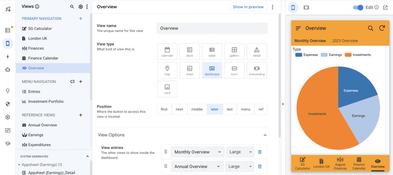
An example of an AppSheet dashboard view.
Advanced Filtering Techniques
User-Specific Filtering
To restrict data visibility so users only see their own relevant information, you can implement user-specific filtering. This often involves:
- Requiring user sign-in in your AppSheet app.
- Having a column in your data table that uniquely identifies the user (e.g., email address).
- Using a row filter condition in a slice that compares the user identifier column to the current user's email address using the
USEREMAIL()expression.
Example User-Specific Filter Condition for a Slice:
[User Email] = USEREMAIL()Saving Multiple Filter Configurations
If you need to allow users to save different sets of filter criteria, you can extend the "Filter" table concept. Instead of a single row per user, you could have multiple rows, each representing a saved filter configuration. Users could then select which saved filter they want to apply.
Using Actions for Filtering
While the interactive dashboard mode is powerful, you can also use actions and deep links to navigate to filtered views. The LINKTOFILTEREDVIEW() expression allows you to create a link that, when clicked, opens a specific view filtered by a defined expression.
Syntax for LINKTOFILTEREDVIEW():
LINKTOFILTEREDVIEW("ViewName", "FilterExpression")This approach can be useful for creating custom filter buttons or navigating to filtered data from other parts of your app.
Troubleshooting Common Issues
When building filtered dashboards, you might encounter issues such as views not updating or incorrect data being displayed. Here are a few things to check:
- Slice Filter Expression: Double-check your slice filter expressions for syntax errors or incorrect logic. Ensure that column names and comparison operators are correct.
- Interactive Mode: Verify that the interactive mode is enabled for your dashboard view.
- Data Consistency: Ensure that the data types of the columns being compared in your filter expressions are consistent.
- Sync: Make sure your app is syncing properly to reflect the latest changes in your data and filter settings.
Enhanced Dashboard Example
The following video provides a demonstration of an enhanced dashboard implementation in AppSheet, showcasing how a detail view can act as a live-edit section to filter other views on the dashboard.
Demonstration of an Enhanced Dashboard in AppSheet.
This video illustrates the practical application of the concepts discussed, particularly the use of a control panel view to drive filtering in other dashboard elements.
Frequently Asked Questions (FAQ)
What types of views can I include in an AppSheet dashboard?
You can include various view types in an AppSheet dashboard, including calendars, maps, charts, gallery, deck, table, and detail views.
How do I make a dashboard interactive?
Dashboard views have an "interactive mode" that links multiple views together. When enabled, interactions in one view (like selecting a row) can filter the data in other views on the same dashboard, provided the data is related.
What is an AppSheet slice and how is it used for filtering?
A slice is a filtered subset of a data table. You define a slice with a filter expression. Views based on a slice will only display the rows that meet the filter condition, making them essential for displaying filtered data on a dashboard.
Can I create user-specific filters in AppSheet?
Yes, by requiring user sign-in and using filter expressions that compare a user identifier column in your data to the signed-in user's email (using USEREMAIL()), you can create security filters that limit users to seeing only their own data.
Recommended Further Exploration
- How to build an interactive dashboard in AppSheet step by step?
- Explore advanced filter expressions for AppSheet slices.
- Learn how to use user settings for personalized filtering in AppSheet.
- Understand the LINKTOFILTEREDVIEW() function for custom filtering actions.
References
Last updated May 17, 2025