
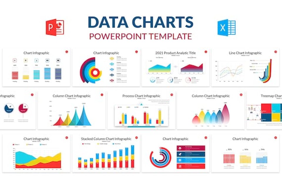
Finding the Optimal Tools for Chart Slides in Presentations
Elevating Your Data Visualization with Top-Tier Software and AI Assistance
Key Insights for Creating Effective Chart Slides
- PowerPoint and Google Slides Remain Core Tools: Despite the emergence of new software, Microsoft PowerPoint and Google Slides are still widely used and offer robust capabilities for creating and incorporating charts.
- AI is Revolutionizing Chart Creation: AI-powered presentation makers can significantly speed up the process of generating slides with charts, suggesting designs and automating layout.
- Specialized Charting and Presentation Add-ins Enhance Capabilities: Tools like think-cell and Canva offer advanced features and templates specifically designed for creating professional and visually appealing charts and entire presentations.
Creating compelling presentations often hinges on effectively visualizing data. Chart slides are fundamental to this, transforming complex information into easily digestible formats. The "best" tool for creating chart slides depends on various factors, including your specific needs, technical expertise, and budget. This comprehensive guide explores a range of options, from traditional presentation software to innovative AI-powered tools and specialized charting add-ins, to help you find the ideal solution for your data visualization needs.
Visualizing Data with Impact
Core Presentation Software: The Foundation
For many, the journey of creating presentation slides, including those with charts, begins with established presentation software. These tools provide a broad set of features for building entire presentations, with integrated capabilities for chart creation and insertion.
Microsoft PowerPoint
Microsoft PowerPoint has long been the industry standard for presentations. Its widespread use and familiar interface make it a go-to for many professionals. PowerPoint offers built-in charting tools that allow you to create various chart types directly within your slides. Furthermore, its seamless integration with Microsoft Excel makes it incredibly easy to import and link data to your charts, ensuring they stay updated if your source data changes. This integration is particularly valuable for creating data visualizations that can be easily inserted into presentations.
Key Strengths of PowerPoint for Charts
- Deep integration with Excel for data import and linking.
- Wide range of customizable chart types.
- Familiar interface for most users.
- Robust features for animations and transitions to enhance chart presentation.
Google Slides
Google Slides has gained significant traction, especially for its collaborative features and accessibility. As a cloud-based platform, it allows multiple users to work on the same presentation simultaneously. Google Slides also offers integrated charting capabilities, allowing you to create charts and import data from Google Sheets. Its simplicity and ease of sharing make it a strong contender, particularly for teams working remotely or needing to collaborate efficiently on presentations with charts.
Advantages of Google Slides for Chart Creation
- Real-time collaboration features.
- Seamless integration with Google Sheets.
- Cloud-based accessibility from anywhere.
- User-friendly interface for quick chart creation.
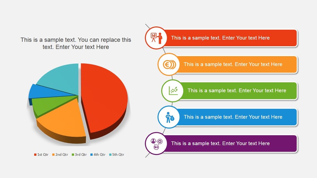
Presenting Data Clearly with Pie Charts
The Rise of AI in Presentation and Chart Creation
Artificial intelligence is rapidly transforming the landscape of presentation creation, offering innovative ways to generate slides and visualize data, including charts, with minimal effort. AI presentation makers can automate the design process, suggest layouts, and even generate content based on your input.
Gamma.app
Gamma.app is frequently highlighted as a leading AI presentation maker. It can generate entire presentations from a single prompt, including incorporating relevant visuals and data charts. Gamma is known for its speed and ability to create visually appealing slides with minimal user intervention. It offers templates and customization options to refine the AI-generated output.
Why Consider Gamma for Charts?
- Rapid generation of presentations with integrated charts.
- AI-powered design suggestions and automation.
- Templates and customization options.
Beautiful.ai
Beautiful.ai focuses on using AI to ensure design consistency and aesthetic appeal. It helps users create presentations that look professionally designed, with AI assisting in layout and visual choices. While not solely a chart tool, its AI-powered design capabilities extend to how charts are presented within slides, ensuring they are integrated harmoniously with the overall presentation design.
Beautiful.ai's Approach to Chart Design
- AI-driven design assistance for visually consistent presentations.
- Helps integrate charts seamlessly into well-designed slides.
- Focus on creating aesthetically pleasing visuals.
Other Notable AI Tools
Several other AI presentation makers are emerging, each with unique strengths. Tools like Plus AI offer capabilities for generating full presentations or single slides, rewriting content, and reformatting existing slides, including those with charts. These tools leverage AI to reduce the time spent on formatting and design, allowing users to focus more on the content and delivery of their charts.
Exploring the Capabilities of Other AI Presentation Makers
- Automated slide and content generation.
- Assistance with formatting and design.
- Potential for integration with existing presentation software.
Discovering the Potential of AI for Presentation Creation
This video explores Gamma.app, an AI-powered tool that can help users create visually appealing presentations quickly. It highlights how AI can streamline the presentation design process, which is particularly useful when incorporating various visual elements like charts. Understanding the capabilities of such AI tools can provide valuable insights into accelerating and enhancing the creation of chart-heavy presentations.
Specialized Tools and Add-ins for Enhanced Charting
Beyond the core presentation software and general AI tools, several specialized applications and add-ins are designed to enhance chart creation and data visualization within presentations. These tools often provide more advanced charting options, data handling capabilities, and design flexibility.
think-cell
think-cell is a powerful add-in specifically designed for creating business presentations in PowerPoint. It is highly regarded for its ability to quickly generate complex charts, such as Mekko charts, Gantt charts, and waterfalls, directly from data. think-cell is widely used in consulting and finance due to its efficiency in creating professional and data-driven slides with sophisticated charts.
Benefits of Using think-cell for Business Charts
- Rapid creation of complex business charts.
- Automation of chart updates from linked data.
- Professional and standardized chart designs.
Canva
While known for its broader graphic design capabilities, Canva also offers robust tools for creating presentations and charts. Its drag-and-drop interface and extensive library of templates and design elements make it accessible for users of all skill levels. Canva provides a dedicated comparison chart maker and various chart types that can be easily customized and incorporated into presentation slides.
Canva's Strengths for Visualizing Data in Presentations
- User-friendly interface and extensive template library.
- Dedicated tools for creating comparison charts.
- Wide range of design elements to enhance chart visuals.
Other Charting and Presentation Tools
Other tools and add-ins cater to specific needs. LibreOffice Impress and WPS Office Free are viable free alternatives to PowerPoint and Google Slides, offering presentation and charting features. For more advanced data visualization or specific chart types, exploring tools like Visme or even leveraging the charting capabilities within data analysis software like Microsoft Excel before importing into a presentation can be beneficial.
Exploring a Variety of Charting Options
-
Free alternatives with core presentation and charting features.
-
Tools with advanced data visualization capabilities.
-
Utilizing data analysis software for chart creation prior to presentation.
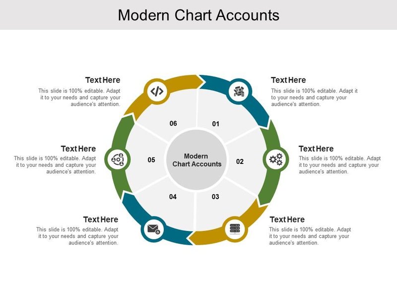
Designing Effective Chart Layouts
Choosing the Right Tool: A Comparison
To help you decide which tool might be best for your chart slides, here is a comparison of some of the key options based on their features and strengths:
| Tool | Primary Use | Chart Creation Features | Collaboration | AI Assistance | Integration with Data Sources |
|---|---|---|---|---|---|
| Microsoft PowerPoint | General Presentations | Built-in charts, customizable, supports various types | Real-time collaboration (with Microsoft 365) | Microsoft Copilot (emerging) | Excellent with Microsoft Excel |
| Google Slides | General Presentations, Collaboration | Built-in charts, basic customization | Excellent real-time collaboration | Gemini (emerging) | Excellent with Google Sheets |
| Gamma.app | AI-Powered Presentations | Generates charts as part of presentation | Yes | Strong AI generation | Limited direct data integration |
| Beautiful.ai | AI-Powered Design-Focused Presentations | AI-assisted chart integration and design | Yes | Strong AI design assistance | Limited direct data integration |
| think-cell | Business Presentations (PowerPoint Add-in) | Advanced business charts, highly customizable | Via PowerPoint collaboration | No | Excellent with Microsoft Excel and other data sources |
| Canva | Graphic Design and Presentations | User-friendly chart maker, templates | Excellent team collaboration | Some AI design features | Manual data input or upload |
Creating Effective Chart Slides
Regardless of the tool you choose, several principles can help you create effective chart slides that clearly communicate your data:
Know Your Audience and Message
Tailor your charts to your audience's understanding and the specific message you want to convey. Avoid overwhelming them with too much data or overly complex chart types.
Choose the Right Chart Type
Select the chart type that best represents your data and the relationship you want to highlight. Common chart types include bar charts (for comparisons), line charts (for trends), pie charts (for proportions), and scatter plots (for relationships). Using templates can also help in selecting appropriate chart types for different data sets.
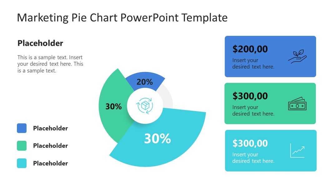
Illustrating Proportions with Pie Charts
Keep it Clean and Simple
Avoid cluttering your charts with unnecessary elements. Use clear labels, concise titles, and a clean design. Ensure that the most important information stands out.
Use Color Strategically
Color can draw attention to key data points and improve readability. Use color consistently and consider accessibility for colorblind individuals.
Provide Context
Include a brief explanation or key takeaway with each chart slide to help your audience interpret the data correctly. Adding comments can also be helpful for internal review or further explanation.
FAQ: Chart Slides and Presentation Tools
What is the easiest way to create a comparison chart?
Many presentation tools, including Canva and dedicated template providers, offer specific templates for comparison charts, making it easier to organize and visualize similarities and differences between items or concepts. You can also create a comparison table directly in most presentation software.
Can AI tools create charts directly from data?
Some advanced AI presentation makers can interpret data and generate charts as part of the slide creation process. However, for complex data or specific chart types, you may still need to prepare your data in a spreadsheet and import it.
Are there free alternatives to PowerPoint and Google Slides for creating chart slides?
Yes, LibreOffice Impress and WPS Office Free are examples of free presentation software that include charting capabilities. Canva also offers a free tier with tools for creating charts and presentations.
How can I ensure my charts are visually appealing?
Using templates, maintaining design consistency, using color effectively, and keeping the design clean and uncluttered are all key to creating visually appealing charts. Tools like Beautiful.ai can assist with design, while template marketplaces offer pre-designed chart slides.
What are some common types of charts used in presentations?
Common chart types include bar charts, line charts, pie charts, scatter plots, and waterfall charts. The best choice depends on the type of data you are presenting and the message you want to convey.
References
Last updated April 20, 2025