
Best Vim Color Schemes
A comprehensive guide to enhancing your Vim experience with top color schemes
Key Takeaways
- Enhance Readability: Choosing the right color scheme can significantly improve code readability and reduce eye strain during long coding sessions.
- Personalization: With a wide variety of color schemes available, you can customize Vim to match your aesthetic preferences and work environment.
- Seamless Integration: Top color schemes like Gruvbox and Dracula offer compatibility with various plugins and tools, ensuring a unified development experience.
Top Vim Color Schemes
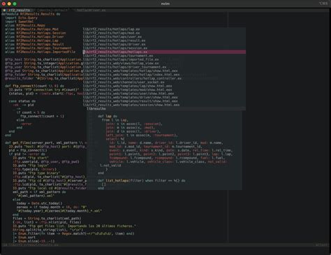
Gruvbox
Gruvbox stands out as one of the most popular and highly recommended Vim color schemes. Praised for its retro-inspired palette and balanced contrast, Gruvbox is designed to be easy on the eyes, making it ideal for extended coding sessions. It offers both light and dark variants, allowing users to switch based on their preference or environmental lighting conditions. Its adaptability across various monitors ensures consistent visual appeal, enhancing overall code readability and reducing eye strain.
Dracula
Dracula is a favorite among developers for its dark, high-contrast theme that makes syntax highlighting pop. This color scheme provides a consistent and visually appealing interface across numerous developer tools, not just Vim. Its vibrant colors are carefully selected to ensure readability while maintaining aesthetic appeal. Dracula is also known for its strong community support and regular updates, making it a reliable choice for developers seeking a modern and professional look.
One Dark
Originally inspired by the Atom editor, One Dark has been ported to Vim and has gained immense popularity for its sleek and professional appearance. The theme's subdued color palette is easy on the eyes, making it suitable for long coding sessions. One Dark provides a modern, dark aesthetic that aligns well with contemporary development environments, offering simplicity and elegance that enhances focus and productivity.
Nord
Inspired by the Arctic's calm and serene palette, Nord features cool, ice-cold tones that provide excellent contrast without being overwhelming. This color scheme is designed to reduce eye strain and improve focus, especially in low-light environments. Nord's clean and crisp design makes it a great choice for both writing and programming, offering a balanced and visually soothing experience that enhances code comprehension.
Ayu
Ayu offers three distinct variants—Light, Mirage, and Dark—catering to different user preferences and lighting conditions. This versatility allows developers to switch seamlessly between themes without compromising on clarity or vibrancy. Ayu is praised for its minimalistic and subtle colors that maintain code clarity while providing a visually appealing interface. Its balanced contrast ensures that syntax highlighting is both clear and aesthetically pleasing.
Molokai
Molokai is a classic dark theme inspired by the Monokai scheme from TextMate. It is minimalistic yet bold, offering a clean look that is highly effective for developers who prefer a straightforward interface. Molokai's strong contrast and distinctive color accents make it a reliable choice for enhancing code readability and reducing eye fatigue.
Solarized
Solarized is a perennial favorite in the Vim community, designed with a scientific approach to color selection. It offers both light and dark variants, ensuring minimal eye strain and maximum readability. Solarized's consistent contrast across different environments and strong terminal compatibility make it a versatile and reliable choice for developers looking to maintain visual consistency across various platforms.
Tokyo Night
Tokyo Night is a modern color scheme inspired by cyberpunk aesthetics. Its subtle, pastel tones create an elegant and sophisticated coding environment that appeals to developers who appreciate a contemporary and stylish interface. Tokyo Night's unique color palette ensures that syntax elements are both distinct and harmonious, enhancing overall code readability.
Everforest
Everforest draws inspiration from nature, offering a soft and calming theme with muted tones that reduce eye strain. Available in both light and dark modes, Everforest provides a balanced contrast that aids in maintaining focus and improving code clarity. Its nature-inspired palette brings a sense of tranquility to the coding environment, making it an excellent choice for developers seeking a serene and productive workspace.
Spacegray
Spacegray is a futuristic and minimalistic theme tailored for developers who prefer a sleek, modern interface. Its understated color palette and clean design elements make it an ideal choice for those seeking a professional and visually appealing coding environment. Spacegray's focus on simplicity ensures that syntax highlighting remains clear and effective without unnecessary distractions.
More on Spacegray
Choosing the Right Color Scheme
Factors to Consider
-
Readability: Ensure that the color scheme provides clear contrast between different syntax elements to enhance code readability.
-
Aesthetic Preference: Select a theme that aligns with your personal taste and the visual atmosphere you find most comfortable.
-
Environment Compatibility: Consider the lighting conditions of your workspace. Dark themes are generally better for low-light environments, while light themes are suitable for well-lit spaces.
-
Plugin Compatibility: Some color schemes offer better integration with popular Vim plugins, ensuring a cohesive development experience.
-
Coding Languages: Certain themes may be optimized for specific programming languages, highlighting syntax elements more effectively based on your stack.
Installation and Configuration
Installing and configuring a Vim color scheme is straightforward. Here's a step-by-step guide to help you set up your desired theme:
-
Download the Color Scheme
Most color schemes are hosted on GitHub or similar platforms. You can clone the repository directly to your local system using a plugin manager like Vim-Plug. For example, to install Gruvbox, add the following lines to your.vimrcfile:call plug#begin('~/.vim/plugged') Plug 'morhetz/gruvbox' call plug#end() colorscheme gruvbox -
Edit Your
.vimrcConfiguration File
After cloning the repository, specify the color scheme in your.vimrcby adding:colorscheme gruvbox -
Enable Syntax Highlighting
To ensure proper syntax highlighting, include the following lines in your.vimrc:syntax on set termguicolors -
Restart Vim
Save your.vimrcchanges and restart Vim to apply the new color scheme.
For a more comprehensive collection of Vim color schemes, you can explore VimColorschemes or the Awesome Vim Colorschemes repository on GitHub, which provides an extensive collection of popular themes for quick use.
Advanced Customization
Adapting Color Schemes to Your Workflow
While preset color schemes offer a great starting point, further customization can enhance your coding experience. Here are some advanced tips:
- Adjusting Contrast: Modify the contrast levels within a theme to better suit your monitor and personal preference.
- Custom Highlights: Tweak specific syntax highlighting rules to improve visibility and distinction between code elements.
- Integration with Plugins: Ensure that your color scheme works seamlessly with Vim plugins like
nerdtree,lightline, and others to maintain a consistent look across your development environment. - Dynamic Switching: Use Vim scripts or plugins to switch between different color schemes based on the time of day or your current task.
Example: Customizing Gruvbox
To customize Gruvbox for better readability, you can adjust the background contrast and tweak specific syntax groups in your .vimrc:
" Set Gruvbox as the color scheme
colorscheme gruvbox

" Customize background contrast
let g:gruvbox_contrast_dark = 'hard'

" Override specific highlight groups
highlight Comment ctermfg=240 guifg=#928374
highlight Function guifg=#fabd2f
This customization enhances the contrast for comments and functions, making them stand out more prominently within your code.
Comparative Analysis
| Color Scheme | Variants | Key Features | Best For |
|---|---|---|---|
| Gruvbox | Light, Dark | Retro-inspired palette, balanced contrast | Extended coding sessions, versatility |
| Dracula | Dark | High contrast, vibrant colors | Modern development environments, multi-tool integration |
| One Dark | Dark | Sleek and professional, subdued palette | Focus and productivity, modern aesthetics |
| Nord | Dark | Calm, Arctic-inspired tones | Low-light environments, reducing eye strain |
| Ayu | Light, Mirage, Dark | Minimalistic, subtle colors | Flexibility, maintaining code clarity |
| Molokai | Dark | Minimalistic, bold accents | Clean and straightforward interface |
| Solarized | Light, Dark | Scientifically designed palette, terminal compatibility | Consistency across platforms, reducing eye strain |
| Tokyo Night | Dark | Cyberpunk aesthetics, pastel tones | Modern and stylish interfaces |
| Everforest | Light, Dark | Nature-inspired, calming tones | Serene and productive workspace |
| Spacegray | Dark | Futuristic, minimalistic design | Sleek and professional coding environments |
Community and Support
The Vim community plays a crucial role in the development and maintenance of color schemes. Many themes are regularly updated to ensure compatibility with the latest Vim versions and plugins. Popular repositories like Awesome Vim Colorschemes on GitHub compile curated lists of the best themes, making it easier for developers to discover and switch between them. Additionally, community forums and platforms like Reddit's Vim Recommendations provide valuable insights and user feedback, helping you make informed decisions about which theme best suits your needs.
Conclusion
Selecting the best Vim color scheme is a highly subjective decision that depends on your personal preferences, workflow, and environmental factors. However, based on widespread recommendations and distinctive features, themes like Gruvbox, Dracula, One Dark, Nord, and Ayu consistently emerge as top choices for enhancing readability, aesthetics, and overall coding experience.
Experimenting with different color schemes can help you find the perfect match that not only complements your coding style but also improves productivity and reduces eye strain. Utilizing resources like VimColorschemes and GitHub repositories will provide you with a vast array of options to explore and customize Vim to your liking.
Ultimately, the best color scheme is the one that makes you feel comfortable and enhances your ability to write clean, efficient code. Don't hesitate to switch themes periodically to keep your development environment fresh and inspiring.
Last updated January 9, 2025