
Fundamental Principles of Composition in Calendar Design
Exploring the Intersection of Functionality and Aesthetics in Calendar Creation
Key Takeaways
- Integration of design principles such as balance, contrast, and harmony is essential for creating functional and visually appealing calendars.
- Effective calendar composition enhances user experience by improving readability, usability, and cultural relevance.
- The evolution of calendar design merges traditional methods with modern technologies, reflecting both historical context and contemporary user needs.
Introduction
Background and Purpose
Calendars are integral tools for organizing time, scheduling events, and marking significant dates. Beyond their functional role, calendars serve as canvases for artistic expression and cultural representation. The composition of a calendar involves the strategic arrangement of visual elements to achieve both usability and aesthetic appeal. This dissertation explores the fundamental principles of composition in calendar design, examining how these principles contribute to creating effective and engaging calendars.
Scope
This study encompasses both traditional print and digital calendar formats, analyzing how compositional principles are applied across different mediums. It delves into historical perspectives, theoretical frameworks, and practical applications, providing a comprehensive understanding of calendar composition. The focus extends to cultural influences, user experience considerations, and future trends in calendar design.
Literature Review
Historical Evolution of Calendar Design
The design of calendars has evolved significantly from ancient timekeeping systems to modern digital interfaces. Early calendars, such as the Roman and Mayan, combined astronomical observations with artistic elements, reflecting cultural and scientific knowledge. With the advent of printing technology, calendars transitioned to more standardized formats, emphasizing clarity and functionality. The digital age introduced interactive features and dynamic content, requiring adaptable compositional strategies to maintain usability across various devices.
Theoretical Foundations in Design
Fundamental design theories underpin the composition of calendars. Gestalt principles explain how users perceive visual elements as organized wholes, influencing the arrangement of dates and events. The Rule of Thirds and the Golden Ratio guide the placement of key elements to achieve visual harmony. Typographic theories address the role of font selection and hierarchy in enhancing readability and guiding the viewer's eye through the calendar's content.
Modern Perspectives on Calendar Composition
Contemporary research in human-computer interaction (HCI) emphasizes the importance of balancing information density with visual clarity in digital calendars. Studies highlight the need for responsive design that adapts to different screen sizes and user preferences. Minimalist versus maximalist design approaches are debated, with each offering distinct advantages in terms of user engagement and aesthetic appeal. The integration of personalization features allows users to tailor calendar layouts to their specific needs, enhancing overall user experience.
Principles of Composition in Calendar Design
Balance
Balance in calendar design refers to the distribution of visual weight across the layout. It can be achieved through symmetrical or asymmetrical arrangements. Symmetrical balance provides a sense of stability and order, while asymmetrical balance offers dynamic interest without sacrificing harmony. Effective balance ensures that no single element overwhelms the composition, contributing to a cohesive and aesthetically pleasing design.
Contrast
Contrast enhances readability and visual interest by differentiating elements through color, size, shape, or texture. High contrast between text and background improves legibility, especially for dates and important annotations. Contrast can also be used to highlight specific dates, such as holidays or events, making them stand out and facilitating quick navigation through the calendar.
Harmony
Harmony involves the consistent use of design elements to create a unified aesthetic. This includes selecting a cohesive color palette, consistent typography, and recurring graphic motifs. Harmonious designs prevent the calendar from appearing disjointed, ensuring that all components work together to form a visually appealing whole. Harmony also contributes to the professional appearance of the calendar, making it more attractive to users.
Alignment
Proper alignment organizes text and graphical elements, creating a structured and orderly layout. In calendars, aligning days of the week with their corresponding dates and ensuring consistent placement of events or notes enhances readability and usability. Alignment contributes to a clean and professional design, making it easier for users to interpret the information presented.
Proximity
Proximity groups related elements together, indicating their relationship and facilitating quick understanding. For instance, clustering dates within a month and associating events with their respective dates using close placement improves the calendar's navigability. Effective use of proximity reduces cognitive load, allowing users to process information more efficiently.
Repetition
Repetition reinforces consistency and rhythm within the calendar design. Repeating colors, fonts, or graphic elements across different sections of the calendar creates a sense of unity and coherence. Repetition also aids in establishing a visual identity for the calendar, making it more recognizable and aesthetically pleasing.
Unity
Unity ensures that all design elements work together harmoniously, creating a seamless and integrated composition. Achieving unity involves the thoughtful combination of balance, contrast, harmony, alignment, proximity, and repetition. A unified design enhances the overall aesthetic appeal and functionality of the calendar, making it an effective tool for time management and visual organization.
| Design Principle | Application in Calendar Design | Impact on Usability |
|---|---|---|
| Balance | Symmetrical or asymmetrical arrangement of dates and events | Creates visual stability and prevents clutter |
| Contrast | Differentiating text from background, highlighting important dates | Enhances readability and draws attention to key information |
| Harmony | Consistent color schemes and typography | Ensures a cohesive and professional appearance |
| Alignment | Organizing days of the week and dates consistently | Improves navigation and information processing |
| Proximity | Grouping related dates and events | Facilitates quick understanding and reduces cognitive load |
| Repetition | Recurring use of colors and graphic motifs | Establishes visual rhythm and unity |
| Unity | Integration of all design elements into a cohesive whole | Enhances overall aesthetic appeal and functionality |
Usability in Calendar Design
Legibility
Ensuring that all text, particularly dates and event descriptions, is easily readable is paramount. This involves selecting appropriate font types, sizes, and weights that enhance clarity. High legibility reduces user frustration and increases the effectiveness of the calendar as a time management tool.
Space Utilization
Adequate spacing allows users to write notes and appointments without cluttering the calendar. Effective space utilization balances the amount of information presented with the need for writable areas, ensuring that the calendar remains both functional and aesthetically pleasing.
Functional Design Considerations
The design should align with the intended use of the calendar, whether it's for personal planning, office use, or as a decorative piece. Functional considerations include the layout format (e.g., wall, desk, digital), portability, and the inclusion of features like monthly views, yearly overviews, and interactive elements in digital formats.
Visual Elements
Grid Systems and Layout
Grid systems provide a structured framework for organizing dates and events. Typically, monthly calendars use a seven-column grid corresponding to the days of the week. The grid ensures consistency, making it easier for users to navigate and locate specific dates.
Typography
Typography plays a crucial role in establishing hierarchy and readability. Selecting fonts that balance style and clarity ensures that essential information, such as dates and event names, stands out. Variations in font size and weight can indicate the importance of certain elements, guiding the user's attention effectively.
Color Theory
Color choices influence both the aesthetic appeal and functionality of the calendar. A harmonious color palette creates visual unity, while strategic use of contrast enhances readability. Colors can also convey information, such as differentiating weekdays from weekends or highlighting holidays and special events.
Imagery and Themes
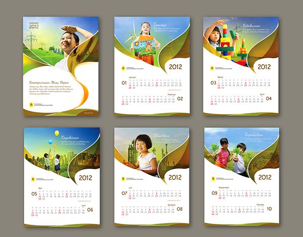
Incorporating relevant images and themes can enhance the visual interest of the calendar. Thematic consistency, whether based on seasons, cultural motifs, or specific interests, adds personality and can make the calendar more engaging for users. High-quality images should complement the overall design without overwhelming the functional aspects.
Practical Applications and Case Studies
Traditional Print Calendars
Traditional print calendars, such as wall and desk varieties, rely on static design principles to maintain clarity and ease of use. Effective grid systems, consistent typography, and balanced layouts are essential in these formats. Historical designs often incorporate artistic elements that reflect cultural and aesthetic values, serving both functional and decorative purposes.
Digital and Interactive Calendars
Digital calendars introduce interactive features that enhance user engagement. Responsive design ensures compatibility across various devices, while interactive elements like pop-up reminders and customizable views improve functionality. The dynamic nature of digital calendars necessitates flexible compositional strategies that adapt to different screen sizes and user preferences.
Cultural and Thematic Considerations
Calendars often reflect cultural practices and traditions through their design. Incorporating culturally significant dates, symbols, and color schemes makes calendars more relevant and meaningful to specific audiences. Thematic calendars, such as those based on seasonal changes or specific interests, cater to diverse user preferences and enhance the calendar's appeal.
Discussion
Synthesis of Design Principles
The integration of balance, contrast, harmony, alignment, proximity, repetition, and unity is fundamental to effective calendar composition. These principles work synergistically to create layouts that are both aesthetically pleasing and highly functional. A well-composed calendar not only organizes time but also engages the user through thoughtful design.
User Engagement
User engagement is significantly influenced by the calendar's composition. Clear visual hierarchy and balanced layouts make the calendar intuitive and easy to use, enhancing user satisfaction. Additionally, culturally relevant designs and personalized features in digital calendars foster a deeper connection between the user and the calendar.
Future Trends in Calendar Design
Emerging technologies like augmented reality (AR) and artificial intelligence (AI) are poised to revolutionize calendar design. AR could enable interactive 3D calendar experiences, while AI can offer personalized scheduling recommendations and adaptive layouts based on user behavior. These advancements will require designers to continually adapt compositional strategies to incorporate new functionalities without compromising aesthetic integrity.
Conclusion
The composition of calendars is a nuanced interplay of design principles aimed at balancing functionality with visual appeal. This dissertation has elucidated how principles such as balance, contrast, harmony, alignment, proximity, repetition, and unity are integral to creating effective calendars. By adhering to these foundational concepts, designers can craft calendars that not only organize time efficiently but also resonate aesthetically with users. The ongoing evolution of calendar design, influenced by technological advancements and cultural shifts, underscores the importance of adaptable and user-centric compositional strategies. Ultimately, the thoughtful integration of compositional principles ensures that calendars remain indispensable tools for time management and cultural expression.
References
Last updated February 11, 2025