
Warning! Is Your 'Check Liver Light' On? Design the Perfect Parody Tee!
Discover how to craft a hilarious t-shirt graphic that swaps the engine for the liver in this iconic warning symbol.
Ready to create a t-shirt design that's both witty and visually striking? The "Check Liver Light" concept playfully adapts the universally recognized "Check Engine Light" symbol found on car dashboards into a humorous commentary on health, particularly related to social drinking and indulgence. This guide provides a detailed description to help visualize and design this popular parody graphic.
Design Highlights: Key Elements for Your Tee
- Iconic Parody: The core idea is to replace the standard engine silhouette within the warning light symbol with a stylized, often cartoonish, liver shape.
- Warning Aesthetics: Utilize classic warning light colors like amber, yellow, or orange, incorporating a glow effect to mimic an illuminated dashboard indicator.
- Humorous Text: Boldly display "CHECK LIVER LIGHT" and consider adding a funny tagline for extra comedic effect, tying into themes of partying or needing a break.
Deconstructing the "Check Liver Light" Concept
The humor behind the "Check Liver Light" design lies in its clever subversion of a common automotive warning. The "Check Engine Light" signals potential trouble under the hood, prompting a check-up. By substituting the engine with the liver, the design humorously suggests that perhaps the body's 'engine' – responsible for processing life's excesses – might need some attention, often linked playfully to alcohol consumption.
Crafting the Central Icon
The Liver Element
Instead of the typical engine block shape, the focal point is a stylized representation of a human liver. It should be easily recognizable but not overly clinical or graphic. A simplified, cartoonish approach works well, perhaps with smooth lines and a distinct shape. Colors like deep red or maroon are suitable for the liver itself, contrasting against the warning light background.
Adding Personality
To enhance the humor, consider giving the liver some character. This could involve:
- Small sweat droplets indicating stress or "overwork."
- A slightly weary or stressed expression (if drawing faces).
- Subtle integration of drinking motifs, like a tiny beer mug silhouette nearby or foam-like texture, hinting at the reason for the "warning."
- An exclamation mark overlaid in a corner, directly mimicking alert symbols.
Designing the Warning Light Visual
Shape and Color
The liver icon should be housed within a shape reminiscent of standard dashboard warning lights. This could be a circle, an oblong shape, or the classic engine light silhouette frame. The key is the color: bright amber, yellow, or safety orange are essential to capture the "warning" feel. This color should dominate the background of the icon or the frame itself.
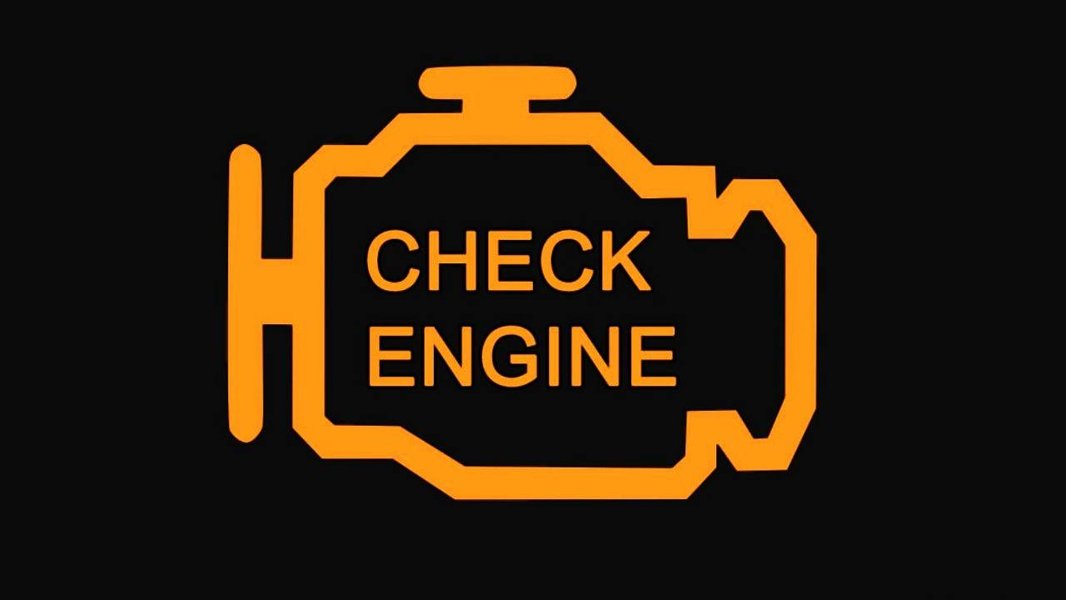
The familiar amber glow of a standard Check Engine Light provides the primary visual inspiration.
Illumination Effect
To simulate a lit-up dashboard light, incorporate a glowing effect. This can be achieved through:
- A soft halo or aura around the main icon shape.
- Subtle light rays emanating outwards.
- Using gradients within the amber/yellow color to suggest illumination.
Integrating Text Effectively
Primary Text: "CHECK LIVER LIGHT"
The phrase "CHECK LIVER LIGHT" is crucial. It should be prominent, typically placed above or below the icon. Use a bold, clear, sans-serif font. Block capital letters work well, mimicking the functional text on dashboards. Consider a font style that feels slightly mechanical or industrial, potentially with a slight tilt for effect.
Secondary Text and Taglines
Adding a secondary line of text can enhance the humor. Position this below the main phrase or subtly integrated elsewhere. Examples include:
- "Time for a Break"
- "Party Responsibly"
- "Service Required Soon"
- "I Have a Feeling This Might Come On Soon"
Color and Contrast
Ensure text is highly readable against the background. Black or white text usually provides the best contrast against the amber/yellow warning light color. The overall design should pop, regardless of the t-shirt color it's printed on (common choices are black, grey, or white tees).
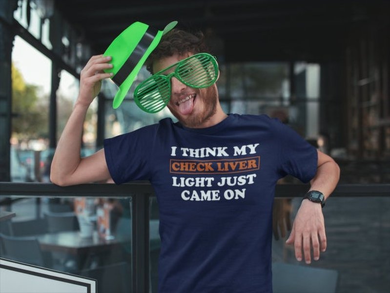
An example of an existing "Check Liver Light" t-shirt design, showcasing the concept's execution.
Visualizing the Design Elements
To better understand how these components fit together, here's a mindmap illustrating the core elements of the "Check Liver Light" t-shirt design concept.
This mindmap breaks down the essential components, showing how the icon, light effects, text, style, and underlying humor combine to create the final image.
Evaluating Design Attributes
When finalizing the design, consider how different attributes balance out. This radar chart provides a subjective assessment of key design characteristics for a typical "Check Liver Light" graphic, aiming for a balance suitable for a popular t-shirt.
This chart suggests prioritizing high recognizability, humor, contrast, and printability. The theme's subtlety might be lower (as the joke is fairly direct), and while the core concept is a parody, there's room for originality in execution.
Style Variations and Considerations
While the core concept is consistent, you can adapt the style and details. Here's a table outlining some potential variations:
| Style Aspect | Option 1: Clean & Modern | Option 2: Retro/Distressed | Option 3: Detailed Cartoon |
|---|---|---|---|
| Icon Style | Flat design, minimal lines, geometric liver shape. | Slightly textured lines, vintage feel, simplified icon. | More rounded shapes, expressive liver (e.g., with face), subtle shading. |
| Text Font | Standard sans-serif (e.g., Helvetica Bold). | Distressed or retro automotive font. | Playful, slightly rounded font. |
| Color Palette | Bright, solid colors (Amber, Red, Black/White). | Muted tones, maybe off-white instead of pure white, added texture overlay. | Vibrant colors, potentially more shades used for effect. |
| Extra Details | Minimal; focus on core icon and text. | Subtle scratches or worn effect on the light graphic. | More elaborate humorous elements (e.g., tiny beer mug, sweat drops). |
| Overall Vibe | Crisp, direct, easily readable. | Nostalgic, worn-in, subtly humorous. | overtly funny, animated, eye-catching. |
Choosing a style depends on the target audience and the desired comedic tone.
Cultural Resonance: The "Check Liver Light" Phrase
The phrase "Check Liver Light" has permeated popular culture, particularly within certain music genres and social circles, as a humorous euphemism related to drinking and its effects. While the t-shirt design is a visual pun, the phrase itself appears elsewhere, such as in song titles. Listening to music that uses the phrase, like the track below by Jamie Bergeron & The Kickin' Cajuns, can provide context for the lighthearted, often party-centric vibe associated with the term.
"Check Liver Light" by Jamie Bergeron & The Kickin' Cajuns (Audio)
This song exemplifies the cultural context where the phrase is used humorously, often associated with Cajun music, festivals, and a celebratory (though perhaps excessive) lifestyle. The t-shirt design taps into this existing cultural shorthand.
Frequently Asked Questions (FAQ)
What's the main joke behind the "Check Liver Light"?
The humor comes from parodying the serious "Check Engine Light" in cars. By replacing the engine with the liver (an organ affected by factors like alcohol consumption), it humorously suggests a need to "check" one's lifestyle choices or give the body a break, especially after indulgence.
What illustration style works best for this design?
A simple, clean, and somewhat cartoonish style is often most effective. Flat design with bold lines and high-contrast colors ensures the graphic is easily recognizable and prints well on fabric. Avoid overly complex or realistic anatomical details.
Where should the design be placed on the t-shirt?
The most common placement is centered on the chest for maximum visibility. An average size might be 8-10 inches wide. A smaller version could also work as a left-chest print, similar to a logo.
What colors are essential for the design?
Amber, yellow, or orange are key for the "warning light" element. A contrasting red or maroon for the liver shape helps it stand out. Black or white for the text ensures readability. The overall palette should mimic automotive warning indicators.
Recommended Explorations
- Explore other funny health-related t-shirt design ideas.
- Learn about the history and meaning of actual car dashboard warning lights.
- Find tips for designing graphics specifically for t-shirt screen printing.
- Discover more examples of parody designs in popular culture.
References


Last updated May 4, 2025