
Crafting a Vision: The "Construction Council of 100" Logo and Identity
Designing a Powerful Emblem for Industry Leadership and Progress
Key Insights for Your "Construction Council of 100" Logo
- Symbolic Fusion: The logo should creatively blend elements representing "construction" (e.g., structures, tools, blueprints) with "council" (e.g., a shield, a strong foundation, interconnectedness) and "100" (e.g., a subtle numerical integration, a sense of completion or excellence), ensuring a cohesive visual narrative.
- Professional Authority: Given that the "Construction Council of 100" likely represents a significant body of industry leaders, the design must exude professionalism, credibility, and authority, using a sophisticated color palette and clean, impactful typography.
- Versatility and Impact: The final logo needs to be highly versatile, capable of being effectively scaled across various platforms—from digital interfaces and social media to print materials, signage, and merchandise—while maintaining its integrity and recognition.
Designing a compelling logo for the "Construction Council of 100" requires a deep understanding of its purpose and target audience. This entity, whether it's an advisory board, a professional association, or a strategic partnership, signifies leadership, expertise, and a collective commitment to advancing the construction industry. The name itself, "Construction Council of 100," suggests a prestigious group of influential individuals or organizations, implying a focus on high-level strategy, policy, and innovation within the sector.
Understanding the Essence of "Construction Council of 100"
Before diving into visual concepts, it's crucial to define the core identity of the "Construction Council of 100." Is it similar to the Construction Industry Council (CIC) which serves as a representative forum for professional bodies, research organizations, and specialist business associations in the UK construction industry, or the Hong Kong Construction Industry Council (CIC), which focuses on worker registration and training? Or does it align more with entities like the Florida Council of 100, a private, non-profit organization of business leaders advising the state's governor on economic and quality-of-life issues?
The "100" in the name could signify a variety of aspects: a limited, exclusive membership; a target number of achievements; a century of influence; or a commitment to achieving 100% excellence or completion in projects. For instance, "100% Construction" is a company focused on delivering entire house build projects with a high standard of workmanship. The Committee of 100, on the other hand, is an organization of prominent Chinese Americans promoting constructive relations between the US and Greater China, with "100" stemming from an ancient Chinese idiom reflecting "everyone in the community." This nuance is vital. If the "100" implies exclusivity and leadership, the logo should reflect that gravitas. If it signifies comprehensiveness or a broad base of stakeholders, a more inclusive design might be appropriate.
Core Values and Mission Alignment
A successful logo visually communicates the organization's core values. For a "Construction Council of 100," these values might include:
- Leadership: Guiding the industry forward, setting standards.
- Collaboration: Bringing diverse experts together for common goals.
- Innovation: Embracing new technologies and sustainable practices.
- Integrity: Upholding ethical standards and trust.
- Excellence: Striving for the highest quality in all endeavors.
- Impact: Contributing positively to society and the built environment.
The logo should reflect these principles, becoming a recognizable symbol that embodies the council's mission to shape a better built environment, as stated by the Construction Industry Council (CIC) in its aim to bring professionals together to enhance the industry's positive impact on society.
Conceptualizing Visual Elements for the Logo
To effectively represent the "Construction Council of 100," the logo should combine imagery that evokes both the construction sector and the idea of a cohesive, influential council. Here are some conceptual approaches:
Elements Representing "Construction"
- Structures: Abstracted architectural forms, building outlines, or geometric patterns that suggest stability, growth, and creation. Think of elements like beams, columns, or a stylized roofline.
- Tools/Equipment: Subtly integrated elements like a compass, ruler, hard hat, or even a crane hook. These can symbolize precision, safety, and progress.
- Foundations/Blueprints: Depicting a strong base or the meticulous planning involved in construction. This could be a stylized grid or a foundational block.
- Progress/Dynamics: Upward-pointing arrows, ascending lines, or a sense of movement to convey advancement and future-focus.
Elements Representing "Council" and "100"
- Unity/Collaboration: Interlocking shapes, a circular arrangement, or elements coming together to form a greater whole. This signifies the collective strength of the "100."
- Shield/Crest: A traditional symbol of authority, protection, and establishment, often used by formal organizations.
- Numerical Integration: The number "100" can be subtly incorporated into the design, perhaps within a geometric shape or as a negative space element. It could also be represented by an abstract pattern of 100 small dots or lines that form a larger shape.
- Abstract Symbolism: A stylized "C" for Council or Construction, or a unique mark that becomes synonymous with the organization.
- Laurels/Wreaths: Symbols of achievement, excellence, and honor, often seen in prestigious organizations.
Design Principles and Aesthetic Considerations
Color Palette
The color palette plays a crucial role in conveying the organization's personality. For a construction council, colors that evoke professionalism, reliability, and innovation are ideal:
- Blues: Trust, stability, professionalism (e.g., navy blue, steel blue).
- Greys/Silvers: Sophistication, technology, modernity, strength (e.g., charcoal grey, metallic silver).
- Golds/Bronzes: Prestige, excellence, leadership, heritage.
- Earthy Tones: Relate to materials and foundations, suggesting groundedness and durability (e.g., deep browns, muted greens).
- Accents: A subtle pop of a vibrant color (e.g., a bright orange or yellow, commonly associated with construction safety or innovation) can add dynamism without overpowering the professional feel.
Typography
The typeface selected should complement the visual elements and reinforce the desired perception. Strong, clear, and legible fonts are paramount:
- Sans-serif fonts: Modern, clean, and highly readable, conveying a contemporary and forward-thinking image (e.g., Gotham, Lato, Montserrat).
- Serif fonts: Can be used for a more traditional, authoritative, or classic feel, often paired with modern elements for a balanced look.
- Custom lettering: For a truly unique and memorable mark, consider custom-designed typography for the "100" or the "Council" portion of the name.
The font choice should convey stability and confidence, avoiding overly decorative or thin typefaces that might diminish the council's authority.
Versatility and Scalability
A well-designed logo functions effectively across various mediums and sizes. It should be:
- Simple: Avoid overly complex designs that become illegible when scaled down.
- Memorable: Easy to recall and recognize.
- Reproducible: Works well in black and white, and across different materials.
- Adaptable: Can be used in both horizontal and vertical formats if needed.
Logos are often evaluated for their "less is more" approach, ensuring clarity and impact, as discussed in various logo design guides.
Illustrative Logo Concepts for "Construction Council of 100"
Here are a few conceptual directions, integrating the principles discussed, for your "Construction Council of 100" logo:
 A minimalist logo featuring abstract geometric shapes, suggesting structure and growth.
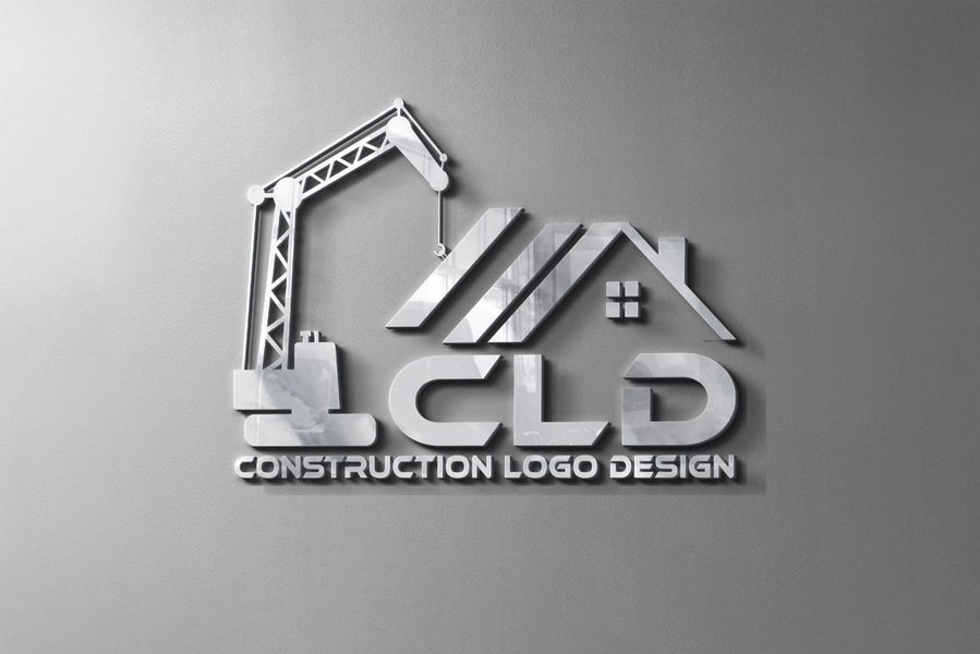 A more detailed logo integrating construction elements with a modern aesthetic.
Concept 1: The Apex of Progress
This design could feature a stylized upward-pointing arrow or a minimalist skyscraper outline, seamlessly integrated with a subtle numerical "100" within its structure. The "100" could form part of the building's base or be subtly incorporated into the negative space. The overall shape could be contained within a strong, geometric shield or circular emblem, symbolizing unity and leadership. The color palette would lean towards sophisticated blues and silvers, with a touch of gold for emphasis.
Concept 2: Interconnected Foundation
Here, the logo emphasizes collaboration and strength. Imagine several interlocking or converging geometric shapes, representing different facets of the construction industry coming together. These shapes could subtly form the number "100" in their arrangement. The entire motif could sit on a strong, solid base, symbolizing a firm foundation. Colors would be more grounded, perhaps a combination of deep greys, earthy browns, and a professional green to suggest sustainability and growth.
The logo of the U.S. Green Building Council, demonstrating a clean, impactful design with symbolic elements.Concept 3: The C-100 Mark
This approach focuses on a strong, memorable monogram. A stylized "C" could be designed with architectural lines, and the "100" could be integrated within or around it as a distinct mark. The "C" could evoke a bridge, a structural beam, or even a blueprint symbol. This concept aims for simplicity and instant recognition, suitable for small applications. A bold, singular color (e.g., a deep professional blue or charcoal) with an accent color could be effective.
Evaluating Logo Effectiveness: A Radar Chart Analysis
To assess the potential effectiveness of various logo concepts for the "Construction Council of 100," we can use a radar chart to compare them across key design criteria. This helps visualize strengths and weaknesses, guiding the selection process.
The radar chart illustrates the perceived strengths of each conceptual direction. "The Apex of Progress" excels in its direct relevance to construction and overall professionalism. "Interconnected Foundation" scores highly on symbolizing collaboration and relevance to a council structure. "The C-100 Mark" shines in memorability, scalability, and modernity due to its streamlined nature. This visualization helps in making an informed decision, showing how different design choices emphasize different attributes.
Considerations for a "Construction Council of 100" Logo
When developing the logo, consider these practical aspects:
| Aspect | Description | Importance for "Construction Council of 100" |
|---|---|---|
| Simplicity | A clean, uncluttered design is easier to recognize and remember. | Crucial for professional recognition and versatility across various mediums. |
| Memorability | The logo should be distinct enough to be easily recalled. | Essential for establishing a strong brand identity among industry leaders and stakeholders. |
| Timelessness | Avoid trendy elements that might quickly become outdated. | Ensures the logo remains relevant and respected for years, reflecting the long-term vision of a council. |
| Appropriateness | The design should align with the industry and the council's serious purpose. | Vital to convey credibility and authority within the construction sector. |
| Versatility | Functions well in different sizes, colors, and applications (digital, print, embroidery). | Necessary for consistent branding on websites, reports, merchandise, and event materials. |
| Target Audience | Appeals to industry professionals, policymakers, and potential members. | The logo must resonate with a sophisticated and informed audience. |
This table highlights the critical factors that contribute to a successful and impactful logo for a high-level organization like the "Construction Council of 100."
Looking at Existing "Council" and "100" Logos
Examining existing logos from various "councils" and "100" organizations can provide inspiration, though direct copying should be avoided. For instance, the Construction Industry Council (CIC) logos often feature strong, architectural lines or abstract representations of building blocks. Organizations like the Florida Council of 100 use clean, corporate aesthetics. Many "100" related logos, especially those focused on numerical significance, often integrate the number prominently or abstractly into the design, such as in the "100 buildings certified under ZCB-Standards" initiative by the Canada Green Building Council.
This video from LexisNexis Legal Glossary explains the legal definition of the "Construction Industry Council," providing context on the type of professional body your logo represents.The video above provides a concise legal definition of the Construction Industry Council, which gives a foundational understanding of similar entities. This organizational context is important because it dictates the level of formality and professionalism that the logo for a "Construction Council of 100" needs to convey. The logo should align with the gravitas and authoritative nature of such a significant industry body, ensuring it is perceived as credible and influential, similar to how the CIC is viewed within the UK construction sector.
Frequently Asked Questions (FAQ)
What is the ideal style for a "Construction Council of 100" logo?
Should the number "100" be explicitly visible in the logo?
What colors are best for a construction industry logo?
How important is versatility for a logo like this?
Conclusion
Creating a logo for the "Construction Council of 100" is an opportunity to forge a powerful visual identity that encapsulates leadership, collaboration, and progress within the construction industry. The design should be a thoughtful blend of symbolic elements representing construction, the unity of a council, and the significance of "100," whether it denotes exclusivity, comprehensiveness, or excellence. By adhering to principles of professionalism, memorability, and versatility, the resulting logo will serve as a strong, enduring emblem for your esteemed organization, resonating with industry professionals and stakeholders alike. It will be a mark that not only identifies but also inspires confidence and reflects the council's commitment to shaping a better built environment.
Recommended Further Exploration
- What are the best practices for designing logos for industry associations?
- How can the number 100 be symbolically represented in organizational branding?
- What are the current trends in branding and visual identity for the construction industry?
- What is the psychology of colors and their impact on corporate logos?