
City of the Hills Dental Logo Design
Modern, Minimalist, and Memorable Dental Brand Identity
Highlights
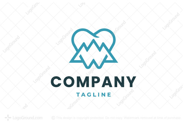
- Clean Molar with Integrated Hills: A simple molar tooth where hills or mountains form part of its structure represents natural aesthetics and modern minimalism.
- Balanced Color Palette: A refined combination of cool blues, crisp whites, and subtle neutrals conveys trust, cleanliness, and professionalism.
- Versatile Application: A design that scales beautifully and adapts seamlessly across digital media, signage, and print.
Design Concept Overview
The "City of the Hills Dental" logo concept is designed around the central idea of integrating a stylized molar tooth with a natural landscape element – hills or mountains. This design not only symbolizes dental care but also nods to the geographical or scenic inspiration behind the name. The objective is to craft a logo that is modern, minimalistic, and clearly reflective of the practice’s identity.
Design Elements
Tooth Silhouette
At the heart of the design is a simplified, geometric molar tooth. The focus on a clean, crisp outline ensures the tooth remains instantly recognizable even at smaller sizes. By stripping away intricate details, the design embraces a minimalist approach which is essential for maintaining clarity across various branding applications.
Integrated Hills and Mountains
To represent the "hills" element in the practice's name, the design features gently curved lines and angular peaks integrated within the tooth shape. These lines can be subtly incorporated using either solid fill differences or as negative space. The depiction of the terrain should evoke natural rolling hills or a series of mountain peaks, visually merging with the tooth outline to create a unique, hybrid icon.
Color Palette and Typography
Choosing the right color scheme is fundamental in setting the appropriate tone. The logo typically uses a palette that conveys both cleanliness and professionalism. A crisp white base serves as the primary tooth color, while accents in calming blues (or greens) are used for the hills/mountains. This combination reflects both health and natural serenity.
The typography pairs a modern, sans-serif font with the logo icon. Fonts like Open Sans, Montserrat, or similar typefaces can be used. They are legible, modern, and the subtle curves in their design complement the naturally inspired elements of the logo.
Design Rationale
Simplicity and Modernity in Design
Modern logo design emphasizes simplicity and adaptability. By focusing on a minimalist molar tooth design combined with discreet mountain or hill elements, the logo becomes versatile and timeless. Simplicity in design helps cater to the increasingly digital landscape where logos must be recognizable on smartphones, tablets, and various print media.
Functional adaptability is a key requirement for any modern logo. The design should be effective on multiple backgrounds, in both large and small formats. This versatility enables consistent branding across business cards, letterheads, signage, promotional materials, and even social media avatars.
Symbolism and Brand Connection
The unique integration of hills/mountains into the dental molar encapsulates the identity of "City of the Hills Dental," linking nature with the precise and caring world of dental health. The hills symbolize a natural, reliable foundation; they are both nurturing and protective, mirroring the qualities one seeks in dental care. The rounded curves along the tooth denote warmth and approachability, inviting potential patients to associate the practice with comfort and trust.
This dual imagery – merging the health-centric symbol of a tooth with natural landscape elements – creates a memorable brand mark. It effectively communicates that the practice values modernity without losing sight of its unique local character.
Technical Execution and Versatility
Scalability and Simplicity
A significant consideration in creating a successful logo is ensuring its scalability. The design must remain legible and impactful when resized for different uses, such as on clinic signage, digital platforms, or printed promotional materials. The minimalist design allows the logo to be easily adapted without losing its essence.
Table: Logo Color Palette and Typography
| Component | Details | Purpose |
|---|---|---|
| Molar Tooth | Crisp white (#FFFFFF) with clean, geometric lines | Represents dental care; focus on simplicity |
| Hills/Mountains | Accents in light blue (#87CEEB) or green shades | Evokes natural landscapes, trust, and calm |
| Typography | Modern sans-serif (e.g., Open Sans, Montserrat) | Ensures legibility and modern appeal |
| Additional Elements | Optional tagline such as "Elevating Smiles" | Enhances brand message and identity |
Digital Tools and Resources
To bring this concept from idea to reality, designers can use professional tools such as Adobe Illustrator or online logo generators. These digital tools offer precision in drafting the shape and integrating the design elements seamlessly. Many of these platforms also facilitate testing the logo across various mockups, ensuring that the final design retains its quality whether used on digital or physical media.
For those less experienced in graphic design, leveraging platforms with AI-powered logo design capabilities can help create variations until the perfect match is found. Tools that allow for easy modification of colors, typography, and layout can be especially beneficial during the iterative design process.
Application and Flexibility
Brand Integration
A robust logo design must have cohesive integration with the overall brand strategy. This involves ensuring consistency with the values and visual identity of the practice. For "City of the Hills Dental," the logo is not just an isolated symbol; it becomes the visual ambassador for all communications. The integrated image of the tooth with natural hills reinforces a narrative of quality care that is both advanced and grounded in local character.
In addition to physical signage, the logo’s appearance on online platforms, including websites, social media profiles, and mobile apps, is crucial. A well-executed logo can bolster digital marketing efforts, help build trust with prospective patients, and stand out in crowded marketplaces.
Alternative Layouts and Usage
Versatility in logo usage is key to a consistent brand identity. The design should include variations for different contexts:
- Primary Logo: The full logo featuring the integrated tooth and landscape elements along with the "City of the Hills Dental" text.
- Icon Version: A simplified version focusing solely on the tooth with the integrated hills, serving well as a mobile icon or a social media avatar.
- Black and White Variation: For use on merchandise or documents where color printing is not an option, this version maintains recognizability and impact.
This flexibility allows the practice to maintain a strong visual identity regardless of the medium, ensuring brand recognition even with scaled-down or monochrome representations.
Step-by-Step Guide to Your Logo Design
1. Brainstorm and Sketch
Start by sketching basic concepts. Outline a molar tooth using simple geometric shapes. Experiment with various ways of integrating hills or mountain silhouettes into the tooth. Consider both filling the negative space with gentle curves or drawing the hills as a part of the tooth's structural lines.
2. Choose a Color Scheme
Select a primary white or neutral background for the tooth. Pick accent colors like cool blues or soft greens that represent both health and nature. Use digital applications to try different combinations, ensuring that the colors look clean and professional.
3. Experiment with Typography
Evaluate different modern sans-serif fonts and align them with the emblem. The practice name should be clear yet complementary to the icon. Test multiple placements—next to, below, or even contouring around the icon—to see what best enhances the logo.
4. Refine and Adapt
Once an initial design is in place, refine the details. Make sure that the hill or mountain elements are seamlessly integrated into the tooth and do not overpower the dental symbol. Test the design in various sizes and formats to ensure scalability. Ask for feedback from peers or focus groups to confirm that the concept resonates with the intended audience.
5. Finalize and Export
With thorough testing and refinements complete, finalize your logo design. Export the logo in various digital formats (such as SVG, PNG, and JPEG) for different use cases. Prepare versions with full color, monochrome, and minimal elements to ensure consistency and flexibility.
Practical Considerations and Future Applications
Marketing Material and Digital Presence
Keeping a consistent visual identity across all platforms is key. Once the logo is finalized, apply it to various marketing collateral such as business cards, letterheads, appointment cards, and digital banners. This ensures a unified brand image that patients recognize and trust.
Additionally, the digital version of the logo should be used on the practice’s official website, social media pages, and app icons. Ensuring that the logo maintains its clarity across all digital devices will further reinforce brand recognition.
Expanding the Visual Identity
As the brand grows, the logo might evolve into a broader visual identity system. Consider complementary visual elements such as a custom color scheme for office interiors, marketing templates, and social media graphics. Incorporating similar design aesthetics throughout these elements can help in building a cohesive brand narrative around "City of the Hills Dental."
References
- Dental Logo Design Inspiration - Looka
- Tooth Logo Concepts - 99designs
- Dental Logo Ideas - DesignCrowd
- Dental Mountain Vector Images - VectorStock
- Mountain-Tooth Logo Concepts - Dribbble
Recommended Related Queries
Last updated March 5, 2025