
Unlock the Full Potential of Elementor's Text Editor Widget: A Deep Dive into Settings
Master content input, styling, layout, and advanced options for perfect text presentation on your WordPress site.
Highlights
- Comprehensive Control: Explore the Content, Style, and Advanced tabs for granular control over text appearance and behavior.
- Rich Customization: Leverage detailed typography settings, color options, drop caps, columns, and text shadows for unique designs.
- Beyond the Basics: Understand related widgets like Heading and Text Path, and the power of global settings for site-wide consistency.
The Elementor Text Editor widget is a fundamental building block for creating content-rich websites using the Elementor page builder in WordPress. Functioning much like the classic WordPress visual editor (TinyMCE WYSIWYG), it offers a familiar interface but integrates seamlessly into Elementor's drag-and-drop workflow, augmented by powerful styling and layout capabilities. Understanding its settings is key to effectively managing textual content, from simple paragraphs to intricately styled sections.
Anatomy of the Text Editor Widget: Content, Style, and Advanced Tabs
Like most Elementor widgets, the Text Editor's settings are neatly organized into three main tabs in the left-hand panel: Content, Style, and Advanced. Let's explore the specific controls within each.
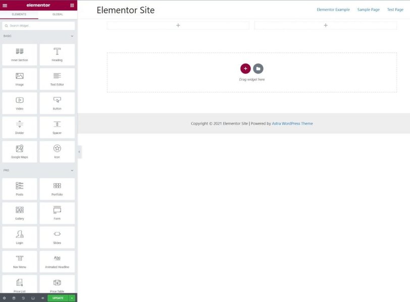
The typical Elementor editor interface showing the widget panel on the left and the live preview canvas on the right.
The Content Tab: Your Text's Foundation
This tab is your starting point for adding and structuring your text.
Rich Text Editor
Here, you input your main text content. This area provides standard word-processing tools:
- Type or paste text directly.
- Apply basic formatting like bold, italics, and underlining.
- Create bulleted or numbered lists.
- Insert hyperlinks to internal or external pages.
- Embed images directly within your text flow.
- Utilize WordPress shortcodes for added functionality.
Drop Cap
Enable the "Drop Cap" option to automatically style the first letter of your paragraph, making it larger and visually distinct. This adds a classic typographical flourish often seen in articles and blog posts. When enabled, you gain access to specific styling options for the drop cap itself:
- View Style: Choose between Default, Stacked (letter has a solid background shape), or Framed (letter has an outline).
- Primary Color: Set the color of the drop cap letter (and its background/frame if using Stacked/Framed).
- Text Shadow: Apply a shadow effect to the drop cap.
- Space: Adjust the spacing between the drop cap and the rest of the text.
Columns & Layout
For better readability or creative layouts, especially on wider screens, you can split the text within a single Text Editor widget into multiple columns.
- Columns: Select the desired number of columns (e.g., 2, 3).
- Column Gap: Use the slider to adjust the amount of space between the columns.
The Style Tab: Visual Customization Hub
The Style tab provides extensive options to control the visual presentation of your text, ensuring it aligns perfectly with your site's design language.
Typography Controls
This is arguably the most critical section for text styling. You have fine-grained control over various font properties:
- Font Family: Choose from a vast library of Google Fonts, system fonts, or fonts defined in your Elementor Site Settings.
- Font Size: Set the text size using pixels (px), em, or rem units. You can set different sizes for desktop, tablet, and mobile devices.
- Font Weight: Select the thickness of the font (e.g., Light, Normal, Bold, or specific numerical weights if the font supports them).
- Transform: Change the text case (Uppercase, Lowercase, Capitalize, Normal).
- Style: Apply Normal, Italic, or Oblique styles.
- Decoration: Add Underline, Overline, Line-Through, or None.
- Line Height: Adjust the vertical space between lines of text for optimal readability.
- Letter Spacing: Control the horizontal space between characters.
Color & Shadow
- Text Color: Choose a solid color for your text using the color picker or by entering a hex code. You can often set different colors for hover states on links within the text.
- Text Shadow: Add depth or emphasis to your text by applying a shadow. You can control the shadow's color, blurriness, and horizontal/vertical offset.
Alignment
Set the horizontal alignment of your text: Left, Center, Right, or Justified. Importantly, you can set different alignments for desktop, tablet, and mobile views to optimize readability across all devices.
The Advanced Tab: Fine-Tuning & Beyond
The Advanced tab offers settings common across most Elementor widgets, allowing for adjustments beyond basic content and styling.
Spacing Controls
- Margin: Controls the space *outside* the Text Editor widget border, pushing other elements away.
- Padding: Controls the space *inside* the Text Editor widget border, between the border and the text itself.
Both margin and padding can be set individually for top, right, bottom, and left, and can be adjusted per device.
Motion Effects
Add entrance animations (like fade-in, slide-in) or scrolling effects (like parallax movement) to make the text widget more dynamic as users interact with the page.
Responsive Design
Control the widget's visibility on different devices. You can choose to hide the Text Editor widget entirely on desktop, tablet, or mobile, which is useful for creating device-specific layouts.
Custom CSS (Elementor Pro)
If you have Elementor Pro, you can add custom CSS classes or IDs to the widget, or even write custom CSS rules directly within the Advanced tab to achieve unique styling effects not available through the standard controls.
Leveraging Global Settings for Consistency
While you can customize typography and colors within each Text Editor widget, it's often more efficient and ensures better design consistency to define global fonts and colors via Elementor's Site Settings (accessible through the hamburger menu in the editor). Widgets will inherit these global styles by default, but you always retain the option to override them on a per-widget basis if needed.
Visualizing Elementor Text Widget Settings
This mindmap provides a hierarchical overview of the settings available within the Elementor Text Editor widget, breaking them down by tab (Content, Style, Advanced) and specific control.
(Input, Format, Lists, Links, Media, Shortcodes)"] id1b["Drop Cap"] id1b1["Enable/Disable"] id1b2["View Style (Default, Stacked, Framed)"] id1b3["Primary Color"] id1b4["Text Shadow"] id1b5["Spacing"] id1c["Columns"] id1c1["Number of Columns"] id1c2["Column Gap"] id2["Style Tab"] id2a["Alignment (L/C/R/J)"] id2b["Text Color"] id2c["Typography"] id2c1["Font Family"] id2c2["Font Size (px, em, rem)"] id2c3["Font Weight"] id2c4["Transform (Case)"] id2c5["Style (Italic, Oblique)"] id2c6["Decoration"] id2c7["Line Height"] id2c8["Letter Spacing"] id2d["Text Shadow"] id2d1["Color"] id2d2["Blur"] id2d3["Horizontal Offset"] id2d4["Vertical Offset"] id3["Advanced Tab"] id3a["Layout"] id3a1["Margin"] id3a2["Padding"] id3a3["Width, Position, Z-Index"] id3b["Motion Effects"] id3b1["Entrance Animation"] id3b2["Scrolling Effects"] id3c["Background"] id3d["Border"] id3e["Mask"] id3f["Responsive"] id3f1["Visibility (Hide on Desktop/Tablet/Mobile)"] id3f2["Device-Specific Styles"] id3g["Attributes"] id3h["Custom CSS (Pro)"]
Text Widget Customization Depth Comparison
While the Text Editor widget is versatile, Elementor offers other widgets focused on text. This radar chart conceptually compares the customization depth of common text-related widgets across key areas. Higher scores indicate more specialized or extensive options in that category.
This chart helps illustrate that while the Text Editor is a strong all-rounder, widgets like the Heading widget offer deeper typography/styling specifically for titles, and addon widgets provide specialized capabilities like animation or text-on-a-path functionality.
Beyond the Basics: Related Text Widgets & Addons
Elementor provides other widgets for specific text needs, and third-party addons often extend these capabilities further.
Standard Elementor Text Widgets
- Heading Widget: Designed specifically for page titles and section headings (H1-H6 tags). Offers similar typography and styling options but often includes more focused controls for things like size, stroke, or blend modes, and integrates semantic heading tags.
- Text Path Widget: Allows you to type text that follows a predefined shape (like a circle or wave) or a custom SVG path. You can control the path, text alignment along the path, and standard typography/color settings.
Advanced Text Widgets (Often via Addons)
Many third-party addon packs for Elementor (like Premium Addons, The Plus Addons, HappyAddons, etc.) include enhanced text widgets:
- Animated Text Widget: Creates eye-catching effects like typing text, rotating words, or fading phrases. Settings typically control the animation type, speed, delay, looping, and styling for different parts of the animation.
- Advanced Text Block Widget: May offer features beyond the standard Text Editor, such as options to limit text by character or word count, add a "read more" toggle, or apply unique hover effects or entrance animations.
- Text Marquee / Ticker: Creates scrolling text effects, often used for announcements or displaying dynamic information.
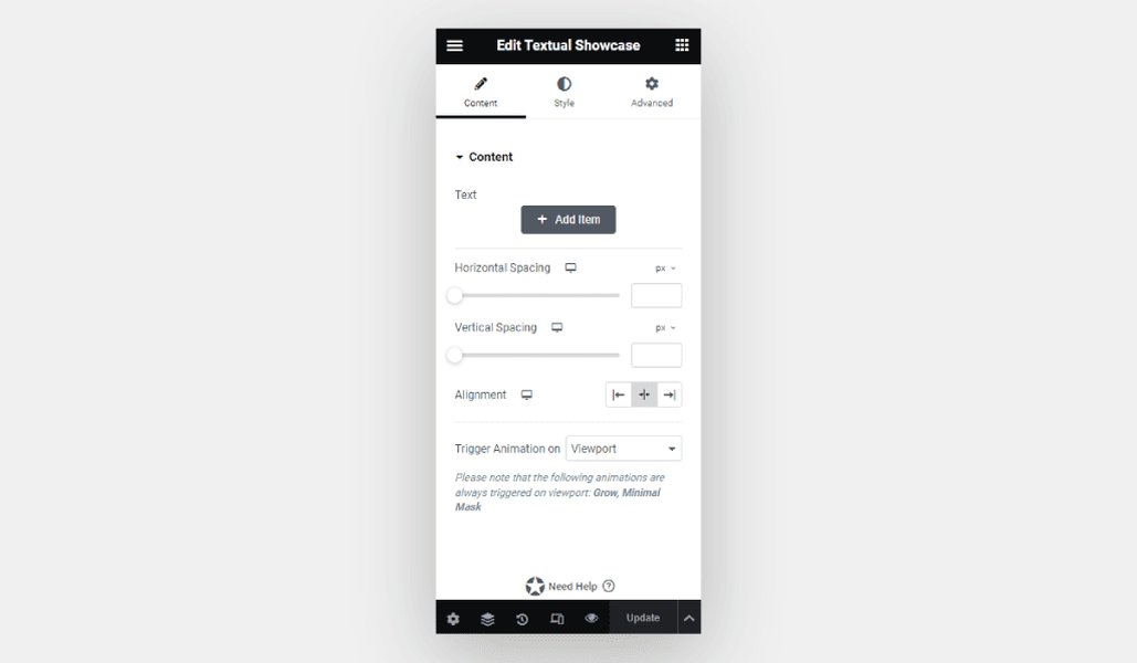
Example interface for an advanced text widget from a third-party addon, showing additional styling options.
Key Settings Overview Table
This table summarizes the primary functions controlled within each main tab of the standard Elementor Text Editor widget.
| Tab | Primary Focus | Key Settings Examples |
|---|---|---|
| Content | Inputting and Structuring Text | Rich Text Editor (text, lists, links, media, shortcodes), Drop Cap, Columns, Column Gap |
| Style | Visual Appearance | Alignment, Text Color, Typography (Font Family, Size, Weight, Transform, Style, Decoration, Line Height, Letter Spacing), Text Shadow |
| Advanced | Layout, Effects, Responsiveness, Customization | Margin, Padding, Motion Effects (Animations), Background, Border, Responsive Controls (Visibility, Device-Specific Styles), Custom CSS (Pro) |
Watch & Learn: Using the Text Editor Widget
This official Elementor tutorial provides a visual walkthrough of how to add, configure, and style the Text Editor widget. It covers the core functionalities found in the Content and Style tabs, offering a practical demonstration of the settings discussed above.
Best Practices for Using Text Widgets
- Break Up Content: Instead of placing large amounts of text in a single widget, use multiple Text Editor widgets for different paragraphs or sections. This makes styling and rearranging content easier.
- Prioritize Global Styles: Define your primary fonts and colors in Elementor's Site Settings for consistency. Only override styles at the widget level when necessary for specific emphasis or design variation.
- Check Responsiveness: Always preview your page on tablet and mobile views. Adjust font sizes, line heights, and alignment as needed to ensure text remains readable and well-formatted on all screen sizes.
- Use Semantic Headings: For titles and subheadings, use the Heading widget with appropriate H1-H6 tags for better SEO and accessibility, rather than just styling text larger in the Text Editor widget.
Frequently Asked Questions (FAQ)
What's the main difference between the Text Editor and Heading widgets?
Can I use custom HTML within the Text Editor widget?
How do I apply styles set in Elementor's Site Settings?
How can I make my text look good on mobile devices?
Recommended
- Discover how to streamline your design process using Elementor's global fonts and colors.
- Explore the specific differences and use cases for the Elementor Heading widget compared to the Text Editor.
- Learn advanced techniques for styling text in Elementor, including custom CSS and motion effects.
- Find out which Elementor addons offer the most powerful widgets for creating animated and unique text effects.
References
Last updated May 6, 2025