
Unlock Market Insights: Scaling Your Excel Data for Powerful Pattern Discovery
Transform raw market numbers into clear trends and actionable insights using Excel's scaling and visualization tools.
Understanding how to effectively "scale" an Excel sheet in the context of market analysis involves more than just adjusting print layouts. It primarily focuses on transforming your numerical data to make comparisons meaningful and then using powerful visualization techniques to uncover hidden patterns, trends, and outliers within your market information. This comprehensive approach allows you to leverage your data fully, turning complex datasets into clear, actionable insights for strategic decision-making.
Highlights: Key Takeaways for Market Analysis in Excel
- Data Scaling is Crucial: Normalizing or standardizing market data (like sales, prices, or customer metrics) using techniques like Min-Max scaling or Z-score normalization brings diverse datasets onto a common scale, enabling accurate comparisons and pattern identification.
- Conditional Formatting Reveals Patterns: Utilize Excel's Conditional Formatting (heat maps, data bars, icon sets, custom rules) to visually highlight significant trends, outliers, peaks, and dips in your scaled market data instantly.
- Combine Techniques for Deeper Insights: Integrate data scaling with powerful tools like PivotTables, charts with trendlines, and moving averages to summarize, visualize, and analyze market patterns from multiple angles for a comprehensive understanding.
Step 1: Preparing Your Market Data Foundation
Clean, Organize, and Structure for Success
Before you can effectively scale data or highlight patterns, your raw market data needs careful preparation. A clean, well-structured dataset is the bedrock of reliable analysis.
Data Cleaning and Consistency
Ensure your data is accurate and usable. This involves:
- Removing Duplicates: Eliminate redundant entries that could skew analysis.
- Handling Missing Values: Decide how to address gaps – remove rows, fill with averages, or use more sophisticated imputation methods.
- Ensuring Consistency: Standardize formats for dates, currencies, and categories (e.g., 'USA' vs. 'United States').
Structuring with Excel Tables
Convert your raw data range into an Excel Table (Insert > Table). This offers significant advantages:
- Dynamic Ranges: Tables automatically expand to include new data, ensuring formulas and charts stay updated.
- Easy Sorting & Filtering: Built-in controls allow quick exploration of data subsets.
- Structured Referencing: Use meaningful column names in formulas (e.g.,
=AVERAGE(SalesTable[Revenue])) instead of cell ranges.
Organizing your dataset, perhaps chronologically for time-series analysis or by region for geographical comparisons, sets the stage for effective scaling and pattern discovery.
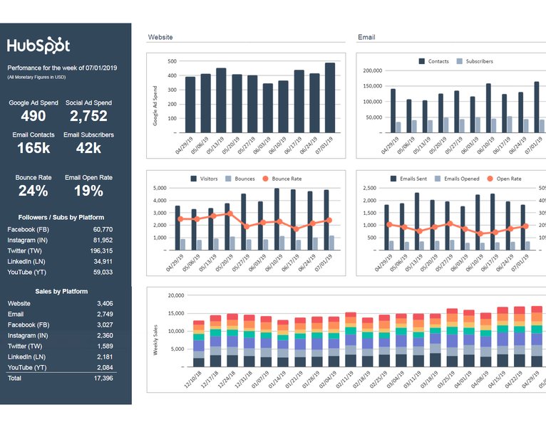
A well-organized marketing dashboard in Excel.
Step 2: Scaling Market Data for Meaningful Comparisons
Why and How to Normalize Your Numbers
Market data often involves metrics with vastly different scales (e.g., website visits in millions vs. conversion rate in percentages). Comparing or combining these directly can be misleading. Scaling (also known as normalization or standardization) transforms data onto a common scale, making comparisons valid and improving the performance of certain analytical techniques.
Common Data Scaling Methods
Min-Max Scaling
Rescales data to a fixed range, typically 0 to 1. This is useful when you need data bounded within specific limits.
The formula is:
\[ X_{\text{scaled}} = \frac{X - X_{\min}}{X_{\max} - X_{\min}} \]Where \(X\) is the original value, \(X_{\min}\) is the minimum value in the dataset, and \(X_{\max}\) is the maximum value. In Excel, assuming your data is in column A (A1:A100), the formula in a new column for cell A1 would be:
=(A1-MIN($A$1:$A$100))/(MAX($A$1:$A$100)-MIN($A$1:$A$100))Z-Score Standardization
Transforms data to have a mean of 0 and a standard deviation of 1. This is particularly useful when your data follows a roughly normal (bell-shaped) distribution and for algorithms sensitive to feature scaling.
The formula is:
\[ Z = \frac{X - \mu}{\sigma} \]Where \(X\) is the original value, \(\mu\) is the mean of the dataset, and \(\sigma\) is the standard deviation. In Excel, you can calculate this directly or use the built-in function:
=STANDARDIZE(A1, AVERAGE($A$1:$A$100), STDEV.P($A$1:$A$100))(Use STDEV.S if your data represents a sample, STDEV.P if it's the entire population).
Simple Factor Scaling (Paste Special)
For quick adjustments, like converting units or applying a constant multiplier/divider:
- Enter the scaling factor (e.g., 1.1 for a 10% increase, or 1000 to scale by thousands) into a blank cell.
- Copy that cell.
- Select the data range you want to scale.
- Right-click, choose "Paste Special".
- Under "Operation", select "Multiply" or "Divide". Click OK.
Choosing the right scaling method depends on your specific data and analysis goals.
Step 3: Highlighting Market Patterns with Visual Tools
Making Trends and Outliers Leap Off the Page
Once data is prepared and potentially scaled, Excel offers powerful tools to visually identify patterns, trends, correlations, and anomalies within your market data.
Conditional Formatting: Your Pattern Spotlight
This feature automatically changes cell appearance (colors, icons, bars) based on rules you define, making it incredibly effective for spotting patterns at a glance.
- Color Scales (Heat Maps): Apply color gradients across a range of cells to show relative magnitude. Excellent for identifying hotspots or cold spots in market performance (e.g., high sales in green, low in red).
- Data Bars: Add bars directly within cells, proportional to the cell's value. Useful for quickly comparing magnitudes within a column (e.g., market share percentages).
- Icon Sets: Use symbols like arrows (up, down, sideways) or traffic lights to indicate trends, performance against targets, or status categories.
- Highlight Rules: Apply formatting to cells that meet specific criteria (e.g., greater than average, top 10%, values containing specific text).
- Formula-Based Rules: Create custom rules using Excel formulas for complex conditions (e.g., highlight sales figures that are both above average and occurred in Q4).
To apply, select your data, go to the Home tab, click Conditional Formatting, and choose the desired option or create a New Rule.
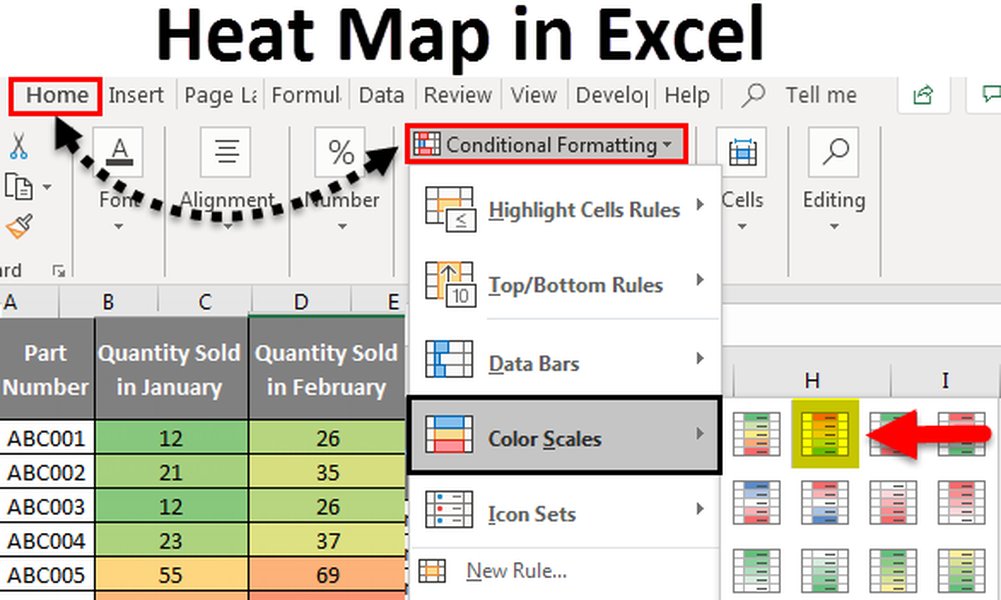
Example of a Heat Map created using Conditional Formatting in Excel.
Charts and Trendlines: Visualizing Trajectories
Charts translate numbers into visual narratives.
- Line Charts: Ideal for tracking market trends over time (e.g., stock prices, monthly website traffic).
- Bar/Column Charts: Good for comparing discrete categories (e.g., sales by region, market share by competitor).
- Scatter Plots: Useful for examining relationships between two variables (e.g., advertising spend vs. sales).
- Trendlines: Add to charts (especially line and scatter) to visualize the overall direction or trajectory of the data, helping to identify linear or non-linear trends.
- Moving Averages: Calculate and plot moving averages (e.g., using the
AVERAGEfunction on a rolling basis) to smooth out short-term fluctuations and reveal underlying long-term trends.
PivotTables: Summarizing and Slicing Data
PivotTables are indispensable for summarizing large market datasets. You can quickly group data by different dimensions (time periods, products, regions) and calculate aggregates (sums, averages, counts). Applying conditional formatting directly within a PivotTable can highlight patterns within these summaries.
Analyze Data Feature (Newer Excel Versions)
Located on the Home tab, the "Analyze Data" (formerly "Ideas") feature uses AI to automatically suggest interesting patterns, charts, and PivotTable summaries based on your selected data, providing quick insights with minimal effort.
Process Overview: From Raw Data to Market Insights
A Mindmap of the Workflow
This mindmap illustrates the typical workflow for scaling data and highlighting market patterns in Excel, starting from initial data collection through to analysis and insight generation.
(Remove errors, duplicates)"] id1b["Handle Missing Values"] id1c["Structure Data
(Use Excel Tables)"] id1d["Sort & Filter"] id2["2. Data Scaling (Normalization/Standardization)"] id2a["Choose Method
(Min-Max, Z-Score, etc.)"] id2b["Apply Scaling Formulas"] id2c["Verify Scaled Data"] id3["3. Pattern Highlighting & Visualization"] id3a["Conditional Formatting
(Heatmaps, Icons, Rules)"] id3b["Charting
(Line, Bar, Scatter)"] id3c["Trendlines & Moving Averages"] id3d["PivotTables & PivotCharts"] id3e["Analyze Data Feature (AI)"] id4["4. Analysis & Interpretation"] id4a["Identify Trends & Cycles"] id4b["Spot Outliers & Anomalies"] id4c["Compare Segments"] id4d["Derive Actionable Insights"] id4e["Report Findings"]
Following these steps systematically allows you to transform potentially overwhelming market data into a clear picture of trends and performance.
Comparing Excel Techniques for Market Pattern Analysis
Effectiveness Radar Chart
Different Excel features excel in various aspects of market data analysis. This radar chart provides an opinionated comparison of key techniques based on criteria like pattern identification, data comparability enhancement, ease of use, visual impact, and suitability for large datasets. Higher scores indicate greater effectiveness in that specific area.
As the chart suggests, Conditional Formatting offers high visual impact and is relatively easy to use for pattern spotting, while Data Scaling is paramount for enhancing comparability. PivotTables excel at handling large datasets, and newer AI features offer ease of use for initial pattern discovery. Combining these techniques provides the most robust approach.
Summary of Data Scaling Techniques
Choosing the Right Method
Here's a quick reference table summarizing the common data scaling techniques discussed:
| Scaling Method | Purpose | When to Use | Excel Implementation |
|---|---|---|---|
| Min-Max Scaling | Rescales data to a specific range (e.g., 0 to 1). | When you need bounded values; useful for algorithms requiring specific input ranges. | Formula: =(Value - MIN(Range)) / (MAX(Range) - MIN(Range)) |
| Z-Score Standardization | Transforms data to have a mean of 0 and standard deviation of 1. | When data is approximately normally distributed; useful for comparing values based on standard deviations from the mean; common in statistical modeling. | Function: STANDARDIZE(Value, AVERAGE(Range), STDEV.P(Range)) |
| Simple Factor Scaling | Multiply or divide all data points by a constant factor. | Quick unit conversions (e.g., dollars to thousands); applying a uniform percentage change. | Paste Special > Multiply/Divide operation. |
| Decimal Scaling | Moves the decimal point of values. | Simple scaling by powers of 10. Less common in complex analysis but can simplify large numbers. | Divide values by 10, 100, 1000 etc. using a formula or Paste Special. |
Selecting the appropriate scaling method is key to ensuring your subsequent pattern analysis is accurate and insightful.
Video Guide: Normalizing and Standardizing Data
Visual Step-by-Step Instructions
For a visual walkthrough of how to apply normalization (like Min-Max scaling) and standardization (Z-score) techniques in Excel, the following video provides clear instructions. Understanding these techniques is fundamental to preparing your market data for effective comparison and pattern analysis.
This video covers the core concepts and demonstrates the practical application of these scaling methods using Excel formulas, aligning well with the techniques discussed earlier for preparing market data.
Frequently Asked Questions (FAQ)
Common Queries About Excel Market Analysis
Recommended Further Exploration
Dive Deeper into Market Analysis with Excel
- How can I use Excel PivotTables for advanced market segmentation analysis?
- What are the best practices for creating interactive market dashboards in Excel?
- How can I perform trend analysis and forecasting in Excel using market data?
- Explore advanced conditional formatting rules with formulas for complex market pattern detection in Excel.
References
Sources Used for This Analysis

Last updated May 4, 2025