
Outlook's Responsive Riddle: Why Your HTML Emails Break and How to Fix Them
Unlock the secrets to making your responsive HTML emails display flawlessly on mobile, even when sent from the notorious Outlook.
It's a common frustration for email marketers and developers: a perfectly crafted responsive HTML email looks great on mobile when sent from an email client like Thunderbird, but falls apart when the exact same code is sent via Microsoft Outlook. This guide will delve into why this happens and provide a comprehensive set of solutions to ensure your emails maintain their responsiveness across all platforms, particularly conquering Outlook's unique challenges.
Key Insights: Taming Outlook's Email Rendering
Essential Takeaways for Responsive Emails in Outlook
- Outlook's Word-Based Engine: Understand that Outlook (especially on Windows) uses Microsoft Word's rendering engine, which has notoriously poor support for modern HTML and CSS standards crucial for responsiveness, unlike Thunderbird which likely uses a more web-standard engine.
- CSS Limitations are Key: Outlook often ignores or misinterprets vital CSS like
max-width, media queries, and flexible box layouts (flexbox), leading to broken mobile views. Inline CSS and table-based layouts become essential. - Targeted Fixes are Necessary: Generic responsive code isn't enough. You'll need Outlook-specific techniques, such as conditional comments (
<!--[if mso]> ... <![endif]-->) and "ghost tables," to force desired layouts.
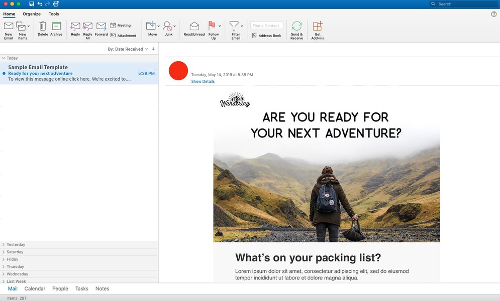
Previewing emails in Outlook is crucial due to its unique rendering.
The Root of the Problem: Why Outlook Behaves Differently
Unpacking Outlook's Rendering Quirks
The primary reason your responsive HTML email breaks when sent from Outlook, despite working perfectly from Thunderbird, lies in how Outlook processes and displays HTML content. Since Outlook 2007, the Windows desktop versions have utilized Microsoft Word as their HTML rendering engine. This engine is optimized for print document fidelity rather than modern web standards, leading to several compatibility issues:
Limited CSS Support
Word's rendering engine has poor or non-existent support for many CSS properties essential for responsive design:
- Media Queries: These are fundamental for responsive design, allowing different styles based on screen size. Outlook often ignores them, particularly
max-widthbased queries. max-widthandmin-width: Whilemin-widthsometimes fares better,max-widthon block-level elements is often disregarded, preventing containers from shrinking on smaller screens.- Flexible Layouts: CSS Flexbox and Grid, which simplify responsive layouts, are not supported.
- Background Images: CSS background images (
background-image) are often problematic, requiring VML (Vector Markup Language) workarounds for Outlook. - Advanced Selectors & Properties: Properties like
float,position(in some contexts), and complex CSS selectors may not work as expected.
HTML Alteration
Outlook's email composer can sometimes alter your HTML code before sending. It might strip out certain tags, add its own proprietary MSO (Microsoft Office) styling, or reformat the code in ways that break your intended responsive behavior. This means the HTML that arrives in the recipient's inbox might not be identical to what you pasted into Outlook.
Preference for Table-Based Layouts
Due to its Word-based engine, Outlook is much more comfortable with traditional table-based layouts. While modern web design has moved towards <div>-based structures, emails targeting Outlook often need to revert to using tables for reliable column structure and alignment.
Crafting Outlook-Proof Responsive Emails: A Step-by-Step Guide
Strategies and Techniques for Universal Compatibility
To ensure your HTML emails are responsive across all clients, including the challenging Outlook environment, you need to adopt specific coding practices and workarounds.
1. Embrace Table-Based Layouts
The Foundation of Outlook Compatibility
While divs are standard for web pages, HTML emails, especially for Outlook, benefit immensely from table-based structures for overall layout. Use tables to define columns and content blocks. For responsive stacking, ensure table cells (<td>) are set to display: block; width: 100% !important; within your mobile-specific media queries.
<!-- Example of a simple responsive table structure -->
<table role="presentation" border="0" cellpadding="0" cellspacing="0" width="100%">
  <tr>
    <td style="padding: 20px;">
      <!-- Main content wrapper table -->
      <table role="presentation" border="0" cellpadding="0" cellspacing="0" width="600" class="email-container" align="center">
        <tr>
          <td class="stack-column" style="padding: 10px; text-align: left;">
            Content Column 1
          </td>
        </tr>
        <tr>
          <td class="stack-column" style="padding: 10px; text-align: left;">
            Content Column 2
          </td>
        </tr>
      </table>
    </td>
  </tr>
</table>

<!-- In your <style> block for mobile -->
<style>
  @media screen and (max-width: 600px) {
    .email-container {
      width: 100% !important;
    }
    .stack-column {
      display: block !important;
      width: 100% !important;
    }
  }
</style>
2. Inline Your CSS
Ensuring Styles are Recognized
Outlook is notorious for stripping out CSS from <style> blocks in the <head> or ignoring linked external stylesheets. The most reliable way to apply styles in Outlook is to inline them directly onto HTML elements (e.g., <td style="padding: 10px; font-family: Arial, sans-serif;">). While tedious, many email development tools and inliner services can automate this process after you've written your CSS in a style block for development.
3. Master Conditional Comments for Outlook (MSO)
Targeting Outlook with Precision
Microsoft Office applications, including Outlook, recognize special conditional comments. These allow you to provide HTML or CSS specifically for Outlook, which other email clients will ignore.
- Ghost Tables: This is a powerful technique where you create a table structure within MSO conditional comments to control layout in Outlook, while a more fluid, div-based, or simpler table structure exists for other clients.
<!--[if mso]> <table role="presentation" border="0" cellspacing="0" cellpadding="0" align="center" width="600"> <tr> <td> <![endif]--> <div style="max-width: 600px; margin: 0 auto;"> <!-- Your content for all clients --> </div> <!--[if mso]> </td> </tr> </table> <![endif]--> - VML for Advanced Graphics: Vector Markup Language (VML) can be used within conditional comments to create elements like rounded buttons or background images that display correctly in Outlook, where CSS counterparts might fail.
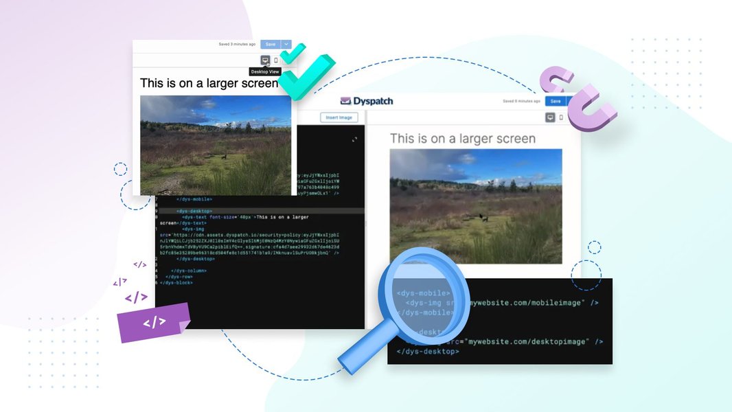
Visualizing how content adapts between desktop (Outlook) and mobile is key to hybrid design.
4. Hybrid and Spongy Email Design
Building Robust and Flexible Layouts
Hybrid (or "spongy") email design combines fixed-width elements (often for Outlook using conditional comments) with fluid, percentage-based elements for other clients. This approach doesn't rely solely on media queries. Instead, it uses techniques like setting `max-width` on containers and `align="center"` on tables to ensure the layout adapts gracefully even if media queries are stripped.
5. Smart Use of Media Queries
Making Them Work Where Possible
While Outlook's support is spotty, media queries are still crucial for other mobile clients.
- Mobile-First Approach: Design your email for mobile by default, then use
min-widthmedia queries to add styles for larger screens. This can sometimes be more robust. - Attribute Selectors: Some Outlook versions might respond better to media queries targeting attributes (e.g.,
td[class="stack-column"]). - Important! Overrides: Use
!importantjudiciously within media queries to ensure mobile styles override inlined desktop styles.
6. Image Handling
Ensuring Images are Responsive and Display Correctly
- Set
width="100%"andmax-width(e.g.,max-width: 600px;) on images via inline styles to make them fluid. Also, includeheight: auto;to maintain aspect ratio. - For Outlook, which might ignore
max-width, ensure thewidthattribute on the<img>tag is set to the image's intended display width on desktop, and control its fluidity with CSS. - Outlook sometimes adds unwanted padding around images. Use
display: block;on images to help mitigate this.
7. Font Strategies
Web Fonts vs. System Fonts
Outlook has limited support for web fonts (@font-face). Always provide fallback system fonts that are widely available (e.g., Arial, Helvetica, Times New Roman). You can declare web fonts in a <style> block and use conditional comments to provide Outlook-specific font styling if needed.
<!--[if mso]>
  <style>
    .outlook-font { font-family: Arial, sans-serif !important; }
  </style>
<![endif]-->
8. Avoid Sending Directly from Outlook's Composer
Preserving Your Code Integrity
Pasting HTML directly into Outlook's email composer window is a common way for code to get mangled. For best results:
- Use an Email Service Provider (ESP) or a dedicated email sending platform that handles HTML correctly.
- If you must use Outlook, explore plugins or add-ins designed for sending HTML emails (like ContactMonkey, or using the "Insert as Text" option for HTML files if available and handled carefully).
- Thunderbird, as you've noticed, generally preserves HTML integrity better, making it a more reliable sender for custom HTML if an ESP isn't used.
Visualizing Feature Support: Email Client Comparison
Radar Chart: CSS Feature Support in Email Clients
This radar chart provides a conceptual overview of how different email clients generally support key CSS features crucial for responsive email design. "Outlook (Windows)" refers to the desktop versions known for using Word's rendering engine. "Thunderbird/Modern Mobile" represents clients with more robust, web-standard rendering capabilities. Scores are indicative (1=Poor, 5=Excellent).
This chart illustrates why strategies targeting Outlook's strengths (like table layouts and inline CSS) and mitigating its weaknesses (like poor media query support) are crucial.
Navigating the Solution Path: A Mindmap
Visual Guide to Fixing Outlook Responsive Emails
This mindmap outlines the core problem and the key strategies involved in making your HTML emails responsive when dealing with Outlook's rendering engine.
(Media Queries, max-width)"] id1c["HTML Code Alteration"] id2["Solutions & Best Practices"] id2a["Table-Based Layouts"] id2a1["Reliable Structure"] id2a2["Stacking cells on mobile"] id2b["Inline All CSS"] id2b1["Avoids style stripping"] id2c["Conditional Comments (MSO)"] id2c1["Ghost Tables for Outlook"] id2c2["VML for Graphics"] id2d["Hybrid/Fluid Design"] id2d1["Fixed + Fluid elements"] id2e["Image Optimization"] id2e1["Fluid Images (width:100%)"] id2e2["Outlook-specific widths"] id2f["Testing Thoroughly"] id2f1["Across Outlook versions"] id2f2["Using Litmus/Email on Acid"] id2g["Careful Sending Method"] id2g1["Avoid Outlook Composer directly"] id2g2["Use ESPs or plugins"] id2h["Fallback Fonts"]
This visual breakdown helps to connect the dots between understanding the problem and implementing effective solutions for Outlook email compatibility.
Common Outlook Rendering Issues and Fixes
Quick Troubleshooting Table
Here's a table summarizing common display problems in Outlook and their typical solutions:
| Issue | Common Cause in Outlook | Recommended Fix |
|---|---|---|
| Layout breaks / columns don't stack | Ignoring media queries, max-width, or using div-based floats. |
Use table-based layouts, display:block; width:100%; on <td> in media queries, Ghost Tables with MSO conditionals. |
| Unwanted white space or lines | Outlook adding margins/padding, line-height issues, image spacing. | Set border-collapse: collapse; on tables, margin:0; padding:0; where needed, display:block; on images. Use Outlook-specific CSS (e.g., mso-line-height-rule:exactly;). |
| Images not resizing or distorted | Ignoring CSS width/max-width, fixed dimensions in HTML attributes. |
Use fluid images (style="width:100%; max-width: [max size]px; height:auto;"), ensure HTML width attribute is for desktop, test VML for background images. |
| Buttons look incorrect (no rounded corners, etc.) | Poor support for CSS border-radius, gradients. |
Use VML buttons for Outlook within conditional comments. For simpler buttons, use padded table cells with background colors. |
| Custom fonts not appearing | Limited web font support. | Declare web fonts with robust @font-face, provide web-safe fallback fonts. Use MSO conditionals to force system fonts if needed. |
| Animated GIFs not animating | Outlook desktop often shows only the first frame. | Ensure the first frame is meaningful. No universal fix for Outlook desktop; Outlook for Web and mobile may support them. |
Video Tutorial: Building Responsive HTML Emails
Visual Learning for Complex Email Code
For a deeper dive into the practical aspects of coding responsive HTML emails, including techniques that can help with Outlook compatibility, the following video provides a comprehensive tutorial. While it covers general responsive email creation, the principles of table-based layouts and careful CSS application are highly relevant for Outlook.
This video, "Build A Responsive HTML Email Template with HTML Tables," demonstrates building emails with HTML tables, a foundational skill for Outlook compatibility.
The tutorial emphasizes using HTML tables for structure, which is a cornerstone of creating emails that render predictably in Outlook. It also covers media queries for responsiveness, which, while needing Outlook-specific handling as discussed, are essential for other clients.
FAQ: Responsive Emails in Outlook
<!--[if mso]> ... <![endif]-->. They are crucial because they allow you to provide Outlook-specific HTML or CSS to fix layout issues or add features that Outlook wouldn't otherwise support, while other email clients ignore this special code.Conclusion
Tackling responsive email design for Outlook requires a specific mindset and toolkit. By understanding that Outlook's Word-based rendering engine is the primary culprit, and by diligently applying techniques such as table-based layouts, inlined CSS, conditional comments (MSO), and thorough testing, you can significantly improve the mobile viewing experience of your HTML emails, regardless of whether they are sent from Thunderbird or Outlook. While it demands extra effort, the result is a more consistent and professional communication experience for all your recipients.
Recommended Further Exploration
- What are the best tools for testing HTML email rendering in Outlook?
- How to use VML for creating responsive buttons and backgrounds in Outlook emails.
- Deep dive into hybrid email design techniques for maximum compatibility.
- Common pitfalls to avoid when coding HTML emails for Outlook 2016 and newer.