
Color Choices for General Stores Worldwide
Understanding the Diverse Palette that Attracts and Engages Customers
Key Takeaways
- Neutral and Warm Base Colors: General stores commonly adopt neutrals like white, gray, and beige combined with warm accents such as red or orange to create a welcoming and organized space.
- Psychological Influence: The chosen colors often serve psychological functions—from instilling trust with blue to stimulating appetite with red and promoting calmness with cool colors like green.
- Adaptability for Diverse Demographics: The color palette is selected not only based on aesthetic appeal but also on the target customer base and the type of products offered.
Introduction
The aesthetics of retail spaces play a crucial role in shaping the shopping experience of customers. When it comes to general stores, which serve as versatile hubs catering to a broad range of products and customers, color schemes are chosen carefully. There isn’t one universal color that every general store uses worldwide; rather, there is a well-thought-out strategy combining neutral tones with strategic accent colors. This approach helps create an environment that is both visually appealing and psychologically engaging.
Understanding the Role of Colors in Retail
Colors in retail settings have far-reaching impacts—from influencing perceived brand identity to eliciting specific customer behaviors. In a general store, the aim is to create a balanced space where environmental factors enhance the shopping experience while allowing the products to shine without visual competition. The right mix of colors can lead to positive customer perceptions, encourage longer visits, and potentially drive higher sales.
Neurological and Psychological Impact
Human psychology plays a significant role in why certain colors are preferred in retail. For example, cool colors such as blue and green evoke a sense of calm and reliability. Blue, in particular, is often associated with trust and stability, characteristics that are essential in retaining customer loyalty. Meanwhile, warm colors like red, orange, and yellow are energizing and attract attention; but when not used judiciously, they can become overwhelming. For instance, red is known to stimulate appetite and urgency, making it effective for highlighting promotional sections without dominating the overall design.
Market-Specific Considerations
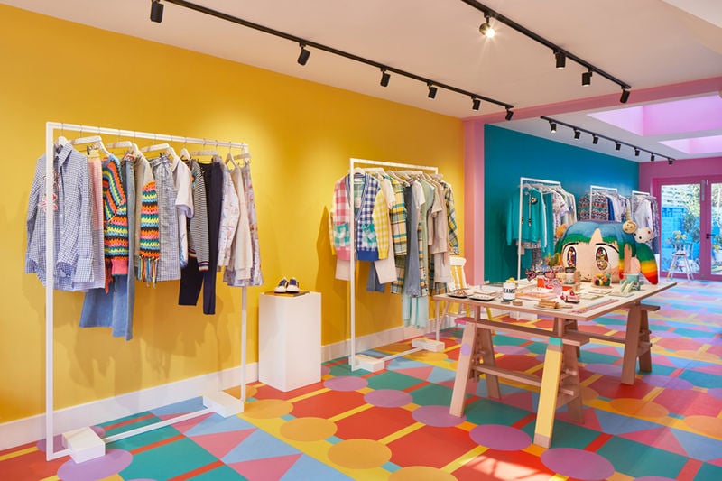
The target demographic of a general store influences its color strategy. For a store that caters to families and older demographics, more subtle houses of warm, neutral, and cool colors are favored to create a relaxed shopping experience. On the other hand, stores targeting younger, trend-sensitive audiences might incorporate more vibrant, contrasting colors to create a dynamic atmosphere. Additionally, cultural differences can affect color perception, meaning that the same color may evoke different responses depending on regional traditions or societal norms. As general stores are typically designed to appeal to a broad audience, they often settle on universally accepted shades that can be appreciated across diverse cultural backgrounds.
Core Colors Often Used in General Store Design
Let’s explore the most frequently used colors in the retail design of general stores based on psychological research, practical usability, and aesthetic trends.
Neutral Colors
White, Gray, and Beige
Neutral colors form the backbone of many retail interiors. Their importance lies in creating an environment that appears clean, spacious, and real. White, gray, and beige are commonly used because they do not overpower the merchandise. Instead, they allow products to take center stage, ensuring that the items displayed are the focus of the customer’s attention. Neutrals provide a pleasant background that can easily be paired with some bolder accent colors for a modern and sophisticated tally.
Warm Colors
Red, Orange, and Yellow
Warm colors are strategically chosen to evoke feelings of energy, warmth, and sometimes a sense of urgency. Red, when used sparingly, can be very effective in drawing attention to sales promotions, special offers, or entrance areas. It is particularly valued in sections dealing with food items because it is known to stimulate appetite. In combination with other warm tones like orange and yellow, the store atmosphere becomes inviting and dynamic, helping to generate excitement and immediate interest.
Cool Colors
Blue and Green
Blue is known for its calming effects and its associations with trust and reliability. In many retail spaces, especially those that aim to create a serene environment, blue is widely used. Similarly, green is linked to freshness, health, and balance. In general stores, green can be particularly effective in sections dealing with produce or eco-friendly products, reinforcing the message of natural and sustainable offerings. The integration of these cool hues enhances the overall ambiance and can encourage customers to spend more time inside the store.
Developing a Comprehensive Color Strategy
When planning the color strategy for a general store, several key factors are taken into consideration:
Brand Identity and Market Positioning
The chosen colors should be consistent with the store's brand identity. If a store has a long-standing history or is known for a particular style, the color palette must resonate with its established image. For instance, a vintage-themed store might lean more towards muted hues with nostalgic undertones, whereas a modern, minimalist store might opt for crisp white and cool blues to maintain a sleek look.
Spatial and Environmental Considerations
The physical layout and design of the store also dictate the feasible color combinations. A well-lit general store with a spacious layout might use a lot of neutrals to maximize light and create a perception of openness. Contrasting accent walls or elements can then be introduced to break the uniformity and guide customer movement through the space.
Target Demographics
It is essential to balance the storefront design with the tastes and preferences of the target customer base. For instance, a general store located in a region with more conservative tastes may rely heavily on neutrals and subtle shades, while a store in a trendier urban area might incorporate edgy or experimental color combinations.
Product Pool and Variety
Because general stores typically stock a wide array of products, the color scheme should not clash with the merchandise. A color strategy that uses a neutral background effectively frames the array of products, allowing customers to quickly identify what they are looking for. Accent colors can be used to differentiate product areas or to create visual markers for special promotions.
Practical Implementation of Color Schemes
To illustrate how these concepts come together in practice, consider the following table that summarizes the benefits and recommended uses of various color groups in general store design.
| Color Group | Psychological Impact | Use Cases in General Stores |
|---|---|---|
| Neutral (White, Gray, Beige) | Creates a clean, modern, and spacious feel | Background for product displays; enhances natural light; suitable for mixing with accent colors |
| Warm (Red, Orange, Yellow) | Energizing, stimulating, and attention-grabbing | Highlighting promotional areas; enhancing food sections; drawing immediate customer interest |
| Cool (Blue, Green) | Calm, trustworthy, and relaxing | Creating a serene shopping environment; ideal for sections like produce or wellness; reinforcing trust |
This table serves as a snapshot of the strategic decisions behind color usage. The goal is always to create a balanced and harmonious visual environment that subtly guides customer behavior while facilitating ease of navigation.
Case Studies and Global Trends
Looking at global trends, various general stores have demonstrated the effective application of these color principles. Many stores worldwide adapt their interior design to local cultural norms while still adhering to the core tenets of neutral backdrops punctuated with strategic warm and cool accents.
North American and European Markets
In North America and Europe, general stores tend to rely on a minimalist approach that favors neutral bases. Whites, grays, and beiges dominate most of the interior landscapes. This choice is driven by the desire to create an uncluttered atmosphere that allows diverse product ranges to stand out. Accents, often in red or blue, are used selectively to highlight specific areas or seasonal promotions.
Asian and Latin American Markets
In contrast, some general stores in Asian and Latin American markets may incorporate more vibrant color schemes. Warm hues are more prevalent, especially in storefronts and display areas. The use of reds and oranges helps create an energetic and festive environment that not only draws attention but also resonates culturally with traditions that value vivid colors. However, even in these markets, neutrals are still important for balancing the overall design.
Small Towns vs. Urban Centers
The scale and context of a general store also dictate color strategies. In smaller towns where community ties and simplicity are valued, earthy tones mixed with soft neutrals are common. In urban centers, a more modern or even edgy approach might be taken, with strategic bursts of color designed to cater to a fast-paced and aesthetically aware audience.
Integrating Color Perspectives with Retail Design Trends
Modern retail design is increasingly focused on creating an immersive customer experience. Colors are not just applied to walls and displays; they extend to lighting, furniture, signage, and even digital interfaces. The continuous interplay between colors enhances the in-store experience, ensuring that it remains relevant and adaptive to changing consumer behaviors.
Lighting and Color Interaction
Lighting is a critical factor that works in tandem with color schemes. A neutral palette under dynamic lighting conditions can transform the ambiance of a store. Soft, natural lighting makes neutrals come alive and can soften harsh contrasts, while focused spotlights on warm accents can enhance the visual impact of featured products. Retail spaces are frequently designed with adaptive lighting systems that adjust throughout the day, creating an optimal visual environment at all times.
Digital Integration and Signage
In today’s retail landscape, physical store design often complements digital marketing and digital signage. Colors on electronic displays, interactive kiosks, and even mobile applications must align with the overall in-store atmosphere to provide a cohesive brand experience. When the digital interface mirrors the physical store’s color scheme, it reinforces the brand identity and offers an integrated shopping experience that can be particularly persuasive.
Challenges and Best Practices
Crafting the perfect color palette for a general store is not without its challenges. Retailers must continually adapt to trends while also meeting the expectations of diverse customer segments. Best practices in this coordination include:
Balancing Uniformity and Diversity
To create an environment that remains fresh and appealing, it’s important to balance a uniform design language with elements of diversity. Retailers often expect that a predominantly neutral store with carefully placed warm or cool highlights can cater to various consumer moods and preferences. This balance ensures that while customer perceptions of the brand are rooted in reliability, there is also room for sensory excitement and engagement.
Seasonal and Promotional Adjustments
In many cases some general stores refresh their color schemes partially during seasonal events, special sales, or promotions. For example, a general store might temporarily introduce festive colors during a holiday season, or use vibrant accents during back-to-school promotions. These adjustments are designed judiciously so as not to completely alter the store’s core identity, while bolstering customer interest and aligning with specific marketing goals.
Cultural Adaptation
As retailers expand into new markets, adapting the color scheme becomes essential. Colors carry different meanings in different cultures; what is seen as cheerful and inviting in one region might not translate similarly in another. Thus, successful general stores often incorporate market research on cultural color preferences to tailor their environments appropriately. This sensitive approach can greatly enhance customer comfort and local engagement.
The Future of Color in General Store Design
Looking ahead, the role of color in retail design is expected to become even more dynamic. With advancements in technology, stores can now experiment with lighting, interactive installations, and even responsive color-changing elements that adjust based on customer presence and natural light conditions. This technological integration promises to create ever-evolving spaces that continue to captivate and engage a tech-savvy consumer base.
Adaptive Environments
The modern consumer expects more from their shopping experience than a static and monotonous environment. The ability to adjust with interactive lighting panels and digital displays that complement the base color scheme indicates a trend toward personalized shopping experiences. These adaptive environments not only enhance the aesthetics of the general store but also improve customer satisfaction by dynamically responding to environmental and demographic changes.
Sustainability in Color Selection
Environmental consciousness is increasingly becoming a factor in retail design. Sustainable and eco-friendly materials that match chosen color schemes are gaining popularity. For example, stores may opt for eco-friendly paints that have lower chemical emissions while still achieving the desired visual impact. Along with this, incorporating natural elements into interior design—in the form of plants, wooden accents, and natural light—can synchronize beautifully with a neutral and earthy color palette, further emphasizing a commitment to sustainability.
Conclusion
In summary, while there is no single color used by all general stores worldwide, a unified strategy often emerges from the combination of neutral colors with carefully selected warm and cool accents. This approach is supported by an understanding of human psychology, customer behavior, and cultural sensitivities. General stores utilize these principles to craft an environment that is visually welcoming and supportive of a diverse product range, ensuring that every customer can enjoy a balanced shopping experience. The evolving nature of technology and consumer expectations continues to drive innovation in color strategies, promising a future where retail spaces adapt dynamically to maximize both aesthetics and functionality.
References
- Shopify Color Schemes - Gempages
- Retail Store Color Ideas - Color Meanings
- Retail Color Trends - CertaPro
- Colors that Major Retailers Use - Creative Displays Now
- Best Colors for Retail Store - LitSignage
More
Last updated February 19, 2025