
Unlock Design Harmony: Your Ultimate Guide to Implementing Spacing Tokens in CSS & Figma
Master consistent spacing across design and code for scalable, professional UIs.
Key Insights: Mastering Spacing Consistency
- Standardize Your Scale: Define a consistent spacing scale (e.g., based on a 4px or 8px grid) as the foundation for all spacing decisions in both Figma and CSS. This ensures visual rhythm and predictability.
- Leverage Native Tools & Plugins: Utilize CSS Custom Properties (variables) for robust implementation in code, and Figma's native Variables or dedicated plugins like Tokens Studio for seamless integration in your design workflow.
- Bridge Design and Development: Ensure token names and values are synchronized between Figma and CSS. Exporting tokens from Figma (e.g., as JSON) facilitates a smoother handoff and maintains a single source of truth.
The Foundation: What Exactly Are Spacing Tokens?
Spacing tokens are predefined, reusable values that dictate the space between and around UI elements. Think of them as the consistent "breathing room" in your design – encompassing margins, paddings, and gaps in layouts. They are a crucial component of any robust design system, moving away from arbitrary, magic numbers to a structured, scalable approach.
By establishing a clear set of spacing tokens, teams can achieve remarkable benefits:
- Unwavering Consistency: Every element adheres to the same spacing rules, leading to a harmonious and professional user interface.
- Enhanced Scalability: Need to adjust spacing globally? Update the token value, and the change propagates throughout your entire project, in both design files and codebase.
- Improved Efficiency: Designers and developers work faster by referencing established tokens rather than reinventing spacing for each component. This drastically reduces design debt and speeds up iteration cycles.
- Seamless Collaboration: Tokens create a shared language between designers and developers, minimizing misinterpretations and ensuring that the final product accurately reflects the design intent.
Typically, spacing tokens are built upon a base unit (e.g., 4px or 8px) and then scaled in multiples (e.g., 4px, 8px, 12px, 16px, 24px, 32px). This modular scale ensures a rhythmic and visually pleasing layout.

Conceptual illustration of spacing tokens ensuring consistent layout.
Crafting Spacing Tokens in CSS: The Developer's Blueprint
In Cascading Style Sheets (CSS), spacing tokens are most effectively implemented using CSS Custom Properties (often referred to as CSS Variables). This modern CSS feature allows you to define reusable values that can be accessed throughout your stylesheets.
Step 1: Defining Your Spacing Scale with CSS Variables
The first step is to establish your spacing scale and declare these values as custom properties, typically within the :root pseudo-class to make them globally available.
Establishing a Base Unit
Most design systems adopt a base unit, commonly 8px, and derive other spacing values as multiples of this base. Some also use 4px for finer control. For example, the U.S. Web Design System (USWDS) utilizes an 8px grid.
/* Define global spacing tokens in your CSS */
:root {
  --space-xxs: 0.25rem;  /* 4px (assuming 1rem = 16px) */
  --space-xs: 0.5rem;   /* 8px */
  --space-sm: 0.75rem;  /* 12px */
  --space-md: 1rem;     /* 16px */
  --space-lg: 1.5rem;   /* 24px */
  --space-xl: 2rem;     /* 32px */
  --space-xxl: 3rem;    /* 48px */

  /* Semantic tokens for specific use-cases (optional but recommended) */
  --space-inset-sm: var(--space-sm); /* For small padding */
  --space-inset-md: var(--space-md); /* For medium padding */
  --space-stack-lg: var(--space-lg); /* For large vertical margins between elements */
  --space-inline-md: var(--space-md); /* For medium horizontal margins between elements */
}
Using relative units like rem for spacing tokens can also enhance accessibility and responsiveness, as they scale with the root font size.
Step 2: Applying Spacing Tokens in Your Styles
Once defined, these variables can be used with the var() function in your CSS properties like margin, padding, and gap.
.card {
  padding: var(--space-inset-md); /* Uses 16px padding */
  margin-bottom: var(--space-stack-lg); /* Uses 24px bottom margin */
}

.button-group {
  display: flex;
  gap: var(--space-inline-md); /* Uses 16px gap between buttons */
}

.article-content > * + * { /* Applying stack spacing between direct children */
  margin-top: var(--space-stack-lg);
}
Step 3: Best Practices for CSS Spacing Tokens
Semantic Naming
Consider using semantic names for tokens where appropriate (e.g., --spacing-inset-button, --spacing-stack-section-title). This makes the intent clearer, though primitive, scale-based tokens (--space-sm, --space-md) form the foundation.
Logical Properties
For internationalization and better layout flexibility, consider using logical properties like margin-inline-start, padding-block-end, which adapt to writing modes (e.g., left-to-right vs. right-to-left text).
Maintaining and Extending
As your design system evolves, you can easily add new tokens or adjust existing ones in the :root. If using CSS-in-JS or preprocessors like Sass, tokens might be managed in JSON or JavaScript/Sass map files and then transformed into CSS variables.
Designing with Spacing Tokens in Figma: The Designer's Toolkit
Figma offers robust ways to implement spacing tokens, primarily through its native **Variables** feature and powerful plugins like **Tokens Studio for Figma**. This ensures that design specifications directly translate to the spacing values used in development.
Step 1: Setting Up Spacing Tokens in Figma
You have two main avenues: Figma's built-in Variables or a dedicated plugin.
Using Figma Variables (Native)
- Open the "Local Variables" panel (Shift + L).
- Create a new collection, perhaps named "Spacing" or "Foundation."
- Inside this collection, create "Number" variables for each spacing unit. Name them consistently with your CSS tokens (e.g.,
space/xs,space/sm,space/md).space/xs: 4space/sm: 8space/md: 16space/lg: 24
- You can group them (e.g., using
/in the name likespacing/scale/050) for better organization.
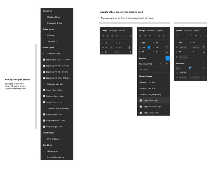
Defining number variables for spacing in Figma's Local Variables panel.
Using Plugins like Tokens Studio for Figma
Plugins like Tokens Studio offer more advanced token management, including multi-value tokens (e.g., for padding shorthand like "8px 16px") and better synchronization with development workflows.
- Install Tokens Studio for Figma from the Figma Community.
- Create a new token set for "Spacing."
- Define your spacing tokens. Tokens Studio allows for dimension tokens and can handle single values (e.g.,
spacing.sm = 8px) or multi-value strings (spacing.padding-card = "16px 24px"). - These tokens can then be applied to various properties in Figma.
It's important to note that while plugins might support multi-value tokens, Figma's native Variables currently only support single values for number variables. When exporting plugin-defined tokens to Figma Variables, multi-value tokens might be skipped or need special handling.
Step 2: Applying Spacing Tokens in Figma Designs
Once defined, apply these tokens to your components and layouts, primarily using Figma's **Auto Layout** feature.
- Gap (Spacing between items): In an Auto Layout frame, you can apply a spacing variable or token to the "Gap" property.
- Padding (Horizontal and Vertical): Apply variables/tokens to the horizontal and vertical padding fields in an Auto Layout frame.
- Fixed Sizes for Spacers: Create "Spacer" components whose width or height is driven by a spacing variable, useful for inserting consistent gaps.
When you select a frame with Auto Layout, click the variable icon next to the padding or gap input fields to choose from your defined spacing variables.
Step 3: Best Practices for Figma Spacing Tokens
Consistency is Key
Ensure your Figma token names and values precisely match those defined for CSS. This is crucial for a smooth design-to-development handoff.
Leverage Auto Layout
Auto Layout is Figma's powerhouse for responsive and systematic design. Using spacing tokens with Auto Layout properties makes your designs inherently more flexible and maintainable.
Document and Communicate
Clearly document your spacing tokens and their intended use. Share this documentation with your team to ensure everyone is aligned.
Visualizing the Spacing Token Ecosystem
To better understand the relationships and processes involved in implementing spacing tokens, the following mindmap provides a high-level overview. It illustrates the core concepts and how CSS and Figma implementations connect.
This mindmap highlights the journey from conceptualizing spacing tokens to their practical application in both design (Figma) and development (CSS), emphasizing the importance of integration for a cohesive workflow.
Bridging the Gap: Synchronizing Spacing Tokens Between Figma and CSS
The true power of spacing tokens is realized when there's a seamless bridge between design and development. This synchronization ensures that what designers create in Figma is accurately and efficiently translated into code.
Exporting Tokens from Figma
Plugins like Tokens Studio for Figma are invaluable here. They typically allow you to export your entire token set (including spacing, colors, typography, etc.) as a JSON file. This JSON file can then serve as a single source of truth for developers.
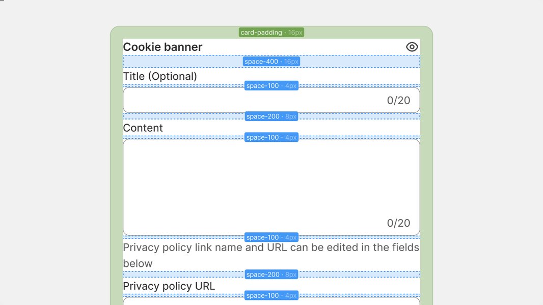
Visual example of using spacing tokens for layout consistency.
Consuming Tokens in Development
Developers can use tools like Style Dictionary or custom scripts to transform this JSON data into various formats, including CSS Custom Properties, Sass variables, JavaScript objects, and more. This automated process minimizes manual errors and keeps the codebase in sync with the design specifications.
Maintaining Consistency
- Naming Conventions: Adopt a consistent naming convention for tokens across both platforms (e.g.,
spacing-smin Figma becomes--spacing-smin CSS). - Regular Syncs: Establish a process for regularly updating and syncing tokens, especially when changes are made in the design system.
- Documentation: Comprehensive documentation for your design tokens, including their purpose and usage, is vital for both designers and developers.
Comparative Analysis: Spacing Tokens in CSS vs. Figma
While both CSS and Figma aim to utilize spacing tokens for consistency, their implementation methods and strengths vary. The radar chart below offers an opinionated comparison across several key aspects. This analysis considers factors like ease of definition, application flexibility, scalability within their respective environments, maintenance overhead, and collaborative potential.
This chart suggests that while CSS offers powerful scalability once set up, Figma excels in ease of initial definition and real-time collaborative aspects for visual design. Both are crucial, and their synergy through effective syncing tools unlocks the greatest potential.
Workflow Summary: CSS and Figma Spacing Token Implementation
To provide a clear, side-by-side view of the implementation process, the following table outlines the key steps for setting up and using spacing tokens in both CSS and Figma.
| Step | CSS Implementation | Figma Implementation |
|---|---|---|
| 1. Define Spacing Scale | Establish a base unit (e.g., 8px) and create a modular scale (4px, 8px, 16px, 24px, etc.). | Define spacing values matching the CSS scale (e.g., 4, 8, 16, 24 as numbers). |
| 2. Create Tokens | Declare CSS Custom Properties (variables) in :root (e.g., --space-sm: 8px;). |
Create Number Variables in Figma's "Local Variables" panel (e.g., spacing/sm = 8) or use a plugin like Tokens Studio to define dimension tokens. |
| 3. Apply Tokens | Use var(--space-sm) in CSS properties like padding, margin, or gap. |
Assign variables/tokens to Auto Layout properties (gap, padding) or component dimensions. |
| 4. Maintain & Update | Modify token values directly in the :root or source token files (e.g., JSON if using a build process). |
Edit token values in the Figma Variables panel or Tokens Studio interface; changes propagate through linked designs. |
| 5. Sync & Handoff | Share CSS files or compiled stylesheets. If using a token pipeline, the source JSON/JS files are key. | Export tokens (e.g., as JSON from Tokens Studio) for development integration. Utilize Figma's inspect panel for developers. |
This structured approach ensures that both designers and developers are working from the same foundational spacing system, leading to greater efficiency and consistency.
This video, "Setting up SPACING & RADIUS TOKENS using Figma..." by Mizko, provides a practical demonstration of how to create and manage spacing (and radius) tokens within Figma. It visually walks through the process, which can be very helpful for understanding how these concepts are applied directly in the design tool, complementing the textual explanations for Figma implementation.
Frequently Asked Questions (FAQ)
Recommended Further Exploration
- How can I establish a complete design token pipeline using Style Dictionary for automated cross-platform exports?
- What are some advanced techniques for implementing responsive spacing using tokens in conjunction with CSS functions like clamp()?
- What are the best practices for thoroughly documenting spacing tokens within a design system for team collaboration?
- How can I effectively manage theming (e.g., compact vs. comfortable density) using spacing tokens in both Figma and CSS?
References
 polaris.shopify.com
Last updated May 7, 2025