
Unveiling the Dynamics of Systems: A Deep Dive into Input-Process-Output Models
Understanding the Core Mechanism Behind Every System and Process
- Fundamental Structure: The Input-Process-Output (IPO) model is a foundational concept across diverse fields, illustrating how systems transform raw inputs into desired outputs through a defined process.
- Versatility in Application: From computer science and software engineering to economic analysis and business process optimization, IPO models provide a clear framework for analyzing and improving system performance.
- Complementary Tools: While the IPO model offers a high-level overview, tools like Data Flow Diagrams (DFDs) delve deeper into data movement and storage, and Input-Output economic models analyze inter-industry dependencies within an economy.
At the heart of virtually every system, whether technological, economic, or operational, lies a fundamental mechanism: the transformation of inputs into outputs. This core concept is elegantly captured by the Input-Process-Output (IPO) model. This pictorial model serves as an indispensable tool for understanding, designing, and optimizing processes across an astonishingly wide array of disciplines. By breaking down complex systems into their most basic components, the IPO model provides clarity, facilitates analysis, and empowers informed decision-making.
The Essence of the Input-Process-Output (IPO) Model
Defining the Core Components
The Input-Process-Output (IPO) model, also known as the IPO diagram or IPO pattern, is a widely used approach in systems analysis, software engineering, and various business operations. It visually describes how a workflow, information flow, or an entire system functions. The model is typically structured into three main columns or sections:
- Inputs: These are all the resources, raw materials, data, information, or conditions that enter the system and are required for the process to begin. Inputs can originate from users, other systems, suppliers, or even internal components. Examples include raw materials in manufacturing, data in a computer program, or requirements in a project.
- Process: This represents the set of operations, activities, calculations, transformations, or steps performed on the inputs to achieve the desired outcome. The process describes "what happens" to the inputs. It could involve human labor, automated machinery, software algorithms, or a combination of these. The goal of the process is to convert the inputs into something more valuable or refined.
- Outputs: These are the final results, products, information, services, or outcomes produced by the system after the process has been completed. Outputs are the tangible or intangible deliverables that satisfy the system's objectives. They can be finished goods, new data, a decision, a report, or even an output that serves as an input for another process.
The IPO model establishes a clear cause-and-effect relationship, moving from left to right: inputs feed the process, which then generates outputs. This straightforward flow makes it an excellent tool for initial system conceptualization and high-level analysis.
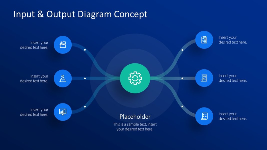
An illustrative diagram of the Input-Process-Output flow.
The Continuous Cycle and Feedback Loops
While often presented as a linear flow, the IPO model can also represent a continuous cycle, especially in computer science and programming. In this context, outputs can often feed back as inputs for subsequent iterations or related processes, forming a "continuous cycle." This is particularly relevant in systems that involve constant monitoring and adjustment, analogous to closed-loop control theory where feedback from the output is used to modify the input or process to achieve desired results. For instance, in a system designed to maintain a specific temperature, the current temperature (output) is fed back as an input to adjust the heating or cooling process.
Applications Across Diverse Fields
Software Engineering and System Design
In software engineering, the IPO model is fundamental for structuring information processing programs and system components. It helps developers understand how data enters a system, what computations are performed on it, and what results are returned. This clarity is crucial for identifying requirements, designing modular components, and ensuring that software behaves predictably. For example, a batch transaction processing system takes large volumes of homogeneous transactions (inputs), processes them (e.g., updates a database), and produces reports or computations (outputs).
An introductory video on IPO Diagrams, illustrating their visual representation and utility in system design.
The video above provides a concise introduction to IPO diagrams, emphasizing their visual utility in mapping out inputs, processes, and expected outputs. It serves as a valuable resource for anyone looking to quickly grasp the foundational elements of this modeling technique, showcasing its application in simplifying complex system analyses.
Business Process Management and Optimization
Businesses extensively use the IPO model to analyze and improve workflows. By diagramming a process, organizations can identify bottlenecks, inefficiencies, and areas for improvement. For instance, in a manufacturing scenario, inputs like raw materials, labor, and energy undergo a manufacturing process to yield finished products, but also generate waste materials and emissions (outputs). Understanding these allows for optimizing material flow, reducing waste, and enhancing productivity. The IPO model is often used as part of the Six Sigma DMAIC (Define, Measure, Analyze, Improve, Control) methodology, particularly in the "Define" stage, to clarify project goals and scope.
Economic Analysis: The Input-Output Model
Beyond individual processes, a more specialized branch of economics uses the "Input-Output (I-O) Model" to analyze interdependencies between different sectors of a national or regional economy. Developed by Wassily Leontief, this model represents the flow of money and goods among industries. An industry's outputs become inputs for other industries, demonstrating a complex web of economic linkages. This allows economists to assess the economic impacts of events, public investments, or changes in demand across various sectors. For example, a rise in demand for steel (output of the steel industry) will have ripple effects on industries that use steel as an input, such as construction.
Economic input-output models typically rely on comprehensive input-output tables, which are matrices detailing monetary transactions between industries. These tables show how much of each commodity is made by each industry (make table) and how much is used by each industry (use table). This analysis helps in understanding supply chains, identifying important industries, and predicting the impact of economic changes like job loss or creation on a regional economy.
Distinguishing IPO from Data Flow Diagrams (DFDs)
Complementary Perspectives on System Flow
While both IPO models and Data Flow Diagrams (DFDs) visualize system flows, they serve different purposes and offer distinct levels of detail:
- IPO Model: Provides a high-level, abstract view of a single process, focusing on what goes in, what happens, and what comes out. It simplifies the understanding of a system's fundamental transformation. It typically doesn't show data storage or external entities in detail.
- Data Flow Diagram (DFD): Offers a more detailed graphical representation of how data moves through an information system or business process. DFDs use specific symbols to depict processes, external entities (sources/sinks of data), data stores (where data is held), and data flows (the paths data takes). DFDs can be multi-level, starting with a broad context diagram (Level 0) and progressively drilling down into finer details of subprocesses (Level 1, Level 2, etc.).
Essentially, an IPO model can be seen as a conceptual precursor or a summary of a single process that, within a DFD, would be represented by a single "process bubble." DFDs then elaborate on how data flows to and from that process, interacting with other processes, external entities, and data stores.
Key Differences in Focus
The table below summarizes the primary distinctions between the IPO model and Data Flow Diagrams:
| Feature | Input-Process-Output (IPO) Model | Data Flow Diagram (DFD) |
|---|---|---|
| Primary Focus | High-level transformation of inputs to outputs within a single process. | Detailed flow of data through an entire system, including storage and external interactions. |
| Components | Inputs, Process, Outputs. | Processes, External Entities, Data Stores, Data Flows. |
| Granularity | Abstract, simplified view of a single function or system. | Can be multi-leveled, showing increasing detail of data paths and transformations. |
| Purpose | Initial system understanding, clarifying scope, identifying fundamental transformations. | System analysis, design, identifying data sources, destinations, and storage, revealing inefficiencies. |
| Usage Context | Project definition, quick process mapping, programming logic. | Information system design, business process re-engineering, detailed system analysis. |
Analyzing System Characteristics with a Radar Chart
A Comparative View of Modeling Strengths
To further illustrate the strengths of IPO models and DFDs in different analytical contexts, let's consider a radar chart. This chart will visually represent how well each modeling approach addresses various system analysis characteristics, based on their inherent design and typical usage.
This radar chart illustrates the comparative strengths of the IPO model, Data Flow Diagrams (DFDs), and the Input-Output Economic Model across various analytical dimensions. The IPO model excels in "Simplicity of Representation" and "Process Transformation Clarity," making it ideal for quick, high-level understanding. DFDs, on the other hand, shine in "Detail of Data Movement," "Identification of Data Storage," and "Scalability for Complex Systems," making them suitable for in-depth system analysis and design. The Input-Output Economic Model, a distinct but related concept, stands out primarily for "Economic Interdependency Analysis." This visualization helps in selecting the most appropriate modeling tool based on the specific analytical needs.
Building a Pictorial IPO Model
Practical Steps for Visualization
Creating a pictorial IPO model involves a few straightforward steps:
1. Define the System or Process Scope
Clearly identify the boundaries of the process or system you intend to model. What is its beginning and end? This helps in precisely determining what falls within "input" and "output."
2. Identify All Inputs
Brainstorm and list every single piece of information, resource, material, or condition that is necessary for your process to start and run. Be as specific as possible. Consider what triggers the process or what data it needs to operate.
3. Describe the Process Steps
Outline the sequence of actions, transformations, or operations that occur within the system to convert the inputs into outputs. Keep this section concise and focused on the "what" rather than the "how" in great detail, especially for a high-level IPO.
4. List All Outputs
Determine all the results generated by the process. This includes not only the desired outcomes (e.g., a product, a report) but also any unintended or byproduct outputs (e.g., waste, error messages). Ensure outputs are thorough, specific, and measurable where possible.
5. Arrange Visually
The most common pictorial representation is a simple left-to-right flow. Inputs are typically shown on the left, the process in the middle, and outputs on the right. Arrows are used to indicate the direction of flow. For more detailed visualizations, you might include simple shapes like rectangles for process blocks and arrows for flows.
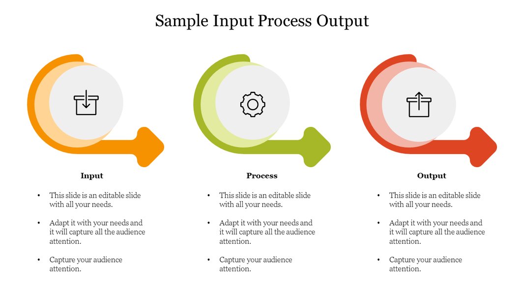
A clear visual layout of an Input-Process-Output diagram.
Frequently Asked Questions
Conclusion
The Input-Process-Output (IPO) model, whether in its simplified form for individual processes or its more complex economic manifestation, stands as a cornerstone in understanding system dynamics. It offers a powerful, intuitive pictorial representation that demystifies how resources are consumed, transformed, and ultimately yield results. By providing a clear framework, the IPO model facilitates analysis, aids in problem identification, and supports the design of efficient and effective systems across a multitude of domains. Its simplicity and versatility make it an invaluable tool for anyone seeking to clarify, optimize, or communicate the essence of how things work.
Recommended Further Exploration
- How to apply IPO model in software development lifecycle?
- Advanced techniques for economic input-output analysis.
- Detailed comparison of DFD levels and their applications.
- Real-world examples of IPO models in business operations.
References
 aws.amazon.com
Last updated May 21, 2025