
Unlock Your Data's Potential: Choosing the Best Internal Analytics Visualization Tool for Google Sheets in 2025
Navigate the options for fast, AI-enhanced, interactive visualizations directly from your Google Sheets.
Key Insights at a Glance
- Google Looker Studio (formerly Data Studio) often emerges as a top choice for its seamless, free integration with Google Sheets, ease of use, and robust interactive dashboarding capabilities for internal sharing.
- For those prioritizing AI-driven visualization and insights, tools like Zoho Analytics offer powerful features, including natural language querying and automated chart generation, while maintaining Google Sheets compatibility.
- While powerful platforms like Microsoft Power BI and Tableau provide extensive features, they may involve a steeper learning curve and potential costs, but offer strong Google Sheets connectivity and, in Power BI's case, notable AI features.
Navigating the Landscape of Internal Analytics Visualization
In today's data-driven environment, effectively visualizing analytics for internal teams is crucial for informed decision-making. When your data resides in Google Sheets, you need a tool that not only connects effortlessly but also allows for rapid creation of interactive and insightful visualizations. The ideal solution should be user-friendly, preferably leveraging AI to speed up the process, and enable secure online publishing for your team. This guide will help you explore the best options available in 2025 that meet these specific needs.
Key Criteria for Your Ideal Tool
When sifting through the options, keep these core requirements in mind, as per your query:
- Google Sheets Compatibility: Direct and easy connection to your existing data.
- Ease and Speed of Creation: Intuitive interfaces, templates, and drag-and-drop functionality.
- AI-Enhanced Features: AI assistance for chart suggestions, insight generation, or natural language queries.
- Interactivity: Features like filters, drill-downs, and dynamic updates for user exploration.
- Online Publishing for Internal Use: Secure sharing mechanisms within your organization.
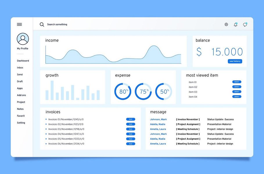
An example of a well-designed analytics dashboard for effective data analysis.
Top Contenders for Visualizing Your Google Sheets Data
Several tools stand out in 2025 for their ability to transform Google Sheets data into compelling internal analytics dashboards. Let's explore the leading options:
1. Google Looker Studio (formerly Data Studio): The Seamless Integrator
Looker Studio is a widely recommended free tool, especially for users already within the Google ecosystem.
Google Sheets Harmony
It offers native, real-time connectivity with Google Sheets. Setting up your data source is typically a straightforward process, allowing live updates directly from your spreadsheets.
Simplicity and Speed
Known for its user-friendly, drag-and-drop interface, Looker Studio enables rapid dashboard creation even for non-technical users. Pre-built templates can further accelerate the process.
Interactive Dashboards for Internal Eyes
You can build highly interactive dashboards with features like filters, date range controls, data drill-downs, and clickable chart elements, allowing your team to explore data dynamically.
AI Capabilities
While not its primary strength, Google is continually enhancing AI capabilities across its suite. Looker Studio benefits from some of Google's underlying data intelligence but doesn't feature prominent AI-driven chart generation in the same way as some dedicated AI tools.
Publishing and Sharing
Dashboards can be easily shared within your organization using Google account permissions, embed codes, or direct links, ensuring controlled access for internal purposes.
2. Zoho Analytics: The AI-Powered Ally
Zoho Analytics is frequently highlighted for its robust AI features and comprehensive BI capabilities.
Effortless Google Sheets Connection
It provides seamless integration with Google Sheets, among many other data sources. You can schedule periodic data imports or, in some cases, set up live connections.
AI at Your Service
This is where Zoho Analytics truly shines. Its AI assistant, Zia, can understand natural language queries (e.g., "Show me sales trends by quarter"), automatically generate relevant visualizations, provide insights, and even detect anomalies in your data.
Dynamic and Interactive Visuals
Create rich, interactive dashboards with a wide array of chart types, pivot tables, and KPI widgets. It supports features like drill-downs, user filters, and dashboard linking.
Internal Deployment
Zoho Analytics offers flexible sharing options, including private sharing, embedding dashboards in internal portals, and fine-grained access controls suitable for internal teams.
3. Microsoft Power BI: The Analytics Powerhouse
Power BI is a leading business intelligence tool, particularly strong within the Microsoft ecosystem, but also versatile with other data sources.
Connecting to Google Sheets
Power BI can connect to Google Sheets data, typically via a web connector or by exporting Google Sheets data to a compatible format. While not as direct as Looker Studio, it's a well-supported pathway.
AI-Driven Insights
Power BI incorporates several AI features, such as Quick Insights (automatically finding patterns), Q&A for natural language queries, and integrations with Azure AI services for more advanced analytics.
Rich Interactivity
It excels at creating highly interactive reports and dashboards with features like cross-filtering between visuals, drill-through pages, and bookmarks for customized views.
Sharing Within Your Organization
Publishing to the Power BI service allows for sharing dashboards and reports internally, with robust options for managing access through workspaces and apps. A Power BI Pro or Premium license is typically required for extensive sharing.
4. Google Sheets with AI Add-ons: The Direct Approach
For simpler needs, or as a starting point, Google Sheets itself can be enhanced for better visualizations.
Straight from the Source
You can create charts and basic dashboards directly within Google Sheets. This is the most direct way to visualize data already in Sheets.
AI-Enhanced Charting
Several Google Workspace Marketplace add-ons, such as Coefficient's AI Chart Builder, can help. These tools allow you to use natural language prompts to generate charts quickly within your Google Sheet, significantly speeding up the creation process.
Basic Interactivity and Sharing
Google Sheets offers interactive elements like slicers, filters, and data validation dropdowns. Sharing is straightforward using Google Drive's built-in permissions.
While convenient, the visualization capabilities are less sophisticated than dedicated BI tools, and managing complex interactive dashboards can become cumbersome.
5. Emerging AI Dashboard Generators (e.g., Polymer Search, Luzmo)
A newer category of tools leverages AI to rapidly generate dashboards from your data.
The Cutting Edge of AI
Platforms like Polymer Search or Luzmo connect to data sources (often including Google Sheets) and use AI (like GPT models) to automatically create dashboards, identify trends, and suggest visualizations.
Rapid Prototyping
These tools can create initial dashboard drafts in minutes, making them excellent for quick exploration or when you need inspiration. They often provide interactive elements like filtering.
Considerations
While promising for speed, the depth of customization and advanced analytical features might vary. Always check the specifics of Google Sheets integration and sharing capabilities for internal use. Some may introduce additional costs or require API setups.
Feature Showdown: Comparing Your Options
To help you weigh your options, this radar chart provides a visual comparison of some of the leading tools based on key criteria relevant to your needs. Each axis represents a feature, with points further from the center indicating better performance or suitability for that aspect. We're comparing Google Looker Studio, Zoho Analytics, Microsoft Power BI, and Google Sheets with AI Add-ons.
This chart illustrates that Google Looker Studio and Google Sheets with AI Add-ons excel in ease of Google Sheets integration and have a gentle learning curve. Zoho Analytics stands out for its AI capabilities, while Power BI offers strong interactivity. Your choice will depend on which of these factors you prioritize most highly.
Visualizing Your Decision Path: A Mindmap
Choosing the right tool can seem complex. This mindmap outlines a simplified decision-making process based on your primary needs and priorities when working with Google Sheets data for internal analytics visualization.
for Google Sheets Data"] id1["Key Requirements"] id1_1["Google Sheets Compatible"] id1_2["Interactive Dashboards"] id1_3["Internal Secure Sharing"] id1_4["Fast/Easy Creation"] id1_5["AI-Enhanced (Preferred)"] id2["Primary Focus: Max Ease & Free"] id2_1["Google Looker Studio"] id2_2["Google Sheets + AI Add-ons"] id3["Primary Focus: Strongest AI Integration"] id3_1["Zoho Analytics"] id3_2["AI Dashboard Generators
(e.g., Polymer Search, Luzmo)"] id3_3["ThoughtSpot (Enterprise AI)"] id4["Primary Focus: Advanced BI & Microsoft Ecosystem"] id4_1["Microsoft Power BI"] id5["Balanced Approach: Good AI & Ease with Google Ecosystem"] id5_1["Consider Zoho Analytics or
Looker Studio (depending on AI depth needed)"]
This mindmap helps visualize how different priorities might lead you to select one tool over another, all while keeping your core requirement of Google Sheets compatibility central.
Deep Dive into Tool Capabilities: A Comparative Table
Here's a table summarizing the key features of the discussed tools, focusing on aspects most relevant to your request for internal analytics visualizations from Google Sheets data.
| Tool | Google Sheets Integration | Ease of Use (AI Influence) | Interactivity Level | Best For Internal Publishing | Key AI Features | Learning Curve |
|---|---|---|---|---|---|---|
| Google Looker Studio | Native, Real-time | Very Easy (Drag & Drop) | High (Filters, Drill-downs) | Excellent (Google ecosystem sharing) | Basic AI-assisted insights (limited explicit AI generation) | Low |
| Zoho Analytics | Seamless Connector | Easy (AI Assistant, NLP Queries) | Very High (Rich charts, NLP interaction) | Excellent (Secure links, embedding) | AI Assistant (Zia), Auto-charting, Anomaly Detection, NLP | Low to Moderate |
| Microsoft Power BI | Connector (Web, API) | Moderate (Powerful, more complex) | Very High (Cross-filtering, Q&A) | Very Good (Power BI Service, requires license for full features) | Quick Insights, NLP Q&A, Azure AI integration | Moderate to High |
| Google Sheets + AI Add-ons | Native (Directly in Sheets) | Easy (NLP for charts via add-ons like Coefficient) | Moderate (Slicers, basic charts) | Good (Google Drive sharing) | Chart generation via NLP (with specific add-ons) | Very Low (if familiar with Sheets) |
| AI Dashboard Generators (e.g., Polymer) | Connector/Upload | Very Easy (AI auto-generates dashboards) | Moderate to High (Varies by tool) | Good (Designed for online sharing) | Automated visualization, Trend detection | Low |
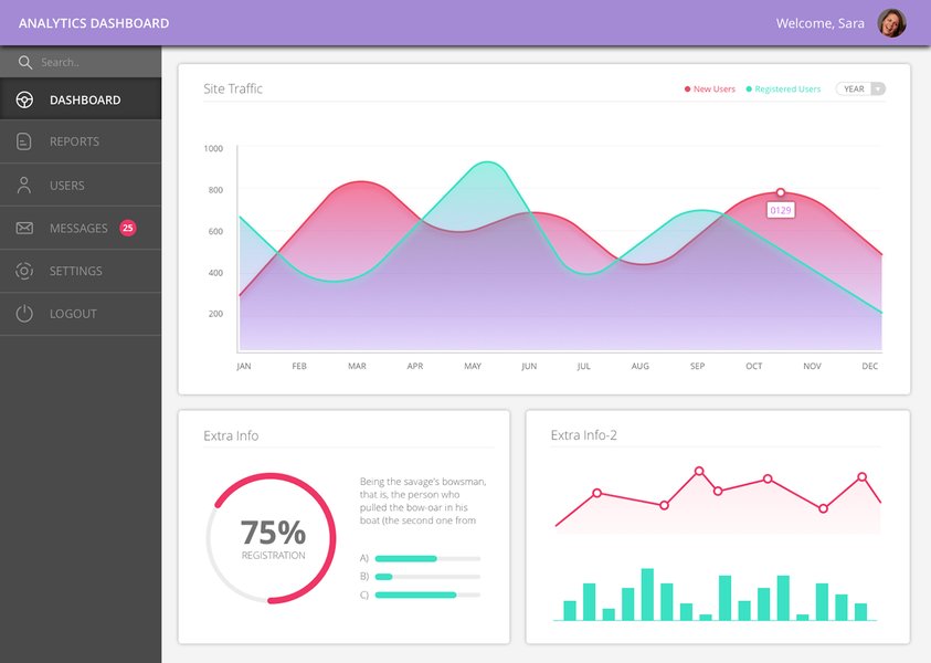
An example of an analytics dashboard design showcasing various data points.
See It in Action: Data Visualization Tools Overview
To get a better sense of what these tools can do, the following video provides an overview and demonstrations of several leading data visualization platforms. While it covers a broader range, it can offer valuable context on features like interactivity and dashboard design, including a look at Microsoft Power BI, one of the tools discussed.
This video, "7 Best Data Visualization Tools 2025 (Full Software Demo ...)", showcases various tools, including a demonstration of Microsoft Power BI, providing insights into their capabilities.
Frequently Asked Questions (FAQ)
Recommended Further Exploration
- How can I set up Google Looker Studio with Google Sheets for real-time internal dashboards?
- What are the specific AI features of Zoho Analytics that can help automate report generation from my Google Sheets data?
- How do the security and internal sharing options compare between Google Looker Studio and Microsoft Power BI?
- Can you provide a step-by-step guide to using AI add-ons within Google Sheets for quick data visualization?
References
Last updated May 6, 2025