
Unlocking Data Insights: Top Microsoft Apps for Dashboard Creation Beyond Power BI
Explore Powerful Alternatives Within the Microsoft Ecosystem for Your Dashboard Needs
Key Highlights for Microsoft Dashboard Creation
- Excel remains a robust and familiar tool: Leveraging Power Pivot and Power Query, Excel can create dynamic, interactive dashboards for data analysis, especially for smaller businesses or those comfortable with its interface.
- Power Apps offers custom, interactive solutions: For tailored applications and project reporting, Power Apps enables the creation of custom dashboards with deeper integration across Microsoft 365 services.
- SharePoint and Teams provide collaborative platforms: SharePoint can host web part pages with dashboards, while Teams offers integrated dashboard apps for centralizing information and fostering collaboration.
Microsoft offers a rich ecosystem of applications beyond Power BI that can be leveraged to create effective and insightful dashboards. While Power BI is a formidable tool for business intelligence and data visualization, various other Microsoft apps excel in different scenarios, catering to diverse user needs, technical proficiencies, and integration requirements. The "best" app ultimately depends on your specific goals, the complexity of your data, your team's familiarity with certain tools, and the level of customization desired.
Understanding Dashboard Creation in the Microsoft Landscape
Dashboards serve as a centralized platform to visualize and analyze complex information in a simplified, intuitive manner. They present data in an interactive format, enabling users to monitor key performance indicators (KPIs) and gain actionable intelligence. Within the Microsoft suite, several applications are designed to facilitate this, each with its unique strengths.
The Versatility of Microsoft Excel for Dashboards
Often perceived as a simple spreadsheet tool, Microsoft Excel is a highly capable dashboard solution, especially when integrated with its powerful add-ins like Power Pivot and Power Query. Excel's familiarity and flexibility make it an excellent choice for many organizations.
Leveraging Power Pivot and Power Query
Power Pivot allows users to perform advanced data modeling by bringing together data from various sources, creating relationships, and defining complex calculations. Power Query, on the other hand, enables seamless data import and transformation, cleaning and shaping raw data before it's used for analysis. Together, they empower users to build dynamic, interactive dashboards directly within Excel.
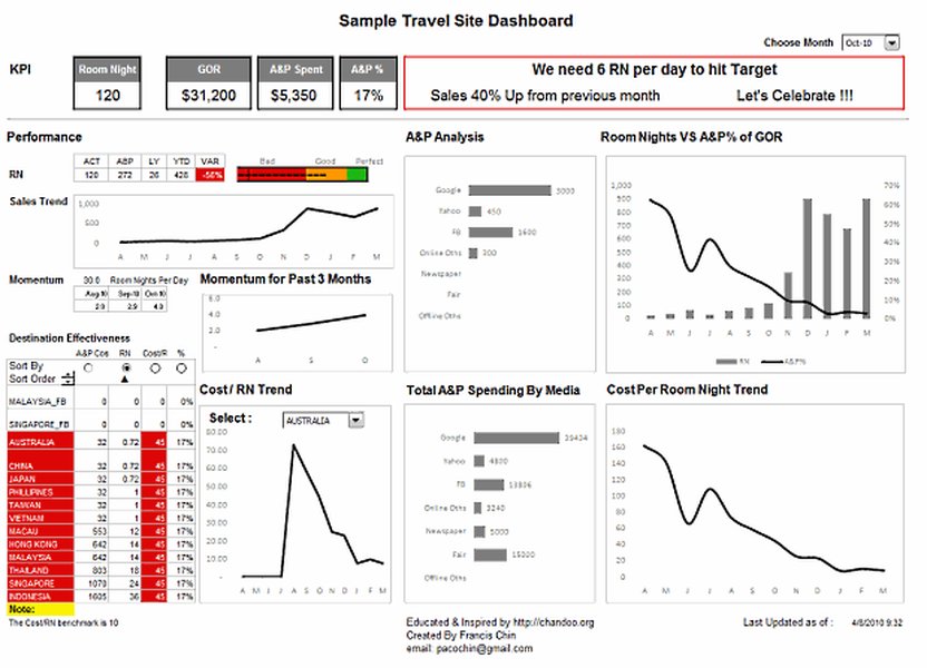
An example of a dynamic dashboard created using Microsoft Excel.
Excel dashboards can include multiple PivotTables, PivotCharts, slicers, and timelines, offering consolidated data views and self-service business intelligence opportunities. This allows users to filter and analyze data to display precisely what's important to them, eliminating the need for multiple static reports for different stakeholders.
Watch this video for a deep dive into creating interactive dashboards in Excel:
This video demonstrates how to build interactive dashboards in Microsoft Excel, showcasing techniques like using PivotTables, PivotCharts, and slicers to transform raw data into easily digestible visual information. It highlights Excel's native capabilities for dynamic reporting without requiring VBA or external add-ons, making it highly relevant for users looking to create robust dashboards with a familiar tool.
Power Apps: Custom Dashboards for Tailored Solutions
Microsoft Power Apps is a low-code platform that enables users to create custom applications for various business purposes, including project management, inventory tracking, and CRM. This makes it an ideal tool for building highly specific and interactive dashboards tailored to unique business processes.
Enhancing Project Reporting with Power Apps
Power Apps dashboards can streamline reporting for project processes by centralizing project tracking and information. They integrate seamlessly with other Microsoft 365 services, providing enhanced insights into project analytics. You can create custom apps with dashboards that leverage data from Microsoft Lists, Planner, and other sources, providing real-time visibility into project health and performance.
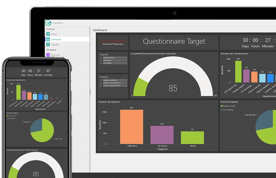
A comprehensive dashboard built within the Microsoft Power Platform.
The flexibility of Power Apps allows for the creation of both user-owned and system-wide dashboards, offering granular control over access levels and security. Interactive dashboards within Power Apps also provide the capability to act on specific data rows directly from the dashboard, fostering immediate data-driven actions.
SharePoint and Microsoft Teams: Collaborative Dashboard Environments
For organizations deeply embedded in the Microsoft 365 ecosystem, SharePoint and Microsoft Teams offer robust platforms for hosting and interacting with dashboards, fostering collaboration and centralized information access.
SharePoint as a Dashboard Hub
SharePoint Server enables the creation and use of dashboards that provide up-to-date information in a centrally managed, easily accessed location. You can create Web Part pages and add various components like status indicators and Chart Web Parts to build simple to complex dashboards. For SharePoint in Microsoft 365, Power BI report web parts can be integrated, allowing users to leverage Power BI visuals directly within SharePoint sites.
An example of a project dashboard integrated into SharePoint.
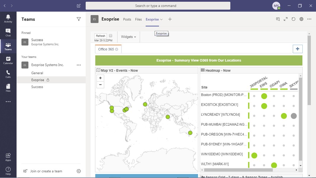
Teams for Integrated Dashboard Apps
Microsoft Teams can host dashboard tab apps, providing a centralized view for productivity, project management, and other key metrics. The Teams Toolkit facilitates the creation of such dashboard apps, enabling seamless integration of data and visualizations directly within the Teams interface. This allows teams to monitor KPIs and collaborate effectively without switching between multiple applications.
Other Microsoft-Related Options for Dashboarding
Beyond the primary tools, Microsoft also offers other specialized services for dashboard creation:
Azure Dashboards for Cloud Monitoring
Azure Dashboards are ideal for monitoring cloud resources and application performance. Users can create multiple dashboards in the Azure portal, including tiles visualizing data from various Azure resources across different resource groups and subscriptions. These dashboards can be customized with real-time data, markdown tiles for custom content, and filters for specific subscriptions or locations, providing a comprehensive view of cloud operations.
An Azure dashboard showing real-time monitoring of application performance.
Microsoft Fabric for Real-Time Intelligence
Microsoft Fabric is a unified analytics platform that allows for the creation of real-time dashboards. It simplifies data integration and provides AI-powered tools for data engineers, scientists, analysts, and business users. Dashboards in Fabric are collections of tiles, each with an underlying query and a visual representation, enabling easy data exploration and improved query performance for real-time insights.
Comparing Microsoft Dashboarding Capabilities
To help you decide which Microsoft app is best for your dashboard needs, here's a comparative overview of their strengths and ideal use cases:
This radar chart illustrates the comparative strengths of various Microsoft applications for dashboard creation across several key criteria. It highlights that while each tool has unique advantages, they excel in different areas such as customization, data integration, and collaboration. For instance, Excel is highly cost-effective and easy to use, while Power Apps offers superior customization. Azure Dashboards and Microsoft Fabric shine in scalability and real-time capabilities, crucial for cloud monitoring and large-scale data analytics. This visual comparison aids in identifying the most suitable Microsoft application based on specific organizational priorities.
Summary of Microsoft Dashboarding Options
The following table provides a concise overview of the various Microsoft applications suitable for dashboard creation, outlining their primary features and ideal use cases:
| Microsoft Application | Primary Use Case | Key Features for Dashboards | Best For |
|---|---|---|---|
| Microsoft Excel (with Power Pivot/Query) | Ad-hoc analysis, small to medium datasets, familiar interface | PivotTables, PivotCharts, Slicers, Data Models, Data Transformation (Power Query) | Users comfortable with Excel, financial reporting, personal dashboards |
| Microsoft Power Apps | Custom business applications, interactive solutions | Drag-and-drop interface, custom forms, integration with Microsoft 365, workflow automation | Tailored project management, operational dashboards, line-of-business applications |
| SharePoint Server / Microsoft 365 | Centralized information portals, team collaboration | Web Parts, Document Libraries, Lists, Integration with Power BI (online) | Team dashboards, internal communications, structured content display |
| Microsoft Teams | Collaborative workspaces, integrated app experiences | Dashboard tab apps, real-time communication, centralized team tools | Project teams, departmental monitoring, quick access to key metrics |
| Azure Dashboards | Cloud resource monitoring, infrastructure health | Pinning charts from Azure Monitor, custom markdown, resource group filtering | IT operations, DevOps, cloud administrators, monitoring Azure services |
| Microsoft Fabric | Unified analytics, real-time data processing, AI insights | Real-time dashboards, integrated data sources, AI-powered tools, OneLake integration | Large-scale data analytics, real-time intelligence, data engineers/scientists |
Factors to Consider When Choosing an App
When selecting the best Microsoft app for your dashboard needs, consider the following:
User Proficiency and Learning Curve
If your team is already proficient in Excel, leveraging its advanced features can be a quick and efficient solution. For those needing custom applications without extensive coding, Power Apps offers a low-code environment. SharePoint and Teams are excellent for integrating dashboards into existing collaborative workflows, requiring minimal additional training for users already familiar with these platforms.
Data Sources and Integration
Consider where your data resides. Excel is excellent for data from spreadsheets and accessible databases. Power Apps and Fabric offer broader integration capabilities, connecting to various data sources within and outside the Microsoft ecosystem. Azure Dashboards are specifically designed for data originating from Azure services.
Customization and Interactivity
The level of customization and interactivity you need will influence your choice. Power Apps allows for highly customized, interactive solutions. Excel provides significant interactivity through slicers and pivot features. SharePoint and Teams offer more structured, template-based dashboarding with less granular control over individual visual elements.
Scalability and Performance
For large datasets, real-time analytics, or enterprise-wide solutions, platforms like Microsoft Fabric and Azure Dashboards are built for scalability and high performance. Excel, while versatile, may face performance limitations with extremely large or complex datasets.
Collaboration and Sharing
How important is it for your team to collaborate on dashboards? SharePoint and Teams are designed for shared environments. Excel dashboards can be shared, but real-time collaborative editing might require specific setups like SharePoint integration.
Frequently Asked Questions
Conclusion
While Power BI stands out as a leading business intelligence tool, the Microsoft ecosystem offers a diverse array of applications perfectly capable of creating insightful and effective dashboards. For familiar data manipulation and analysis, Excel remains a powerful and accessible choice. Power Apps provides unparalleled flexibility for custom, interactive solutions tailored to specific business processes. SharePoint and Microsoft Teams offer robust platforms for collaborative dashboarding, centralizing information and fostering team synergy. Lastly, Azure Dashboards and Microsoft Fabric cater to more specialized needs, such as cloud monitoring and large-scale real-time analytics. The optimal choice will always align with your organization's unique requirements, existing infrastructure, and user capabilities, ensuring that your data tells the most compelling story.
Recommended Further Exploration
- How to build dynamic dashboards in Microsoft Excel?
- Creating custom project reporting dashboards with Power Apps.
- Integrating real-time data into Microsoft 365 dashboards.
- Comparing Microsoft Fabric with other analytics platforms.
References
Last updated May 21, 2025