
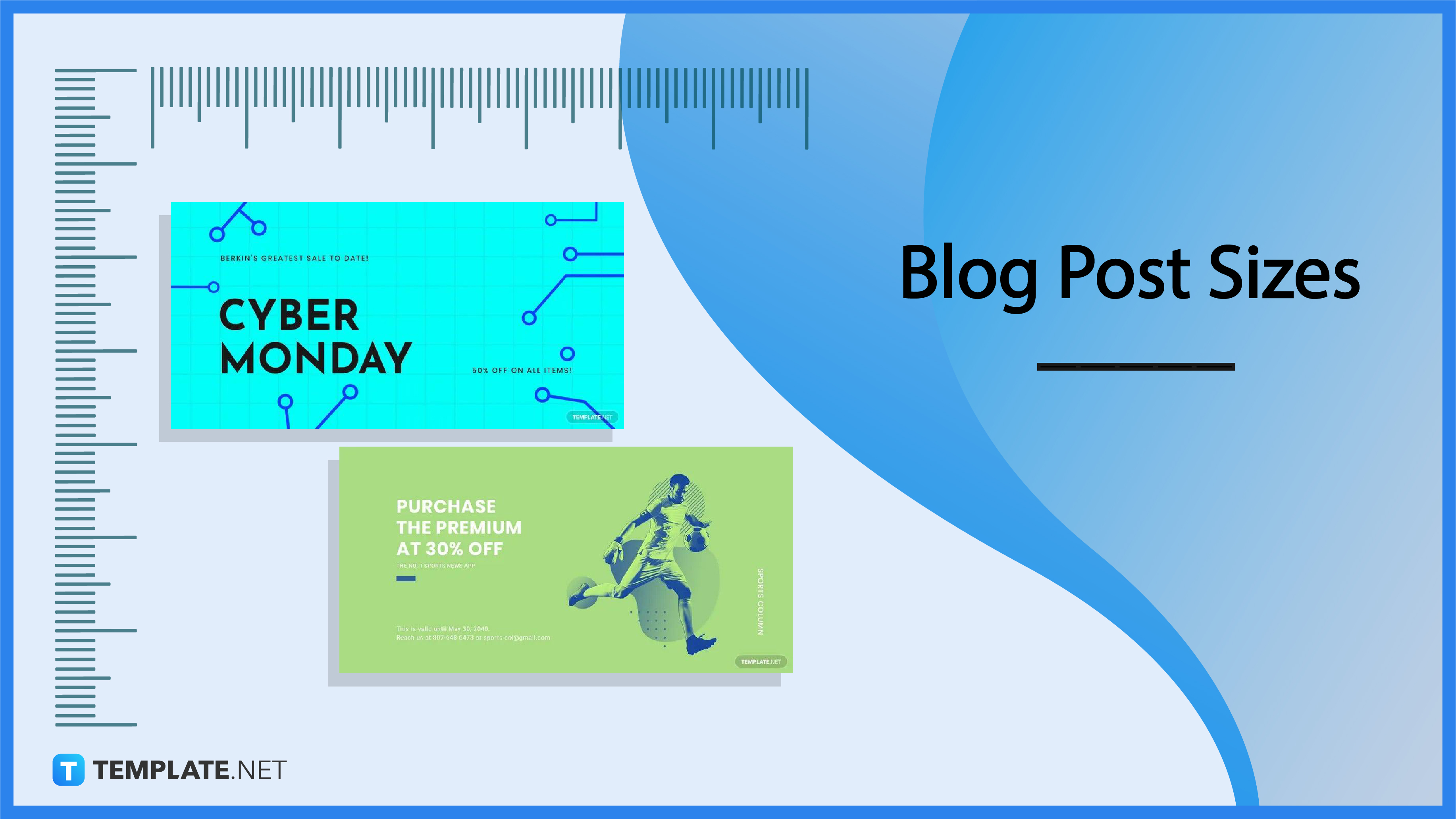
Optimal Minimum Image Widths for Horizontal Blog Images
Ensuring Clarity and Performance Across All Devices
Key Takeaways
- Standard Width: Utilize a minimum of 1200 pixels to maintain quality across devices.
- High-Resolution Support: Double the content column width (e.g., 1600 pixels) for retina displays.
- Responsive Design: Optimize images for various screen sizes to enhance user experience.
Introduction
In the digital age, visuals play a pivotal role in engaging blog readers. Horizontal, or landscape, images are commonly used to break up text, illustrate points, and enhance the overall aesthetic of blog posts. However, selecting the appropriate image width is crucial to ensure clarity, fast loading times, and a seamless user experience across a multitude of devices and screen resolutions. This comprehensive guide delves into the optimal minimum image widths for horizontal pictures in blog articles, incorporating best practices and expert recommendations to help you make informed decisions.
Understanding Image Width Requirements
Importance of Image Dimensions
The dimensions of an image significantly impact how it appears on different devices. An image that is too small may appear pixelated or stretched, detracting from the professional appearance of your blog. Conversely, excessively large images can lead to longer load times, which may frustrate users and negatively affect your site's SEO rankings.
Factors Influencing Minimum Image Width
- Blog Layout: The design structure of your blog, including the width of the content column, dictates the minimum width your images should have to fit seamlessly within the layout.
- Device Diversity: With readers accessing blogs from a variety of devices—desktops, tablets, smartphones—images must be versatile enough to display well across all screen sizes.
- Display Resolution: High-DPI (retina) displays require higher resolution images to maintain visual clarity.
- Loading Speed: Optimizing image size balances quality with performance, ensuring quick load times without sacrificing visual appeal.
Recommended Minimum Image Widths
Standard Content Images
For images that are intended to fit within the main content area of your blog, a minimum width of 1200 pixels is recommended. This size ensures that images appear sharp and clear on most devices, from standard desktop monitors to mobile phones. A width of 1200 pixels strikes a balance between quality and performance, providing sufficient resolution without causing excessive load times.
High-Resolution (Retina) Displays
To accommodate high-resolution screens, often referred to as retina displays, it's advisable to double the width of your content column. For instance, if your content area is 800 pixels wide, using images that are 1600 pixels wide will ensure that they appear crisp and detailed on devices with higher pixel density.
Full-Screen and Hero Images
For full-screen or hero images—those that span the entire width of the screen or serve as prominent headers—a minimum width of 2500 pixels is recommended. These larger images maintain their clarity and impact across all screen sizes, from large desktop monitors to expansive high-definition displays.
Aspect Ratios
Maintaining consistent aspect ratios enhances the visual harmony of your blog. Common aspect ratios for horizontal images include:
- 16:9 (e.g., 1200x675 pixels or 1920x1080 pixels): Ideal for most blog layouts and widely supported across platforms.
- 4:3 or 3:2: These ratios are also popular and can be chosen based on specific design preferences.
File Size Optimization
While larger images offer better quality, they can slow down your website's loading speed. As a best practice, aim to keep image file sizes under 150KB for standard blog images and under 250KB for full-width or hero images. Utilizing modern image formats like WebP can help reduce file sizes without compromising quality.
Responsive Design Considerations
With the variety of devices used to access blogs, responsive design is essential. Images should automatically resize and adapt to different screen widths. Implementing responsive images using HTML's srcset attribute or utilizing CSS can ensure that the appropriate image size is delivered based on the user's device, enhancing load times and user experience.
Practical Implementation Strategies
Determining Your Content Column Width
The width of your blog's content area is a primary factor in determining the minimum image width. Here's how to approach it:
- Measure the width of your blog's main content column. This is typically between 800–1200 pixels.
- Ensure that all horizontal images are at least as wide as the content column to prevent stretching or distortion.
- For users with retina displays, consider doubling this width to maintain image clarity.
Optimizing for Different Image Types
Different types of images serve various purposes within your blog. Here's a breakdown of recommended widths based on image type:
| Image Type | Minimum Width (Standard) | Minimum Width (Retina) | File Size |
|---|---|---|---|
| Standard Content Image | 1200 pixels | 2400 pixels | Under 150KB |
| Featured/Large Image | 1500 pixels | 3000 pixels | Under 200KB |
| Full-Width/Hero Image | 2500 pixels | 5000 pixels | Under 250KB |
Implementing Responsive Images
To ensure images look great on all devices, implement responsive techniques:
- Use the
srcsetattribute in your<img>tags to specify multiple image sizes. - Leverage CSS media queries to adjust image sizes based on the viewport.
- Consider using content delivery networks (CDNs) that automatically serve appropriately sized images based on user device.
Optimizing Image Formats
Selecting the right image format impacts both quality and load times:
- JPEG: Ideal for photographs and images with many colors. Offers good compression with manageable quality loss.
- WebP: Modern format that provides superior compression, reducing file sizes without significant quality degradation.
- PNG: Best for images requiring transparency or images with text.
Tools and Techniques for Image Optimization
Image Compression Tools
Compressing images helps reduce file sizes while maintaining quality. Utilize the following tools:
Leveraging Content Delivery Networks (CDNs)
CDNs like Cloudflare and Akamai can automatically optimize and serve images based on the user's device, location, and network conditions, ensuring fast load times globally.
Implementing Lazy Loading
Lazy loading defers the loading of images until they are about to enter the viewport. This technique improves initial page load times and reduces bandwidth usage:
<img src="placeholder.jpg" data-src="actual-image.jpg" class="lazyload" alt="Description">
    <!-- JavaScript to replace src with data-src when the image is near viewport -->
Best Practices for Image Usage in Blogs
Consistency in Image Sizes
Maintaining consistent image widths across your blog enhances visual coherence and professionalism. It ensures that images align properly with your text and other content elements.
Alt Text and Accessibility
Including descriptive alt text not only improves SEO but also ensures that visually impaired users can understand the content of your images through screen readers.
Responsive Captions and Descriptions
Captions and image descriptions should adapt to different screen sizes to maintain readability and complement the image without overwhelming the layout.
Advanced Techniques
Using SVGs for Graphics
For images that involve logos, icons, or illustrations, consider using SVG (Scalable Vector Graphics) format. SVGs are resolution-independent and maintain clarity at any size, making them ideal for responsive designs.
Implementing HDR Images
High Dynamic Range (HDR) images offer greater detail and color depth. Implementing HDR requires careful consideration of file sizes and may necessitate additional optimization techniques to balance quality and performance.
Automated Image Optimization Plugins
For platforms like WordPress, plugins such as WP Rocket or Smush can automate image optimization, handling compression, resizing, and format conversion without manual intervention.
Case Studies
Blog A: Balancing Quality and Speed
Blog A implemented a minimum image width of 1200 pixels for all horizontal images. By utilizing WebP format and compressing images to under 150KB, they achieved a 30% reduction in average page load time, enhancing user engagement and reducing bounce rates.
Blog B: Catering to Retina Displays
Blog B, with a content column width of 900 pixels, opted for a minimum image width of 1800 pixels to support retina displays. This approach maintained image clarity across all devices, contributing to a 20% increase in time spent on pages.
Blog C: Full-Width Image Integration
Blog C utilized full-width hero images with a minimum width of 2500 pixels. By integrating responsive design techniques, they ensured that images scaled appropriately on all devices, resulting in a visually appealing and consistent user experience.
Conclusion
Choosing the right minimum image width for horizontal pictures in your blog articles is essential for maintaining visual quality, ensuring fast load times, and providing a seamless experience across all devices. By adhering to the recommended minimums—1200 pixels for standard content images, 1600 pixels for retina display support, and 2500 pixels for full-width or hero images—you can strike the perfect balance between aesthetics and performance. Incorporating responsive design, optimizing file sizes, and leveraging modern image formats further enhance the effectiveness of your visual content. Ultimately, thoughtful image sizing contributes significantly to the overall success and professionalism of your blog.
References
 shopify.com
Last updated January 20, 2025