
Unlock User Trust: Essential UI Strategies for Top-Tier Mobile Banking Apps
Crafting interfaces that blend seamless usability with robust security for ultimate customer satisfaction.
Designing an effective user interface (UI) for a mobile banking app is more critical than ever. In today's digital-first financial world, a well-crafted UI directly impacts user satisfaction, trust, retention, and the overall success of the banking service. It needs to simplify complex financial tasks, provide robust security without hindering usability, and offer an engaging, personalized experience. This guide outlines the essential best practices for mobile banking app UI design as of May 2025.
Key Highlights for Exceptional Banking UI
- Simplicity and Clarity: Prioritize minimalist design and intuitive navigation to reduce cognitive load and allow users to perform core tasks effortlessly.
- Security and Trust: Seamlessly integrate multi-layered security measures (like MFA and biometrics) and use visual cues to reassure users their data is protected.
- Personalization and Engagement: Leverage user data responsibly to offer customized dashboards, relevant insights, and tailored financial guidance, enhancing user connection.
Foundational Principles for Mobile Banking UI Design
Building a successful mobile banking app starts with understanding the core principles that drive user adoption and satisfaction. These practices form the bedrock of a trustworthy and efficient digital banking experience.
Embrace Simplicity and Clarity
Minimalist Interface
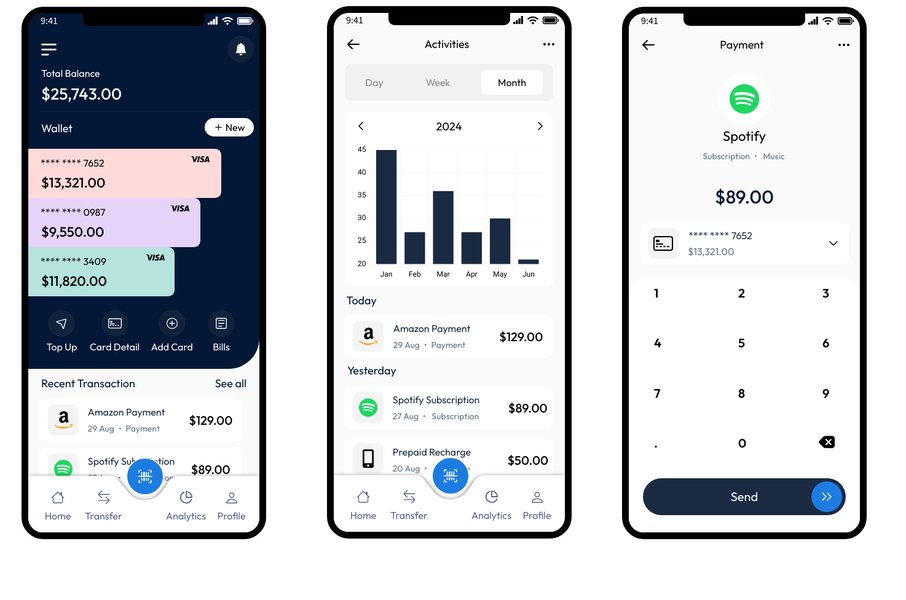
A cluttered interface overwhelms users. Adopt a minimalist approach, focusing on essential banking functions like checking balances, viewing transaction history, making transfers, and paying bills. Eliminate unnecessary visual elements and use ample white space to create a clean, uncluttered look. This reduces cognitive load, making the app feel easier and faster to use.
Intuitive Navigation
Users must be able to find what they need quickly and easily. Implement clear and logical navigation, often using familiar patterns like bottom navigation bars for core sections (Home, Transfers, Payments, Settings). Use universally understood icons and concise labels. The goal is a smooth user journey where tasks can be completed in just a few taps.
High-fidelity wireframes help visualize the app's structure and navigation flow.
Maintain Consistency Throughout
Consistency in design elements (colors, typography, icons, button styles, spacing) across all screens is crucial. It creates a sense of familiarity and predictability, reducing the learning curve and preventing user confusion. Adhering to platform-specific guidelines (iOS Human Interface Guidelines, Android Material Design) while maintaining brand identity ensures a cohesive experience across different devices.
Prioritize Security and Build Trust Visually
Seamless Security Integration
Security is non-negotiable in banking. Implement robust, multi-layered security measures such as Multi-Factor Authentication (MFA), biometric verification (fingerprint, facial recognition), and end-to-end encryption. However, these features must be integrated seamlessly into the user flow to avoid causing friction. For example, biometric login offers both high security and convenience.
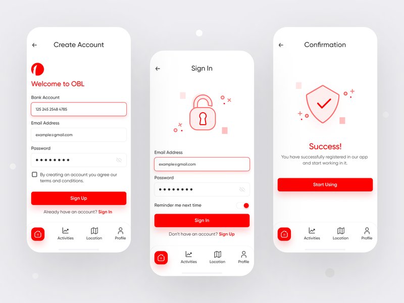
Secure and user-friendly sign-in options are crucial for building trust.
Visual Trust Indicators
Use visual cues to reassure users about the app's security. Displaying security badges, lock icons during secure sessions, and providing clear information about privacy policies builds confidence. Use calming colors, often blues and greens, which are associated with stability and trust in the financial industry.
Enhancing the User Experience
Beyond the fundamentals, several advanced practices can significantly elevate the mobile banking experience, fostering engagement and loyalty.
Leverage Personalization
Tailoring the app experience to individual user needs makes it more relevant and engaging. Allow users to customize their dashboards, highlighting accounts or metrics most important to them. Utilize user data (with explicit consent and transparency) to offer personalized financial insights, spending summaries, budget tracking, and relevant product offers. Smart, context-aware notifications (e.g., large transaction alerts, low balance warnings) add significant value.
Streamline Onboarding and Provide Guidance
The first interaction sets the tone. Design a smooth, frictionless onboarding process. Use interactive tutorials, tooltips, or progressive disclosure (revealing information gradually as needed) to guide new users through key features without overwhelming them. Clear progress indicators for multi-step processes like loan applications are also helpful.
Optimize Navigation and Task Flows
Efficient Access
Employ common mobile navigation patterns like bottom navigation bars for easy thumb reach. Include a robust search function allowing users to quickly find specific transactions, features, or help topics. Implement shortcut actions or widgets for frequently performed tasks like quick transfers or balance checks.
Customized Keyboards
Improve data entry efficiency and reduce errors by using context-specific keyboards. Display a numeric keypad for PINs, amounts, or account numbers, and an alphanumeric keyboard for names or descriptions.
Utilize Data Visualization Effectively
Complex financial data can be intimidating. Present information using clear, simple charts and graphs (e.g., pie charts for spending categories, line graphs for balance history). This makes it easier for users to understand their financial situation, track spending patterns, and monitor progress towards goals at a glance. Break down information into digestible chunks.
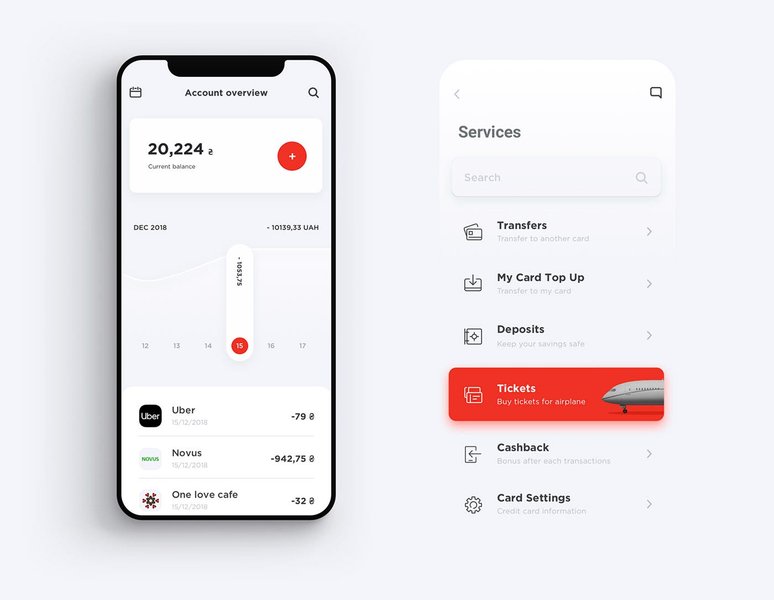
Effective data visualization helps users quickly grasp their financial standing.
Ensure Accessibility and Inclusivity
Design for everyone. Adhere to accessibility guidelines (like WCAG) by ensuring sufficient color contrast, readable font sizes (with options for adjustment), and compatibility with screen readers and other assistive technologies. Consider voice command functionality. Inclusive design broadens the app's user base and demonstrates social responsibility.
Comparative Importance of UI Design Aspects
While all best practices are important, their relative emphasis can vary based on user needs and business goals. The radar chart below provides an opinionated visualization of the typical importance assigned to key UI aspects in modern mobile banking app design.
This chart highlights the paramount importance of Security & Trust and Simplicity & Clarity, followed closely by Performance and Navigation Ease. While Personalization, Data Visualization, and Accessibility are crucial enhancers, the core foundation rests on secure, simple, and reliable operation.
Mindmap of Mobile Banking UI Best Practices
This mindmap provides a visual overview of the interconnected best practices discussed, showing how they contribute to an optimal mobile banking user interface.
Practical Implementation Summary
Translating these principles into practice requires specific design choices. The table below summarizes key practices and suggests concrete implementation strategies:
| Practice Area | Implementation Strategy | Rationale |
|---|---|---|
| Simplified UI | Prioritize core tasks (balance, transfer, pay) on the main screen. Use progressive disclosure for less frequent actions (e.g., settings, detailed reports). | Reduces cognitive load, speeds up common tasks. |
| Intuitive Navigation | Use a standard bottom navigation bar for main sections. Implement a clear visual hierarchy for information. | Ensures users can easily find features and understand information hierarchy. |
| Consistent Branding & Design | Develop and adhere to a design system with standardized colors, fonts, icons, and component styles. | Creates a cohesive, professional look and predictable user experience. |
| Seamless Security | Offer biometric login (fingerprint/face ID) as a primary option. Clearly indicate secure sessions and provide easy access to security settings. | Balances high security with user convenience and builds trust. |
| Personalization | Allow dashboard customization. Provide summaries of spending habits or savings goal progress based on user data (with consent). | Makes the app feel relevant and valuable to the individual user. |
| Data Visualization | Use simple charts (pie, bar, line) to represent financial data. Ensure charts are interactive and easy to understand. | Helps users quickly digest complex financial information. |
| Accessibility | Ensure WCAG AA compliance (contrast ratios, font sizes, screen reader compatibility). Test with users using assistive technologies. | Makes the app usable by the widest possible audience. |
| Performance | Optimize images and code for fast loading times. Provide immediate feedback for actions (e.g., loading indicators, confirmations). | Prevents user frustration caused by lag or unresponsiveness. |
| Iterative Testing | Conduct regular usability testing with target users. Collect in-app feedback and monitor analytics to identify pain points. | Ensures the design evolves based on real user needs and behavior. |
Insights from a UI Audit
Understanding how these principles apply in practice can be aided by observing critiques of existing applications. The following video provides a UI audit of a banking app, discussing design choices based on established best practices. Watching such audits can offer valuable lessons on common pitfalls and effective solutions in mobile banking UI design.
Frequently Asked Questions (FAQ)
Why is simplicity so important in banking app UI?
Simplicity is crucial because banking tasks can be complex and potentially stressful. A simple, clean interface reduces cognitive load, minimizes errors, speeds up transactions, and makes the app accessible to a wider range of users, including those less tech-savvy. It focuses the user on completing essential tasks efficiently.
How can UI design enhance security perception?
UI design enhances security perception through visual cues like lock icons, security badges, and clear indicators of encrypted sessions. Seamless integration of strong authentication methods (biometrics, MFA) without causing excessive friction builds confidence. Transparent communication about security measures and privacy policies also plays a key role in fostering user trust.
What role does personalization play in mobile banking?
Personalization makes the banking app more relevant and engaging for individual users. Features like customizable dashboards, spending insights tailored to user habits, progress tracking for financial goals, and relevant alerts or offers transform the app from a simple utility into a valuable financial companion, thereby increasing user loyalty and engagement.
Are features like dark mode necessary?
While not strictly necessary for core functionality, features like dark mode are increasingly expected by users. Dark mode can reduce eye strain, especially in low-light conditions, improve battery life on OLED screens, and cater to user aesthetic preferences. Offering such options demonstrates attention to user comfort and modern design trends.
Recommended Reading
- How does UX design impact user trust in fintech apps?
- What are the key accessibility standards mobile banking applications should follow?
- Can you show examples of effective data visualization in financial apps?
- What are the future trends in mobile banking UI design, including AI integration?
References
Last updated May 5, 2025