
Crafting a Future-Proof Logo for Novo Neurotech: From Brain Focus to Broader Horizons
A strategic guide to designing an iconic, adaptable logo that embodies innovation and your evolving medical technology brand.
Developing a compelling logo for your new app, "Novo Neurotech," is a crucial step in establishing your brand identity. Given that "Novo" is a fixed element and your initial focus is on brain-related neurotechnology with plans to expand into dental, eye care, and other medical fields, your logo needs to be both specific and remarkably versatile. This guide synthesizes expert advice to help you navigate this creative process.
Key Highlights for Your Logo Strategy
- Embrace "Novo" as the Anchor: Your fixed brand element "Novo" should be a consistent and recognizable cornerstone of the logo, regardless of technological specialization.
- Balance Specificity with Scalability: The design must initially resonate with "Neurotech" and brain-related themes but be inherently adaptable to represent future ventures into dental, ophthalmology, and other health sectors.
- Prioritize Modernity and Trust: The logo should communicate innovation, technological advancement, and the reliability expected in the medical field through clean design, appropriate color choices, and clear typography.
Foundational Pillars for Your Novo Neurotech Logo
A successful logo for Novo Neurotech will be built on a clear understanding of its core components and long-term vision. It's not just about a visually appealing mark; it's about creating a symbol that grows with your company.
The Significance of "Novo"
With "Novo" being the unchanging part of your brand, it must be treated as the primary identifier. This can be achieved through distinctive typography, a consistent color, or a unique stylistic treatment that ensures "Novo" is always the most recognizable element. Think of it as the constant in your brand's evolving equation.
Representing "Neurotech": The Current Focus
Initially, the logo needs to clearly communicate your involvement in neurotechnology. This can be achieved through:
- Stylized Brain Imagery: Abstract or minimalist representations of the brain, neural pathways, or synapses.
- Circuitry or Network Motifs: Elements that suggest technology, connectivity, and intelligence.
- Lightbulb or Spark Concepts: Symbolizing innovation and new ideas within the neuro-space.
The challenge is to make these neuro-centric symbols feel like part of a larger, adaptable system.
A concept embodying neurotechnology through brain and idea symbolism.
Designing for Future Scalability: Dental, Eyes, and Beyond
This is where strategic foresight comes into play. Your logo must be designed with future diversification in mind. Consider:
- Modular Design: A core "Novo" mark that can be paired with interchangeable icons or subtle visual cues representing different medical fields (e.g., a stylized neuron for neurotech, a hint of an eye for ophthalmology).
- Abstract Symbolism: An abstract mark that is not tied too literally to one specific body part. This symbol could represent healing, connection, innovation, or precision in a more general sense, allowing for broader application.
- Adaptable Geometric Forms: Shapes that can be subtly altered or combined to hint at different specialties without a complete logo overhaul.
Visual Elements: Crafting the Novo Neurotech Identity
The specific visual components—symbolism, color, and typography—will define the look and feel of your logo.
Symbolism and Imagery: The Visual Language
Initial Neurotech Focus
For the neurotechnology aspect, consider icons or graphical elements like:
- Stylized Neurons or Neural Networks: These directly communicate brain science and connectivity.
- Abstract Brain Silhouettes: Modern, clean outlines rather than detailed anatomical drawings.
- Interconnected Dots/Nodes: Representing data, pathways, and technological systems.
- Integration with "N": The letter "N" from "Novo" could subtly form part of the neuro-symbol, creating a cohesive unit. For instance, the pathways of a neural network could weave into or emerge from the "N".
Adaptability for Future Fields
To ensure the logo remains relevant as Novo Neurotech expands:
- Abstract Shapes: Employ versatile geometric or organic shapes that can symbolize health, innovation, or precision across different medical domains. A circle, for example, can signify unity or focus, and can be segmented or adapted.
- Unified Graphic Motif: Develop a core graphic style (e.g., line art, interconnected elements) that can be applied to different symbols (brain, tooth, eye) to maintain visual consistency.
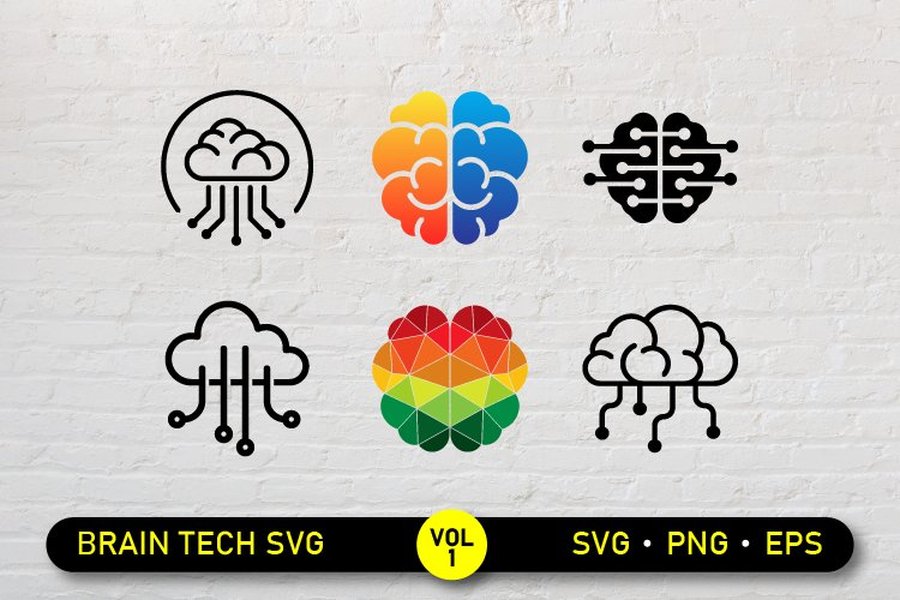
Diverse examples of brain and technology-inspired logo designs.
Color Palette: Evoking Emotion and Meaning
Colors play a significant role in perception. Your palette should reflect both the technological and healthcare aspects of your app.
- Blues and Greens: Often associated with trust, calmness, health, and technology. Shades like teal can bridge the gap between medical and tech aesthetics. Electric blue can add a futuristic feel.
- Purples: Can signify innovation, wisdom, and advanced technology, often used in neuro-related fields.
- Grays and Silvers: Convey modernity, sophistication, and a clean technological edge.
- Accent Colors: A bright, energetic accent (like a vibrant orange or yellow, or even a specific shade of red for "Novo" if differentiated enough from existing brands like Novo Nordisk) can highlight innovation or draw attention to key elements. However, if using red for "Novo," ensure the overall design is unique.
- Consistency for "Novo": Consider a stable primary color for the "Novo" wordmark to reinforce its fixed nature, while accent colors can vary subtly for different specializations.
Typography: The Voice of Your Brand
The fonts you choose will heavily influence the logo's personality.
- Modern Sans-Serif Fonts: These are typically clean, legible, and convey a contemporary, tech-savvy feel. Examples include Montserrat, Poppins, Raleway, or custom geometric typefaces.
- Hierarchy and Balance: "Novo" should likely be more prominent or stylistically distinct. "Neurotech" (and later, terms for other specialties) can be in a complementary, perhaps lighter or slightly smaller, font.
- Scalability: Ensure the typography remains clear and legible across all applications, from small app icons to larger marketing materials.
Conceptual Logo Approaches for Novo Neurotech
Here are a few conceptual directions, integrating the principles discussed:
1. The "Novo" Anchor with an Evolving Icon
This approach features a strong, consistent "Novo" wordmark. Paired with this is an icon that initially represents neurotechnology (e.g., a stylized brain or neural network). As your app expands, this icon can be swapped for, or augmented by, symbols relevant to dental or eye care, while "Novo" remains unchanged. The key is creating an iconographic system that feels cohesive.
2. The Unified Abstract Symbol
This concept relies on a more abstract, timeless symbol that subtly alludes to concepts like connection, intelligence, innovation, or precision health. This symbol wouldn't be overtly tied to any single organ. The "Novo Neurotech" name would accompany it. The abstract nature allows for broad interpretation and easy application across various medical fields without needing significant changes, only perhaps in accompanying text or subtle color shifts.
Example of an abstract logo conveying technology and clarity, suitable for healthcare.
3. The Modular "Novo" Ecosystem
Imagine "Novo" as the central sun in a solar system. Each specialty (Neurotech, Dentaltech, Ophthatech) becomes a planet with its own distinct yet related visual identifier or sub-brand styling. This could involve a consistent "Novo" logotype with a changeable descriptor and a small, unique icon for each field, all unified by a common design language (e.g., line style, color family).
Visualizing Logo Attributes: A Comparative Radar Chart
To help evaluate different conceptual directions, a radar chart can illustrate how well each concept might perform across key attributes. Below is a hypothetical comparison of the three approaches discussed. The scores (out of 5, with 5 being highest) are illustrative, reflecting potential strengths. Your final design choices would influence these. (Axis minimum set to 2 for clarity).
This chart helps visualize trade-offs: for example, a highly abstract symbol might excel in adaptability and tech feel but might score lower on immediate "neuro-focus" compared to a more literal evolving icon.
Mapping Your Logo Strategy: Core Considerations
A mindmap can help organize the various facets involved in your logo design strategy. It visually lays out the interconnected elements from brand identity to specific design choices and desired attributes.
(Fixed Anchor)"] id1b["**Neurotech**
(Initial Focus: Brain)"] id1c["**Future Expansion**
(Dental, Eyes, etc.)"] id2["Design Pillars"] id2a["Symbolism & Imagery"] id2a1["Brain/Neural Motifs"] id2a2["Abstract Concepts"] id2a3["'N' Integration"] id2b["Color Palette"] id2b1["Tech & Health Hues"] id2b2["Consistency & Adaptability"] id2c["Typography"] id2c1["Modern & Legible Fonts"] id2c2["Brand Hierarchy"] id3["Key Logo Attributes"] id3a["Versatility & Scalability"] id3b["Memorability & Uniqueness"] id3c["Modern & Innovative Feel"] id3d["Clarity of Message"] id4["Conceptual Approaches"] id4a["Icon + Wordmark (Evolving)"] id4b["Abstract Unified Symbol"] id4c["Modular Ecosystem"]
This mindmap provides a holistic overview, ensuring all critical aspects are considered during the design process, from the fundamental brand identity components to the practical application of design elements and overarching strategic goals.
Comparing Key Design Element Choices
The following table summarizes considerations for the core visual elements of your Novo Neurotech logo, particularly focusing on their impact on current needs and future adaptability.
| Element | Considerations for Novo Neurotech (Initial Focus) | Impact on Future Expansion (Dental, Eyes, etc.) |
|---|---|---|
| Symbolism/Iconography | Clear representation of brain/neuroscience (e.g., stylized brain, neural network, abstract 'N' integration). Conveys innovation and intelligence. | Needs a modular system (swappable icons) or an abstract form general enough to encompass various medical fields without feeling out of place. Goal is thematic consistency. |
| Color Palette | Blues, teals, purples for tech/neuro feel. Grays/silvers for modernity. Potential distinct color for "Novo" to anchor it. Must convey trust and professionalism. | Core "Novo" color should remain consistent. Accent colors can be adapted per specialty (e.g., different highlight color for dental vs. eye care applications) while maintaining overall brand harmony. |
| Typography | Modern, clean, sans-serif fonts. "Novo" should be prominent and legible. "Neurotech" to be clear and complementary. Overall tech-savvy appearance. | The "Novo" typeface remains the constant, reinforcing brand recognition. The descriptor ("Neurotech," "Dentaltech," etc.) can use a consistent secondary font or have slight stylistic variations appropriate for each field. |
| Overall Style | Flat design, minimalist, potentially with subtle gradients or effects to suggest technology. Should be clean and uncluttered for app icon visibility. | Maintain the core aesthetic (e.g., minimalist, futuristic) across all brand extensions. The challenge is to allow for thematic nuances per specialty without fragmenting the brand's visual identity. |
Understanding Logo Impact: Insights from Neuromarketing
The way your logo is perceived can significantly influence user engagement and brand recall. Neuromarketing principles study how design elements trigger emotional and cognitive responses. While your app is in neurotech, understanding how users psychologically connect with visual branding is universally beneficial.
The following video discusses examples of neuromarketing, which can offer valuable perspectives on creating a logo that resonates deeply with your target audience by considering factors beyond simple aesthetics, such as emotional impact and cognitive ease.
Considering these principles can help in selecting shapes, colors, and compositions that not only look good but also effectively communicate your brand's values of innovation, trust, and advanced healthcare technology for Novo Neurotech.
Frequently Asked Questions (FAQ)
How can I ensure the "Novo" part of my logo remains prominent yet allows for future specialization?
Make "Novo" the most visually stable and dominant part of your logo through consistent typography, size, or color. Future specializations (Neurotech, Dental, Eyes) can be indicated by secondary text, an interchangeable icon system, or adaptable accent colors/graphics that complement the core "Novo" mark without overshadowing it. A strong, unique font for "Novo" can also help it stand out.
What color palettes are most effective for a neurotech app that also needs to convey trust and medical professionalism?
Blues and greens are excellent choices as they evoke trust, calmness, health, and technology. Shades like teal, deep blue, or even a sophisticated purple can reflect innovation in neurotech. Pair these with neutrals like white, gray, or silver for a modern, clean, and professional look. An energetic accent color can be used sparingly to highlight key elements or convey dynamism.
What are some common pitfalls to avoid when designing a logo for a tech startup with plans for expansion?
Common pitfalls include:
- Being too literal or specific initially: A logo tightly bound to one niche (e.g., a very detailed brain) can be hard to adapt.
- Overly complex designs: These don't scale well, especially for app icons, and can look dated quickly.
- Trendy elements: Chasing current design fads can make your logo feel obsolete sooner. Aim for timelessness.
- Poor typography choices: Illegible or inappropriate fonts can undermine credibility.
- Not considering scalability: The logo must work in various sizes and formats, from tiny favicons to large banners.
How can abstract symbolism be used effectively to represent neurotechnology initially, while being broad enough for future medical fields?
Abstract symbols can represent core concepts like connection (interlocking shapes, networks), innovation (dynamic forms, light motifs), precision (geometric elements), or holistic health (circular or encompassing shapes). For neurotech, an abstract symbol might suggest neural pathways or cognitive processes without being a literal brain. Its ambiguity allows it to seamlessly represent other medical fields later, as its meaning is shaped by the brand context rather than a literal depiction.
Should I prioritize a very literal brain symbol now, or opt for something more versatile from the start?
While a literal brain symbol clearly communicates your current neurotech focus, it can limit future adaptability. A more versatile approach is often better for long-term branding. Consider a stylized or abstract representation of neuro-concepts that can evolve or be part of a modular system. This allows you to establish your current niche while building in flexibility for when you expand into dental, eye care, or other areas. The key is finding a balance that is clear now but not restrictive later.
Recommended Further Exploration
To deepen your understanding and inspire your logo design process, consider exploring these related queries:
- How to design a modular logo system for a multi-specialty healthcare brand?
- What are the best color psychology principles for technology and medical app logos?
- Examples of successful abstract logos in the healthcare technology sector.
- Typography trends for modern app logos that convey innovation and trust.
References
The insights and examples provided are informed by practices seen in the branding of technology and healthcare organizations. For further inspiration, you may find these resources useful:
Last updated May 14, 2025