
Unlock Data Insights: Your Full Power BI Beginner's Journey & Guide to Futuristic Report Design
Master Microsoft Power BI from scratch and learn to craft visually stunning, modern reports that captivate and inform.
Essential Insights: Your Power BI Launchpad
- Comprehensive Toolset: Power BI offers an end-to-end solution from data connection and transformation to interactive visualization and collaborative sharing.
- Data Transformation is Key: Leveraging Power Query Editor to clean and shape your data is crucial for accurate and meaningful insights.
- Design Elevates Data: Applying thoughtful design principles, including modern color schemes and layouts, can significantly enhance the impact and readability of your reports.
Embarking on Your Power BI Adventure: A Beginner's Tutorial
Microsoft Power BI is a dominant force in the realm of business intelligence, empowering users to transform raw data into actionable insights through interactive dashboards and reports. This tutorial will guide you through the fundamental steps to get started and build your first report.
Part 1: Understanding the Power BI Ecosystem
Power BI is not a single application but a suite of tools that work together:
- Power BI Desktop: A free Windows application used to connect to data, transform it, create data models, and design reports with rich visualizations. This is where most of your development work will happen.
- Power BI Service: A cloud-based service (SaaS - Software as a Service) where you can publish reports created in Power BI Desktop. It enables sharing, collaboration, and the creation of dashboards from one or more reports.
- Power BI Mobile Apps: Available for iOS, Android, and Windows devices, these apps allow users to view and interact with reports and dashboards on the go.
Why Choose Power BI? It connects to a vast array of data sources, features a powerful data transformation engine (Power Query), enables the creation of visually engaging and interactive reports, and facilitates easy sharing and collaboration across your organization.
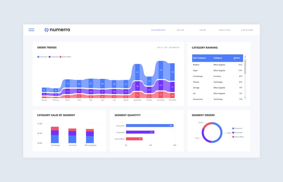
A clean and effective Power BI report design.
Part 2: Getting Started with Power BI Desktop
Step 1: Download and Install
Your first step is to get Power BI Desktop. You can download it for free from the official Microsoft Power BI website or the Microsoft Store. Once downloaded, run the installer and follow the on-screen prompts.
Step 2: Familiarizing Yourself with the Interface
Upon launching Power BI Desktop, you'll encounter a clean interface. Key areas include:
- Report View: This is your canvas for designing reports by adding visualizations.
- Data View: Allows you to inspect, explore, and understand the data loaded into your model.
- Model View: Here, you can manage relationships between different data tables, crucial for complex data analysis.
- Ribbon: Contains tabs like Home, View, and Modeling, providing access to various tools and commands.
- Panes:
- Fields Pane: Lists all available tables and their columns (fields) for use in visualizations.
- Visualizations Pane: Offers a selection of chart types and formatting options.
- Filters Pane: Allows you to apply filters at the visual, page, or report level.
Part 3: Connecting to Data Sources
Power BI can connect to hundreds of data sources, including files (Excel, CSV, XML, JSON), databases (SQL Server, MySQL, PostgreSQL, Oracle), cloud services (Azure SQL Database, SharePoint, Salesforce), and web content.
How to Connect:
- On the Home tab in Power BI Desktop, click Get Data.
- A dialog box will appear, showcasing various data source categories. Select the type of data source you want to connect to (e.g., "Excel Workbook," "SQL Server database," or "Web"). For a comprehensive list, click "More...".
- Follow the prompts specific to your chosen data source. This might involve browsing for a file, entering server details and credentials, or providing a URL.
- Once connected, the Navigator window will appear, allowing you to preview and select the tables or data elements you wish to import.
Part 4: Transforming and Cleaning Data with Power Query Editor
Often, your raw data isn't ready for analysis. It might contain errors, missing values, or require restructuring. Power Query Editor is Power BI's built-in tool for these Extract, Transform, Load (ETL) operations.
Accessing Power Query Editor:
After selecting your data in the Navigator, you can click Transform Data (instead of Load) to open Power Query Editor. If you've already loaded data, you can access it by clicking Transform Data on the Home tab of Power BI Desktop.
Common Data Transformations:
Power Query Editor allows for a multitude of transformations. Below are some of the most frequently used operations for beginners:
| Transformation Task | Description | Typical Scenario |
|---|---|---|
| Remove Columns | Delete unnecessary columns from a table. | Removing columns that are not relevant for the analysis to simplify the dataset. |
| Change Data Types | Convert columns to appropriate data types (e.g., text, number, date). | Ensuring a 'Date' column is recognized as a date for time-based calculations, or 'Sales' as a number for aggregations. |
| Filter Rows | Remove rows based on specified criteria. | Excluding entries with missing values or focusing on data from a specific region or time period. |
| Replace Values | Find and replace specific values within a column. | Correcting typos, standardizing terminology (e.g., replacing "USA" with "United States"). |
| Split Column | Divide a column into multiple columns based on a delimiter or number of characters. | Splitting a 'Full Name' column into 'First Name' and 'Last Name'. |
| Merge Queries | Combine two tables based on a common column (similar to a SQL JOIN). | Adding product details from a 'Products' table to a 'Sales' table using 'ProductID'. |
| Append Queries | Stack rows from two or more tables that have the same columns. | Combining monthly sales data from separate tables into a single consolidated table. |
| Create Conditional Columns | Add a new column whose values are determined by if/then/else logic applied to other columns. | Categorizing sales as 'High', 'Medium', or 'Low' based on the 'Sales Amount' column. |
After completing your transformations, click Close & Apply on the Home tab in Power Query Editor to load the cleaned data into your Power BI model.
Part 5: Data Modeling
Data modeling involves structuring your data for optimal analysis and performance. This primarily means defining relationships between your tables and creating custom calculations.
Creating Relationships:
If you've imported multiple tables, you'll need to establish how they relate to each other. For example, a 'Sales' table might relate to a 'Products' table via a 'ProductID' column. Power BI often automatically detects relationships, but you can manage them manually in the Model View. Drag a field from one table to the corresponding field in another to create a relationship.
Introduction to DAX (Data Analysis Expressions):
DAX is a formula language used to create calculated columns, measures, and tables in Power BI. It's similar to Excel formulas but more powerful for data analysis.
- Calculated Columns: These add a new column to an existing table. The calculation is performed row by row. Example: Creating a 'Profit' column by subtracting 'Total Cost' from 'Total Revenue'.
Profit = Sales[Revenue] - Sales[Cost] - Measures: These are dynamic calculations whose results change depending on the context (e.g., filters applied in a report). Measures are used in visualizations. Example: Calculating total sales.
Total Sales = SUM(Sales[SalesAmount])
You can create new measures and calculated columns from the Modeling tab in Power BI Desktop.
Part 6: Creating Visualizations and Reports
This is where your data comes to life. In the Report View, you'll build interactive reports.
- Choose a Visual: Select a visualization type (e.g., bar chart, line chart, pie chart, map, table) from the Visualizations pane.
- Add Data: Drag fields from the Fields pane into the appropriate wells of the selected visual (e.g., Axis, Legend, Values).
- Format Visuals: Customize the appearance (colors, titles, labels, fonts, backgrounds) using the options under the "Format your visual" tab in the Visualizations pane.
- Add Pages: Reports can have multiple pages. Add new pages using the '+' tab at the bottom of the canvas.
- Use Filters and Slicers:
- Filters: Drag fields to the Filters pane to filter data at the visual, page, or report level.
- Slicers: Add slicer visuals to the canvas to provide interactive on-page filtering for users.
A helpful video tutorial for Power BI beginners by Kevin Stratvert, covering basics of creating visualizations and reports.
Part 7: Publishing and Sharing
Once your report is complete, you'll want to share it with others.
- Publish to Power BI Service: On the Home tab in Power BI Desktop, click Publish. You'll be prompted to sign in to your Power BI account and select a workspace.
- Create Dashboards (in Power BI Service): Dashboards are single-page canvases that display key visualizations (tiles) from one or more reports. In the Power BI Service, you can pin visuals from your published reports to a new or existing dashboard.
- Share: You can share reports and dashboards with colleagues, set up scheduled refreshes for your data, and manage access permissions.
Elevating Your Reports: Crafting a Futuristic Aesthetic
Beyond functionality, the visual appeal of your Power BI reports can significantly enhance user engagement and comprehension. A "futuristic" design often implies sleek, modern, and technologically advanced aesthetics. Here’s how to infuse this into your reports, both within Power BI and if you were to export them as a PDF.
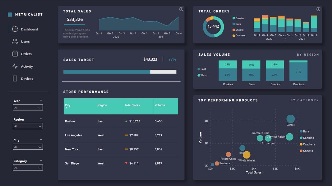
Example of a Power BI dark mode wireframe, embodying a modern, futuristic look.
Core Principles for a Futuristic Design
Color Schemes: The Foundation of Mood
- Dark Themes: A popular choice for a futuristic feel. Think deep grays (e.g.,
#121212,#212121) or near-blacks as your canvas background. - Vibrant Accents: Contrast the dark background with bright, neon-like accent colors. Electric blues (e.g.,
#00B0FF,#00FFFF), luminous greens (e.g.,#00FFAB,#39FF14), or sharp purples/pinks (e.g.,#FF4081,#DA70D6) work well for charts, highlights, and key metrics. - Consistency: Use a limited palette (2-3 main colors plus neutrals like light gray
#E0E0E0for text) consistently throughout your report. Power BI allows you to import custom JSON themes for precise color control.
Typography: Clean and Modern
- Sans-Serif Fonts: Opt for clean, geometric, or slightly condensed sans-serif fonts. Examples include Segoe UI (default in Power BI), Roboto, Montserrat, Open Sans, or Futura.
- Hierarchy: Use different font weights (bold, semi-bold, regular, light) and sizes to establish a clear visual hierarchy for titles, subtitles, body text, and labels.
- Readability: Ensure sufficient contrast between text color and background. Light gray or white text on a dark background is common in futuristic UIs.
Layout and Spacing: Order and Clarity
- Minimalism: Avoid clutter. Every element should serve a purpose. "Less is more" is a key tenet.
- Grid Systems: Align visuals and text elements to an underlying grid for a structured and professional look. Power BI has alignment tools to help.
- Ample White Space (or "Dark Space"): Generous spacing between elements makes the report feel less crowded and more refined, guiding the user's eye.
- Card Layouts: Consider using cards or distinct bordered sections for key performance indicators (KPIs) or individual charts to create a modular, organized appearance.
Visual Elements and Effects: Subtle Enhancements
- Icons: Use simple, modern, and consistent iconography (e.g., line icons) to complement text or represent actions/categories.
- Subtle Gradients & Shadows: If used sparingly, subtle gradients in backgrounds or soft shadows under elements can add depth. Avoid overly complex or skeuomorphic designs.
- Geometric Shapes: Incorporate simple lines, borders, or background geometric patterns (low opacity) to add visual interest without distracting from the data.
- Custom Visuals: Explore the Power BI custom visuals marketplace (AppSource) for unique chart types or elements that might offer a more modern aesthetic than standard visuals.
Applying in Power BI & PDF Export
- Power BI Themes: Create or import a custom JSON theme file to define your color palette, fonts, and default visual settings. This ensures consistency across your report.
- Backgrounds: Set a dark background for your report pages. You can use a solid color or a subtle image.
- Formatting Panes: Utilize the extensive formatting options for each visual to apply your chosen colors, fonts, and styles.
- PDF Export: When exporting to PDF from Power BI (File > Export > Export to PDF), these design choices will be preserved. If further PDF customization is needed (e.g., for a tutorial document itself), tools like Adobe Acrobat or Canva can be used to apply these futuristic design principles to the PDF layout, adding headers, footers, and typographic styling consistent with the theme.
Interactive Elements: Enhancing Your Understanding
Power BI Beginner Workflow Mindmap
This mindmap illustrates the typical journey a beginner takes when learning and using Power BI, from initial setup to sharing insightful reports. It helps visualize the interconnected stages involved in transforming raw data into compelling narratives.
(Report, Data, Model Views)"] id2["2. Data Acquisition"] id2_1["Identify Data Sources
(Excel, DBs, Web, etc.)"] id2_2["Connect to Data using 'Get Data'"] id2_3["Navigate & Select Data"] id3["3. Data Transformation (Power Query)"] id3_1["Open Power Query Editor"] id3_2["Clean Data
(Remove Errors, Handle Missing Values)"] id3_3["Shape Data
(Filter, Sort, Group, Pivot/Unpivot)"] id3_4["Combine Data
(Merge, Append Queries)"] id3_5["Close & Apply"] id4["4. Data Modeling"] id4_1["Create Relationships between Tables"] id4_2["Understand Cardinality & Cross-filter Direction"] id4_3["Introduce DAX
(Calculated Columns & Measures)"] id5["5. Visualization & Report Building"] id5_1["Select Visual Types"] id5_2["Drag & Drop Fields"] id5_3["Format Visuals
(Colors, Labels, Titles)"] id5_4["Add Filters & Slicers"] id5_5["Organize with Multiple Pages"] id6["6. Publishing & Sharing"] id6_1["Publish to Power BI Service"] id6_2["Create Dashboards"] id6_3["Share with Colleagues"] id6_4["Set up Data Refresh"] id7["7. Enhancing Design (Futuristic Focus)"] id7_1["Apply Dark Themes & Neon Accents"] id7_2["Use Modern Typography"] id7_3["Ensure Clean Layout & Spacing"] id7_4["Incorporate Subtle Icons & Graphics"]
Key Factors for a Futuristic Power BI Report Aesthetic
This radar chart visualizes key elements to consider when aiming for a futuristic design in your Power BI reports. Each axis represents a design aspect, with values indicating the level of emphasis or skill required to achieve a high-impact, modern look. Striving for a balance across these factors can lead to truly compelling and forward-looking reports.
Frequently Asked Questions (FAQ)
Recommended Next Steps
Continue your learning journey with these related explorations:
- How can I use advanced DAX formulas for complex financial analysis in Power BI?
- What are the best practices for optimizing Power BI report performance when dealing with very large datasets?
- Can you provide a tutorial on creating custom themes and layouts in Power BI using JSON files?
- How can Power BI be effectively integrated with other Microsoft services like Azure Synapse Analytics or SharePoint Online?
References
Last updated May 8, 2025