
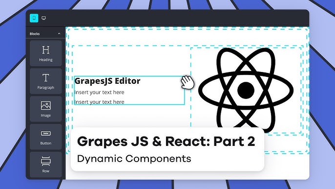
使用React实现带富文本工具栏和可拖拽编辑区域的组件
构建动态交互界面,提升用户体验的全面指南
关键要点
- 选择合适的拖拽库:根据需求评估不同拖拽库的优缺点,以实现最佳的用户交互。
- 组件结构设计:明确工具栏与编辑区域的层级关系,确保组件的可维护性和扩展性。
- 状态管理与性能优化:有效管理组件状态,优化渲染性能,提升整体应用的响应速度。
技术栈选择
核心库与工具
为了实现一个包含富文本编辑工具栏和可拖拽子组件的React组件,以下是推荐的核心库与工具:
- React:构建用户界面的基础库。
- 富文本编辑器库:如
react-quill或draft-js,用于实现工具栏功能。 - 拖拽库:包括
react-dnd、react-beautiful-dnd和dnd-kit,用于实现子组件的拖拽功能。 - 状态管理:如
useState或Redux,用于管理组件的状态。 - 样式方案:使用CSS、Sass或CSS-in-JS解决方案(如
styled-components)进行样式设计。
组件结构设计
层次化的组件架构
设计一个清晰的组件结构对于维护和扩展至关重要。建议将整体组件划分为以下几个子组件:
1. 工具栏组件
负责呈现富文本编辑器的工具按钮,如字体选择、加粗、斜体等功能。
2. 编辑区域组件
作为容器,承载并管理所有可拖拽的子组件。
3. 子组件
具体的可拖拽内容模块,可以是文本框、图像或其他可视化元素。
实现富文本编辑器工具栏
选择和集成富文本编辑器
富文本编辑器是实现工具栏功能的关键。常用的React集成富文本编辑器包括:
-
React Quill: 基于Quill的React封装,易于使用,功能丰富。
-
Draft.js: 由Facebook开发,具有高度的可定制性,适合复杂需求。
集成示例
{`import React, { useState } from 'react';
import ReactQuill from 'react-quill';
import 'react-quill/dist/quill.snow.css';

const Toolbar = ({ onContentChange }) => {
  const [content, setContent] = useState('');

  const handleChange = (value) => {
    setContent(value);
    onContentChange(value);
  };

  const modules = {
    toolbar: [
      [{ header: [1, 2, false] }],
      ['bold', 'italic', 'underline', 'strike', 'blockquote'],
      [{ list: 'ordered' }, { list: 'bullet' }],
      ['link', 'image'],
      ['clean']
    ],
  };

  return (
    <ReactQuill
      theme="snow"
      value={content}
      onChange={handleChange}
      modules={modules}
      style={{ height: '50px' }}
    />
  );
};

export default Toolbar;`}
实现子组件的拖拽功能
选择适合的拖拽库
| 拖拽库 | 特点 | 适用场景 |
|---|---|---|
| react-dnd | 高度灵活,支持复杂拖拽逻辑 | 需要自定义拖拽行为的复杂应用 |
| react-beautiful-dnd | 专注于列表拖拽,提供流畅的拖拽体验 | 主要用于列表或卡片的拖拽排序 |
| dnd-kit | 现代化,性能优化,易于扩展 | 适用于需要高度定制的拖拽应用 |
| react-draggable | 简单易用,适合基础拖拽需求 | 需要基础拖拽功能的项目 |
集成示例:使用 react-draggable
以下示例展示了如何使用 react-draggable 实现子组件的拖拽功能:
{`import React, { useState } from 'react';
import Draggable from 'react-draggable';

const DraggableItem = ({ id, children }) => {
  const [position, setPosition] = useState({ x: 0, y: 0 });

  const handleStop = (e, data) => {
    setPosition({ x: data.x, y: data.y });
  };

  return (
    <Draggable
      position={position}
      onStop={handleStop}
    >
      <div style={{
        border: '1px solid #ccc',
        padding: '10px',
        background: '#fff',
        cursor: 'move',
        position: 'absolute'
      }}>
        {children}
      </div>
    </Draggable>
  );
};

export default DraggableItem;`}
管理组件状态
使用 React Hooks 管理状态
通过 useState 钩子管理编辑区域内子组件的状态,包括它们的内容和位置:
{`import React, { useState } from 'react';
import Toolbar from './Toolbar';
import DraggableItem from './DraggableItem';

const Editor = () => {
  const [components, setComponents] = useState([]);

  const addComponent = () => {
    const newComponent = {
      id: Date.now(),
      content: '新组件',
      position: { x: 100, y: 100 }
    };
    setComponents([...components, newComponent]);
  };

  const updatePosition = (id, position) => {
    setComponents(components.map(comp => comp.id === id ? { ...comp, position } : comp));
  };

  return (
    <div>
      <Toolbar onContentChange={/* 处理内容变化 */} />
      <button onClick={addComponent}>添加组件</button>
      <div style={{ position: 'relative', width: '100%', height: '80vh', border: '1px solid #e5e5e5' }}>
        {components.map(comp => (
          <DraggableItem
            key={comp.id}
            id={comp.id}
            initialPosition={comp.position}
            onStop={(e, data) => updatePosition(comp.id, { x: data.x, y: data.y })}
          >
            {comp.content}
          </DraggableItem>
        ))}
      </div>
    </div>
  );
};

export default Editor;`}
样式与布局
设计响应式布局
确保编辑区域和子组件在不同设备和屏幕尺寸下均能良好显示。使用Flexbox或CSS Grid进行布局设计:
{`.editor-container {
  display: flex;
  flex-direction: column;
  height: 100vh;
}

.toolbar {
  flex: 0 0 60px;
  background-color: #f7f7f7;
  border-bottom: 1px solid #e5e5e5;
  display: flex;
  align-items: center;
  padding: 0 10px;
}

.canvas {
  flex: 1;
  position: relative;
  background-color: #fafafa;
  overflow: auto;
}

.draggable-item {
  position: absolute;
  border: 1px solid #ccc;
  background: #fff;
  padding: 10px;
  cursor: move;
}`}
美化工具栏与子组件
通过CSS或CSS-in-JS添加样式,使工具栏和子组件更加美观和用户友好:
{`.toolbar button {
  margin-right: 10px;
  padding: 5px 10px;
  background-color: #388278;
  color: #fff;
  border: none;
  cursor: pointer;
}

.toolbar button:hover {
  background-color: #2e6e66;
}

.draggable-item:hover {
  box-shadow: 0 0 10px rgba(0,0,0,0.1);
}`}
性能优化与用户体验
优化渲染性能
避免不必要的重新渲染,通过React.memo或useCallback优化组件:
{`import React, { memo } from 'react';

const DraggableItem = memo(({ id, children, onStop }) => {
  // 组件内容
});`}
提升用户交互体验
添加拖拽动画、视觉反馈以及响应式设计,提升整体的用户体验:
{`.draggable-item {
  transition: transform 0.2s ease;
}

.draggable-item:active {
  opacity: 0.8;
}`}
完整代码示例
综合实现
{`import React, { useState } from 'react';
import ReactQuill from 'react-quill';
import Draggable from 'react-draggable';
import 'react-quill/dist/quill.snow.css';
import './Editor.css';

const Toolbar = ({ onContentChange }) => {
  const [content, setContent] = useState('');

  const handleChange = (value) => {
    setContent(value);
    onContentChange(value);
  };

  const modules = {
    toolbar: [
      [{ header: [1, 2, false] }],
      ['bold', 'italic', 'underline', 'strike', 'blockquote'],
      [{ list: 'ordered' }, { list: 'bullet' }],
      ['link', 'image'],
      ['clean']
    ],
  };

  return (
    <ReactQuill
      theme="snow"
      value={content}
      onChange={handleChange}
      modules={modules}
      style={{ height: '50px' }}
    />
  );
};

const DraggableItem = ({ id, children, initialPosition, onStop }) => {
  const [position, setPosition] = useState(initialPosition);

  const handleStop = (e, data) => {
    setPosition({ x: data.x, y: data.y });
    onStop(id, { x: data.x, y: data.y });
  };

  return (
    <Draggable
      position={position}
      onStop={handleStop}
    >
      <div className="draggable-item">
        {children}
      </div>
    </Draggable>
  );
};

const Editor = () => {
  const [components, setComponents] = useState([]);

  const addComponent = () => {
    const newComponent = {
      id: Date.now(),
      content: '新组件',
      position: { x: 100, y: 100 }
    };
    setComponents([...components, newComponent]);
  };

  const updatePosition = (id, position) => {
    setComponents(components.map(comp => comp.id === id ? { ...comp, position } : comp));
  };

  return (
    <div className="editor-container">
      <Toolbar onContentChange={(content) => console.log(content)} />
      <div className="toolbar">
        <button onClick={addComponent}>添加组件</button>
      </div>
      <div className="canvas">
        {components.map(comp => (
          <DraggableItem
            key={comp.id}
            id={comp.id}
            initialPosition={comp.position}
            onStop={updatePosition}
          >
            {comp.content}
          </DraggableItem>
        ))}
      </div>
    </div>
  );
};

export default Editor;`}
结论
通过合理选择React生态系统中的富文本编辑器和拖拽库,设计清晰的组件结构,并结合有效的状态管理与性能优化策略,可以构建一个功能丰富、用户友好的编辑组件。该组件不仅具备灵活的内容编辑能力,还能实现子组件的自由拖拽,极大地提升了用户的交互体验和操作效率。
参考资料
Last updated February 10, 2025
Ask Ithy AI
Download Article
Delete Article