
Mastering Responsive Web Design: Best Practices for Grid Layouts
Unlock the secrets to creating flexible, adaptive, and visually stunning websites that look perfect on any device using grid systems.
Key Highlights for Responsive Grid Mastery
- Embrace Fluidity: Prioritize flexible units like percentages,
fr, andminmax()over fixed pixel values for columns and gutters to ensure layouts adapt seamlessly to varying screen sizes. - Mobile-First Strategy: Design starting from the smallest screen (mobile) and progressively enhance the layout for larger viewports (tablets, desktops) using breakpoints.
- Leverage CSS Grid & Flexbox: Combine the power of CSS Grid for overall page structure (rows and columns) with Flexbox for aligning items within grid containers or for simpler one-dimensional layouts.
Understanding the Anatomy of a Responsive Grid
A responsive grid provides the foundational structure for organizing content on a webpage, ensuring consistency and adaptability across different devices. It primarily consists of three core components:
- Columns: These are the vertical blocks that hold your content. The number of columns often varies depending on the screen size, with 12 columns being a common standard for desktops due to its divisibility, allowing for flexible content arrangements (e.g., halves, thirds, fourths).
- Gutters: These are the spaces *between* columns. Gutters create visual separation and prevent content elements from running together, contributing to readability and a clean aesthetic. Gutter widths can be fixed or responsive, often scaling proportionally with the screen size.
- Margins: These are the spaces around the outer edges of the grid container, separating the main content area from the browser window edges. Margins ensure content doesn't touch the screen edges, particularly important on smaller devices.
Understanding how these components interact is crucial for building effective responsive layouts.
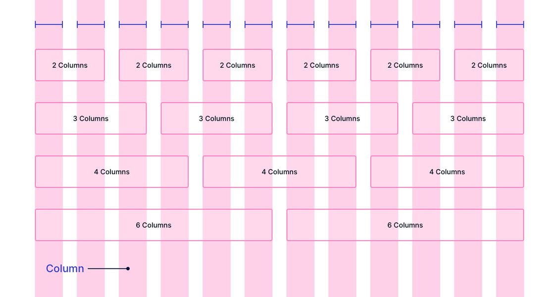
Visual representation of grid columns, gutters, and margins.
Core Principles for Responsive Grid Design
Building truly responsive layouts requires adhering to several key principles that ensure flexibility, consistency, and optimal user experience across all devices.
Adopt a Mobile-First Strategy
Designing mobile-first means creating the initial layout for the smallest screen size and then progressively adding complexity and columns as screen real estate increases. This approach offers several advantages:
- Prioritizes Content: Forces designers to focus on essential content and functionality for the most constrained environment.
- Performance Benefits: Mobile users often have slower connections; starting simple ensures faster load times.
- Scalability: It's generally easier to scale a simple layout up than to simplify a complex desktop layout down.
Start with a single-column layout for mobile, then use media queries to introduce multi-column layouts (e.g., 4, 8, or 12 columns) at tablet and desktop breakpoints.
Embrace Fluidity with Flexible Units
Avoid fixed pixel widths for grid components whenever possible. Instead, use relative and flexible units:
- Percentages (
%): Useful for defining widths relative to the parent container. - Fractional Units (
fr): Specific to CSS Grid, thefrunit represents a fraction of the available space in the grid container. This is highly effective for distributing space proportionally among columns. minmax()Function: Also used with CSS Grid,minmax(min, max)defines a size range. This allows columns to be flexible but prevents them from becoming too narrow or too wide (e.g.,minmax(150px, 1fr)ensures a column is at least 150px wide but can grow to fill available space).- Viewport Units (
vw,vh): Define sizes relative to the viewport's width or height. - Relative Font Units (
rem,em): Useful for setting gutters and margins that scale with the base font size, aiding accessibility.
Using these units ensures that your grid and its contents resize smoothly as the viewport changes.
Leverage CSS Grid and Flexbox Together
Modern web layout relies heavily on both CSS Grid and Flexbox, often used in combination:
- CSS Grid: Ideal for two-dimensional layouts – managing both rows and columns simultaneously. Use it for the overall page structure, defining the main content areas, sidebars, headers, and footers.
- Flexbox: Best suited for one-dimensional layouts – arranging items along a single row or column. Use it for aligning items *within* a grid cell (e.g., vertically centering content, distributing navigation links) or for components like button groups or form elements.
Combining display: grid for the macro layout and display: flex for micro-level alignment within grid items provides precise control and flexibility.
Implement a Consistent Column System
While grids can have any number of columns, a consistent system aids design and development. The **12-column grid** is a widely adopted standard because 12 is highly divisible (by 2, 3, 4, 6), allowing for versatile layouts:
- Desktop (Large Screens): Typically use all 12 columns. Content blocks can span 2, 3, 4, 6, or 12 columns.
- Tablet (Medium Screens): Often adapt to an 8-column grid.
- Mobile (Small Screens): Commonly use a 4-column grid or stack elements into a single column.
Frameworks like Material Design advocate for such adaptive systems (e.g., 12-8-4 columns), adjusting column counts, gutters, and margins at defined breakpoints.
Master Gutters and Margins
Gutters and margins are essential for creating visual rhythm and separation:
- Gutters: Ensure consistent spacing *between* columns. Gutter widths should ideally be consistent across a breakpoint but can adapt at different breakpoints (e.g., smaller gutters on mobile, larger on desktop). Use the
gap,column-gap, androw-gapproperties in CSS Grid. - Margins: Provide breathing room around the entire grid container. Margins prevent content from hitting the screen edges and help center the layout. Like gutters, margins should adapt across breakpoints.
Using relative units (rem, em) or responsive values for gutters and margins helps maintain proportionality.
Define Smart Breakpoints
Breakpoints are the specific viewport widths at which your layout adapts. Instead of targeting specific devices (which change constantly), define breakpoints based on where your *content* starts to break or look awkward.
- Use CSS **Media Queries** (
@media) to apply different grid styles at different viewport widths. - Common starting points for breakpoints might be around 320px (small mobile), 600px (large mobile/small tablet), 768px (tablet), 1024px (small desktop), and 1200px+ (large desktop).
- Adjust column counts, gutter sizes, margin sizes, and even font sizes at these breakpoints to optimize the layout for each context.
Content Placement and Structure
How you place content within the grid is as important as the grid structure itself.
Organize Content Within Columns
Keep Content Contained
Elements should primarily reside *within* the boundaries of columns. This maintains the alignment and structure provided by the grid.
Avoid Using Columns for Spacing
Use Gutters and Padding Correctly
Never leave columns empty simply to create space between elements. Use gutters (via the gap property) for inter-column spacing and CSS padding or margin properties *inside* grid items for spacing within or around content blocks. Using columns for spacing breaks the grid's semantic structure and can lead to alignment issues.
Allow Elements to Span Columns
Achieving Layout Variation
Grids become powerful when elements span multiple columns. Use CSS Grid's grid-column property (e.g., grid-column: span 3; or grid-column: 2 / 5;) to make elements occupy the width of several columns. This is essential for creating varied layouts with elements of different widths (e.g., a wide hero image spanning 12 columns, followed by three content blocks each spanning 4 columns).
Control Vertical Flow
Managing Rows
While columns are often the primary focus, managing rows is also important. Use grid-auto-rows or specific grid-template-rows definitions to control row heights. Often, setting rows to auto or using minmax() for row heights allows content to determine the row size, which is beneficial for responsiveness when content length varies.
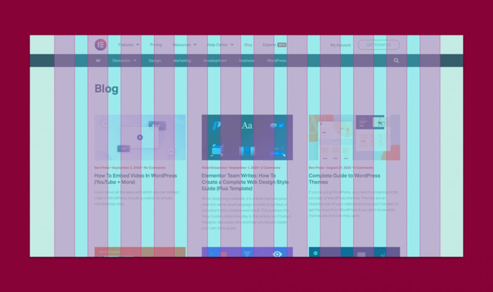
Example of a multi-column layout achieved using a grid system.
Visualizing Grid Concepts
This mindmap provides a visual summary of the core concepts and best practices involved in responsive grid design, helping to consolidate the key ideas discussed.
Comparing Grid Implementation Approaches
Different methods exist for implementing grids, each with trade-offs. This radar chart compares common approaches based on key factors like flexibility, control, ease of use, inherent responsiveness, and performance impact. Note that these are generalized comparisons.
As shown, CSS Grid generally offers the highest flexibility and control for complex 2D layouts, while frameworks provide ease of use by abstracting some complexity. Flexbox excels in 1D alignment and simpler responsive tasks. Older methods like floats are significantly less capable and harder to manage for responsiveness.
Practical Implementation with CSS Grid
CSS Grid Layout provides a powerful and relatively intuitive way to create responsive grids directly in CSS.
Basic Setup
To turn an HTML element into a grid container, simply apply display: grid;.
.grid-container {
  display: grid;
}
Defining Columns
The grid-template-columns property defines the number and size of columns. For responsive designs, flexible units are key:
.grid-container {
  display: grid;
  /* Creates 12 equal-width columns */
  grid-template-columns: repeat(12, 1fr);

  /* Creates columns that are at least 200px wide,
     but grow to fill available space, fitting as
     many as possible per row */
  grid-template-columns: repeat(auto-fit, minmax(200px, 1fr));
}
Setting Gaps
Use the gap property (or row-gap and column-gap) to define the gutters:
.grid-container {
  display: grid;
  grid-template-columns: repeat(auto-fit, minmax(200px, 1fr));

  /* Sets a 20px gap between rows and columns */
  gap: 20px;

  /* Or specify individually */
  /* row-gap: 30px; */
  /* column-gap: 15px; */
}
Media Queries Example
Adapt the grid structure at different breakpoints using media queries:
.grid-container {
  display: grid;
  gap: 1rem;
  /* Mobile-first: Single column layout */
  grid-template-columns: 1fr;
}

.grid-item {
  /* Style for grid items */
  background-color: #eee;
  padding: 1rem;
}

/* Tablet breakpoint: 3 columns */
@media (min-width: 768px) {
  .grid-container {
    grid-template-columns: repeat(3, 1fr);
  }
  /* Example: Make the first item span all 3 columns */
  .grid-item:first-child {
    grid-column: span 3;
  }
}

/* Desktop breakpoint: 4 columns */
@media (min-width: 1024px) {
  .grid-container {
    grid-template-columns: repeat(4, 1fr);
  }
  /* Reset span or apply new rules */
  .grid-item:first-child {
    grid-column: span 4; /* Example: Header spans full width */
  }
}
Common Website Layouts with Grids
CSS Grid makes implementing standard website layouts straightforward. You can define areas like header, footer, main content, and sidebars, and rearrange them easily at different breakpoints.
Consider a typical layout with a header, footer, main content area, and a sidebar. On a desktop, the sidebar might sit next to the main content. On mobile, it might stack below the main content.
Layout Adaptation Across Breakpoints
This table illustrates how column spans for different layout sections might change across breakpoints within a 12-column system:
| Layout Section | Mobile (e.g., 4 cols) | Tablet (e.g., 8 cols) | Desktop (12 cols) |
|---|---|---|---|
| Header | Span 4 | Span 8 | Span 12 |
| Main Content | Span 4 | Span 5 | Span 9 |
| Sidebar | Span 4 (stacks below Main) | Span 3 | Span 3 |
| Footer | Span 4 | Span 8 | Span 12 |
This demonstrates how grid properties like grid-column can be adjusted within media queries to achieve a responsive structure where elements reflow and resize appropriately.
Video Demonstration: Responsive CSS Grid
Visual examples can greatly aid understanding. The following video provides a practical demonstration of how to create responsive layouts using CSS Grid, covering concepts like flexible columns and adapting layouts with media queries.
This tutorial shows how CSS Grid simplifies the creation of adaptive layouts that work well across various screen sizes, highlighting techniques like repeat() and minmax() for fluid column definitions.
Accessibility and Performance Considerations
While grids offer powerful layout capabilities, it's crucial to consider accessibility and performance:
- Accessibility: Ensure the source order of your HTML makes sense, as screen readers typically follow this order. Avoid complex grid rearrangements that might confuse keyboard navigation or disrupt the logical flow. Maintain sufficient color contrast between grid items and backgrounds.
- Performance: While CSS Grid itself is performant, overly complex grid structures with excessive nesting or numerous columns *can* impact rendering time. Keep grid definitions reasonably simple and leverage features like
auto-fitorauto-fillefficiently. Test performance on real devices.
Frequently Asked Questions (FAQ)
What is the best number of columns for a responsive grid?
The 12-column grid is widely considered the most versatile standard for desktop layouts because 12 is divisible by 2, 3, 4, and 6, allowing for many layout variations. For smaller screens, this often adapts down to an 8-column grid (tablets) or a 4-column grid (mobile). However, the "best" number depends on the specific design needs. The key is to choose a system that adapts logically across breakpoints.
Should I use a CSS framework grid (like Bootstrap) or pure CSS Grid?
This depends on the project requirements and developer preference. Frameworks like Bootstrap or Tailwind CSS offer pre-built, well-tested grid systems and utility classes that can speed up development, especially for common layouts. Pure CSS Grid provides more direct control and flexibility, potentially resulting in cleaner, more semantic code without the overhead of a full framework. Many modern projects successfully combine CSS Grid for overall structure with framework utilities or custom components.
How do `auto-fit` and `auto-fill` differ in `repeat()`?
Both `auto-fit` and `auto-fill` allow the browser to automatically determine the number of columns that fit into a container based on a specified size (often using `minmax()`). The difference appears when the container is wide enough to fit more columns than there are items. `auto-fill` will create empty tracks to fill the space, while `auto-fit` will collapse those empty tracks and allow the existing items to grow and fill the space (up to their `max` size defined in `minmax()`). `auto-fit` is often preferred for typical responsive content layouts where you want items to utilize available space.
Can I nest grids within grids?
Yes, nesting grids is fully supported and often necessary for complex layouts. Any grid item can itself become a grid container (`display: grid;`). This allows you to create intricate layouts where different sections of the page have their own internal grid structures, independent of the main page grid. However, excessive nesting can sometimes make CSS harder to manage, so use it judiciously.
Recommended Further Exploration
- How can CSS Grid and Flexbox be combined for optimal responsive layouts?
- What are some examples of advanced and complex website layouts built using CSS Grid?
- What are the specific accessibility considerations when designing with CSS Grid?
- How do popular CSS grid frameworks compare to using native CSS Grid for performance and flexibility?
References
Last updated May 6, 2025