
Developing Responsive UIs with React
Master best practices and strategies for creating adaptive, engaging interfaces
Highlights
- CSS Techniques & Media Queries: Utilize media queries, fluid grids, and flexible images for adaptable layouts.
- Component-Based Design: Leverage React’s modularity with libraries and frameworks such as Material-UI, React Bootstrap, and responsive design utilities.
- Mobile-First & Performance Optimization: Emphasize a mobile-first approach and optimize performance with techniques like lazy loading and efficient state management.
Introduction
Modern web applications are required to adapt seamlessly to a variety of devices ranging from desktops and tablets to mobile phones. Developing responsive user interfaces (UIs) is crucial as it ensures usability and an optimal visual experience regardless of screen size. React, a powerful JavaScript library underpinning component-based development, provides developers with the necessary tools to implement responsive design principles effectively. This guide delves deep into strategies, best practices, and technical implementations to achieve highly responsive UIs with React.
Understanding Responsive Design in React
What is Responsive Design?
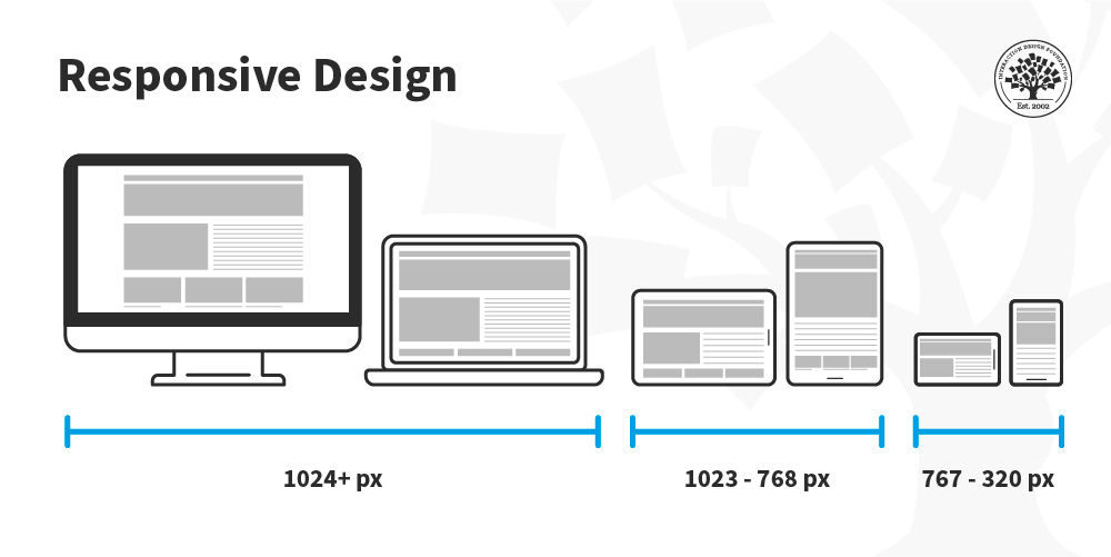
Responsive design refers to the approach whereby a web page layout adapts dynamically to various screen sizes and orientations. It takes into account fluid grids, flexible images, and media queries to ensure that the UI remains accessible and visually appealing no matter how users access your web application. When paired with React’s component-based design, the process of creating responsive layouts becomes both modular and scalable.
Role of React in Responsive UIs
React’s virtual DOM and component-based architecture offer several advantages for developing responsive interfaces:
Component Reusability
React enables developers to build reusable UI components. By designing responsive components that manage their own state and styles, you can craft a UI that automatically adjusts to different viewports while maintaining consistency across the application.
Efficient DOM Updates
The virtual DOM in React ensures that only the components which experience changes are updated. This leads to improved performance especially on mobile devices or slower networks—an essential requirement for responsive design.
Strategies for Developing Responsive UIs in React
1. Using CSS and Media Queries
One of the foundational techniques in responsive design is leveraging CSS media queries. By specifying different styles for distinct screen sizes, you can ensure that each component of your application adapts accordingly.
CSS Media Queries
CSS media queries are used to apply conditional styles based on characteristics like screen width, orientation, and resolution. This method is vital when working with nested React components. Here is a typical example:
/* Base style for mobile-first design */
.container {
  width: 100%;
  padding: 10px;
}

/* Adjust layout for tablets and larger devices */
@media (min-width: 768px) {
  .container {
    padding: 20px;
  }
}

/* Further styling for desktops */
@media (min-width: 1024px) {
  .container {
    max-width: 1200px;
    margin: 0 auto;
  }
}
In React, these styles can be applied directly through CSS files, inline styling, or even through CSS-in-JS libraries.
Fluid and Fixed Layouts
Fluid (or responsive) layouts are designed using relative units like percentages, ensuring that the design adapts to any screen size. Using fixed pixel sizes can lead to layouts that do not scale well on devices with different resolutions. When developing with React, favor fluid layouts to maintain consistency across devices.
2. Utilizing Responsive Component Libraries
React integrates seamlessly with various libraries that offer pre-designed responsive components. Two popular examples include React Bootstrap and Material-UI.
React Bootstrap
React Bootstrap provides a set of responsive, accessible components built with Bootstrap methodology. It allows you to implement grids, forms, buttons, and navigation menus that naturally adapt to different screen sizes.
Material-UI
Material-UI, based on Google's Material Design principles, offers a robust set of components that are fully customizable and responsive. These components handle variations in layout automatically and help maintain a consistent design language.
3. Leveraging React-Specific Tools and Libraries
Beyond standard CSS methodologies, there are several React-specific libraries and tools that facilitate responsive designs.
React Responsive Library
This library simplifies the process of designing responsive components by allowing developers to conditionally render or dynamically adjust components based on the viewport size. With React Responsive, you can directly integrate responsiveness into the component logic:
// Example usage of react-responsive
import React from 'react';
import { useMediaQuery } from 'react-responsive';

const ResponsiveComponent = () => {
  const isDesktop = useMediaQuery({ query: '(min-width: 1024px)' });
  return (
    <div>
      { isDesktop ? <p>You are on a desktop</p> : <p>You are on a mobile device</p> }
    </div>
  );
};

export default ResponsiveComponent;
CSS-in-JS Approaches
Modern styling solutions such as Styled Components and Emotion facilitate the encapsulation of CSS with React components. Through these libraries, you can define styles that automatically adapt based on properties or state, often utilizing media queries within the component's style definition.
4. Adopting a Mobile-First Approach
A mobile-first design strategy ensures that your application is optimized for smaller screens – areas where users are most likely to experience performance limitations. By focusing on mobile design first, you establish a strong foundation upon which progressively enhanced layouts are built for larger screens.
Benefits of Mobile-First
Designing “mobile-first” forces the developer to focus on essential content and functionality, leading to a cleaner code base. Starting with the constraints of small screens helps prioritize performance, content hierarchy, and accessibility. Once optimized for mobile devices, developers can progressively enhance the UI to support tablets and desktops.
5. Performance Optimization Techniques
A responsive interface must not only adapt in layout but also maintain performance. Efficient code and optimized asset management are essential components of a robust application.
Code Splitting and Lazy Loading
Implementing code splitting in React can reduce the initial bundle size, thus decreasing load times and improving performance. Lazy loading components that are not immediately needed further enhances the user experience.
Responsive Typography
Responsive typography greatly improves readability across devices. Instead of relying on fixed font sizes, using relative units such as em or rem ensures that text scales based on the viewport and device settings.
Practical Implementation in React: A Comprehensive Table
The following table summarizes key strategies, their benefits, and relevant tools for implementing responsive UIs in React:
| Strategy | Description | Tools / Libraries |
|---|---|---|
| CSS & Media Queries | Apply conditional styling with media queries for fluid layouts. | Plain CSS, SASS, Less |
| Responsive Component Libraries | Utilize pre-built responsive components for rapid development. | React Bootstrap, Material-UI, Ant Design |
| React Responsive Library | Conditional rendering based on viewport size within React components. | react-responsive |
| CSS-in-JS Techniques | Create encapsulated component styles that adjust with state or props. | Styled Components, Emotion |
| Mobile-First Design | Focus on optimizing the user experience for mobile before scaling up. | Responsive frameworks, custom breakpoints |
| Performance Optimization | Improve user experience with techniques like code splitting and lazy loading. | React.lazy, Suspense, Webpack |
Advanced Techniques and Best Practices
A. Dynamic Component Rendering
In a responsive React application, dynamic rendering plays a significant role. Depending on the viewport size, certain components might be rendered conditionally. This approach ensures that the application only loads and displays components relevant to the current context, optimizing both performance and usability.
For example, you may decide to load a complex navigation bar only for desktop users while opting for a simplified hamburger menu for smaller devices. This conditional rendering can be smoothly managed using hooks and libraries such as react-responsive.
B. Maintaining Consistency Across Devices
Consistency is crucial in responsive design. Employing a design system or style guide can help standardize margins, paddings, color schemes, and typography across various components. Utilizing tools like Material-UI’s theme creation capabilities allows you to enforce these design standards uniformly.
By defining a central theme, you create a cohesive visual language throughout your application. Consistency not only enhances the aesthetic appeal but also aids user navigation and accessibility.
C. Testing and Debugging Responsive Layouts
No responsive UI is complete without rigorous testing across multiple devices and browsers. Tools like Chrome DevTools, BrowserStack, and responsive design simulators help in identifying and rectifying layout issues early in the development cycle. Testing ensures that interactive elements, media content, and component transitions perform seamlessly, thus delivering a high-quality user experience.
D. Enhancing Accessibility
An accessible UI is an integral part of a responsive design. Prioritizing accessibility means ensuring that interactive elements are easily navigable, texts are readable, and the overall interface is intuitive for every user. Employing responsive design requires attention to accessibility standards, including appropriate ARIA labels, keyboard navigations, and contrast ratios.
Integrating Responsive Elements into Your React Project
Below is an example of how you might structure a React project to incorporate these responsive strategies. Notice the combination of CSS media queries, responsive components, and the utilization of a mobile-first approach.
// App.js
import React from 'react';
import ResponsiveComponent from './ResponsiveComponent';
import './App.css'; // Your global styles including media queries

function App() {
  return (
    <div className="App">
      <header className="App-header">
        <h1>Responsive React App</h1>
      </header>
      <main>
        {/* Dynamic component rendering based on screen size */}
        <ResponsiveComponent />
      </main>
    </div>
  );
}

export default App;
The above example demonstrates a simplified project structure where global styles and responsive components work in tandem to deliver a fluid user interface.
Maintaining Your Responsive React Application
Responsive development is an evolving discipline. Once your application is live, it is crucial to continuously monitor how users interact with your site on different devices. Gathering feedback, analyzing performance metrics, and staying updated with the latest design trends and browser updates will help you maintain and improve your responsive design.
Continuous Testing
Utilize automated testing tools to simulate various device environments. Regularly update and refine media queries and component styles to address any new challenges introduced by emerging device types and browsers.
Iterative Enhancements
As your application evolves, make iterative improvements to ensure that new features also adhere to responsive principles. Integrating user feedback, analytics, and performance testing will guide you in making the right adjustments and optimizations. Ensuring backward compatibility while innovating for newer devices is key to long-term success.
Best Practices Recap
In summary, developing a highly responsive UI in React involves:
- Adoption of Mobile-First Design: Start small and progressively enhance for larger screens, ensuring that essential features are optimized for mobile use.
- Utilizing Component-Based Architecture: Leverage React’s modular design to create reusable, adaptive components, reducing redundancy and promoting consistency.
- Employing Advanced CSS Techniques: Use media queries, fluid layouts, CSS-grid, and Flexbox to ensure that layouts dynamically adjust to different device characteristics.
- Integrating Helpful Libraries and Frameworks: Use React-specific tools like react-responsive, Material-UI, and React Bootstrap to simplify responsive design implementation.
- Optimizing Performance: Implement code splitting, lazy loading, and responsive typography to ensure that your application remains fast and efficient.
References
Below is a list of resources that can provide further insights and practical guidance on creating responsive user interfaces with React:
- Responsive UI Guide - MUI
- How to Make React App Responsive - BrowserStack
- Responsive Design in React - Medium
- React Mobile Responsiveness - DhiWise
- Responsive User Interfaces with ReactJS - TaglineInfotech
Recommended Queries for Deeper Insights
Last updated March 10, 2025