
Unlock Dynamic Weather Maps: Server-Side Image Generation for Your Website
Transform your website with automated, real-time weather map visuals generated directly from your server.
Key Insights for Server-Side Weather Map Generation
- Diverse Solutions: A range of tools, from dedicated software like WSV3 and NOAA WCT to powerful APIs like OpenWeatherMap and Xweather MapsGL, can generate weather map images on your server.
- Automation and Customization: Server-side scripting (e.g., Python with libraries like Matplotlib or Node.js) combined with scheduling tools (like cron jobs) enables automated, customizable map generation and updates.
- Data Source Integration: Leverage authoritative data sources like NEXRAD, NOAA, and commercial weather APIs to ensure accuracy and detail in your generated maps.
To integrate dynamic weather maps directly into your website, the most effective strategy involves utilizing server-compatible tools and APIs that can process meteorological data and render it into image files. This approach provides greater control over customization, automation, and overall website performance compared to relying solely on third-party embeds. The solutions available range from robust, professional-grade software for intricate meteorological analysis to flexible API-driven services that allow for seamless integration into web applications.
Architecting Your Server-Side Weather Map Solution
Implementing a server-side solution for weather map generation requires careful consideration of data sources, processing tools, and automation mechanisms. The core principle involves fetching weather data, rendering it into a visual map, and saving this visualization as an image file (e.g., PNG, JPEG) that your website can then display.
Essential Components for Image Generation
At the heart of any server-side weather map generation system are several key components:
- Data Ingestion: The ability to pull live or historical meteorological data from reliable sources.
- Mapping and Visualization Engine: Software or libraries capable of transforming raw weather data into geographic visual representations.
- Image Export: Functionality to convert the generated visualization into standard image formats.
- Automation Framework: Tools to schedule and execute the entire process periodically.
This holistic approach ensures that your website consistently displays up-to-date and relevant weather information.
An analytical radar chart showcasing the capabilities of various server-side weather map generation solutions. Each axis represents a crucial aspect for consideration, including API Integration, Data Customization, Server Performance, and Automation Ease. Higher values indicate stronger performance or greater utility in that specific area.
Leading Tools for Server-Side Weather Map Generation
Several powerful tools and platforms stand out for their ability to run on a server and produce high-quality weather maps as image files. These options offer varying degrees of flexibility, ease of use, and feature sets, catering to different project requirements.
API-Driven Solutions for Dynamic Content
API-driven solutions are highly flexible, allowing developers to programmatically fetch data and render maps, making them ideal for dynamic web content.
OpenWeatherMap API (Weather Maps 1.0)
OpenWeatherMap provides a comprehensive Weather Maps API that offers access to various weather layers, including precipitation, clouds, pressure, temperature, and wind. This API is designed for scalability and can be integrated into server-side scripting languages like Python, Node.js, or PHP. You can make HTTP requests to fetch map tiles or static images and then use libraries (e.g., GDAL or Pillow in Python) to render and save them as custom image files. Its primary strength lies in its versatility and ease of integration for generating frequently updated maps.
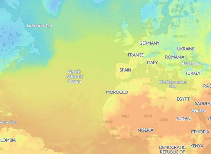
An example of a temperature map generated using OpenWeatherMap, demonstrating its capability to visualize various meteorological data layers.
Xweather MapsGL
MapsGL by Xweather is a WebGL-based solution that enables the creation of high-quality, vector-based weather visualizations. It supports dynamic elements like precipitation and wind patterns, which can be rendered into static image files on your server. This API-driven tool excels in customization and offers hardware-accelerated graphics for precise animations, making it suitable for creating detailed, professional-looking maps.
MapTiler for Weather Visualizations
MapTiler offers specialized tools for creating both animated and static weather maps, including 3D radar visualizations. Its SDKs and APIs allow for server-side processing of weather data, enabling the generation of high-resolution, customizable maps. This platform is geared towards professional use, providing fluid graphics that translate into excellent image outputs for web display.
CustomWeather Images and Maps
CustomWeather provides a service that delivers pre-built weather images and maps, such as Doppler radar and satellite views, via an API. While it offers less customization in terms of map rendering style compared to other solutions, it simplifies the process of obtaining ready-to-use image files directly from your server, making it efficient for automated updates.
Dedicated Software & Open-Source GIS Tools
For more control over data processing and advanced visualization capabilities, dedicated software and open-source GIS tools are excellent choices.
WSV3 (Next-generation PC Weather Tracking Software)
WSV3 is a powerful PC-based weather tracking software that also supports server-side operations, particularly for generating precise weather graphics. It offers hardware-accelerated graphics rendering and can export high-quality still images and videos. With its ability to import ESRI Shapefile data, WSV3 is suitable for meteorologists and professionals who require tailored, detailed weather maps.
NOAA Weather and Climate Toolkit (WCT)
The NOAA WCT is a free, cross-platform software from the National Oceanic and Atmospheric Administration (NOAA) that specializes in visualizing weather radar, satellite, and model data. It is highly capable of exporting weather maps as images and animations, supporting standard GIS formats. WCT is ideal for research-grade applications and for generating maps from authoritative weather datasets like NEXRAD.
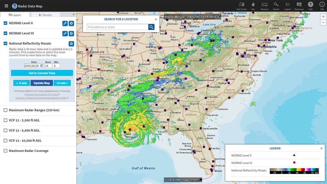
A radar map generated by NOAA, showcasing its capabilities in visualizing real-time weather phenomena.
QGIS with Scripting
QGIS is a free and open-source Geographic Information System (GIS) software that can run on various operating systems. By combining QGIS with Python scripting and relevant plugins, you can ingest meteorological data (e.g., from NEXRAD, NOAA), create highly customized weather maps, and automate their export as image files. This option provides maximum flexibility and control over the entire mapping workflow but requires more setup and programming expertise.
Choosing the Right Tool: A Comparative Overview
To help you decide which tool best fits your needs, here's a comparative overview of their key features and ideal use cases:
| Tool/API | Primary Strength | Ideal Use Case | Customization Level | Server-Side Automation |
|---|---|---|---|---|
| OpenWeatherMap API | Versatile data layers & ease of integration | Dynamic real-time weather updates for websites | Moderate (data, zoom, overlays) | High (scripting) |
| Xweather MapsGL | High-quality vector visualizations & animation | Interactive weather apps, professional displays | High (WebGL rendering) | High (API & rendering libraries) |
| MapTiler | Animated 3D radar & detailed overlays | Advanced weather forecasting displays | High (SDKs, APIs, 3D rendering) | High (scripting) |
| CustomWeather | Ready-to-use pre-built images | Quick integration of standard weather maps | Limited (pre-defined styles) | High (API calls) |
| WSV3 | Precise graphics & ESRI Shapefile support | Professional meteorology, detailed custom maps | Very High (desktop & server capabilities) | Moderate (scripting required for automation) |
| NOAA WCT | Official data sources & GIS compatibility | Research, academic, or public sector applications | Moderate (data filtering, GIS export) | Moderate (batch processing) |
| QGIS + Scripting | Full control & open-source flexibility | Highly customized map styling, research | Very High (full GIS capabilities) | High (Python scripting) |
Comparative table of server-side weather map generation tools, highlighting their strengths, ideal applications, and levels of customization and automation.
The Role of NEXRAD Data in Weather Mapping
The Next Generation Weather Radar (NEXRAD) system is a critical component for many weather map generation tools. Operated by the National Weather Service (NWS), Federal Aviation Administration (FAA), and U.S. Air Force, NEXRAD provides high-resolution S-band Doppler weather radar data. This data is fundamental for detecting precipitation and wind patterns, which are then processed by software and APIs to create detailed weather maps.
Tools like NOAA's Weather and Climate Toolkit (WCT) and open-source applications like Supercell Wx specifically leverage NEXRAD Level 2 and Level 3 data for visualization and export. Integrating NEXRAD data allows for highly accurate and timely weather information to be depicted on your generated maps, essential for severe weather tracking and detailed forecasts.
Automating Your Weather Map Workflow
To ensure your website always displays the most current weather information, automation is key. The process typically involves:
- Data Fetching: Regularly pulling updated weather data from APIs (e.g., OpenWeatherMap) or local sources (e.g., NEXRAD feeds).
- Map Generation: Running a script or calling a software function on your server to generate the visual map based on the fetched data.
- Image Saving: Exporting the generated map as an image file (PNG, JPEG, GIF) to a designated directory on your server.
- Website Integration: Your website's code referencing this image file to display the latest map.
This entire workflow can be automated using:
- Cron jobs (on Linux/macOS servers) or Task Scheduler (on Windows servers) to run scripts at predetermined intervals (e.g., every 15 minutes, hourly, daily).
- Server-side scripting languages like Python with libraries such as Matplotlib, Cartopy, or Pillow for image processing and manipulation.
- Node.js with libraries like Canvas or Puppeteer for rendering web-based maps to static images.
(e.g., OpenWeatherMap, Xweather)"] id1_3["Custom Sensors"] id2["Generation Tools & Software"] id2_1["API-Driven Solutions"] id2_1_1["OpenWeatherMap API"] id2_1_2["Xweather MapsGL"] id2_1_3["MapTiler Weather"] id2_1_4["CustomWeather Images"] id2_2["Dedicated Software"] id2_2_1["WSV3"] id2_2_2["NOAA Weather & Climate Toolkit (WCT)"] id2_3["Open Source GIS"] id2_3_1["QGIS + Python Scripting"] id3["Server Environment"] id3_1["Operating System
(Linux, Windows)"] id3_2["Programming Languages
(Python, Node.js, PHP)"] id3_3["Scheduling Tools
(Cron Jobs, Task Scheduler)"] id4["Output & Display"] id4_1["Image File Formats
(PNG, JPEG, GIF)"] id4_2["Web Server Configuration"] id4_3["Website Integration
(HTML Image Tags)"] id5["Key Considerations"] id5_1["Automation Frequency"] id5_2["Customization Needs"] id5_3["Performance & Resource Usage"] id5_4["Cost (API Tiers, Licensing)"] id5_5["Data Accuracy & Reliability"]
A mindmap illustrating the core components and considerations involved in server-side weather map generation, from data sources to output and display.
Leveraging Open-Source Python Libraries
For developers with programming skills, leveraging open-source Python libraries offers a highly customizable and flexible pathway to generate weather maps. This approach allows for fine-tuned control over data processing, map styling, and integration with various weather data sources.
Matplotlib and Cartopy
Python, with libraries like Matplotlib and Cartopy, is a popular choice for generating highly customizable weather maps. Matplotlib provides extensive plotting capabilities, while Cartopy is specifically designed for geospatial data visualization. Together, they allow you to plot weather data (e.g., temperature, pressure, precipitation) onto geographic maps with various projections and overlays. This method is ideal for creating unique map styles and integrating complex meteorological datasets.
import matplotlib.pyplot as plt
import numpy as np
import cartopy.crs as ccrs
import cartopy.feature as cfeature

# Example data (replace with actual weather data from an API or file)
lats = np.linspace(20, 50, 50)
lons = np.linspace(-130, -70, 50)
lon_grid, lat_grid = np.meshgrid(lons, lats)
# Simulate temperature data (e.g., in Celsius)
temperature_data = 20 * np.sin(np.deg2rad(lat_grid)) + 5 * np.cos(np.deg2rad(lon_grid)) + np.random.rand(50, 50) * 5

fig = plt.figure(figsize=(10, 8))
ax = fig.add_subplot(1, 1, 1, projection=ccrs.PlateCarree())
ax.set_extent([-130, -70, 20, 50], crs=ccrs.PlateCarree()) # Set map extent

# Add geographical features
ax.add_feature(cfeature.LAND)
ax.add_feature(cfeature.OCEAN)
ax.add_feature(cfeature.COASTLINES)
ax.add_feature(cfeature.BORDERS, linestyle=':')
ax.add_feature(cfeature.LAKES, alpha=0.5)
ax.add_feature(cfeature.RIVERS)

# Plot temperature data
# Use a color map to represent temperature
temperature_plot = ax.contourf(lon_grid, lat_grid, temperature_data,
                               levels=np.linspace(temperature_data.min(), temperature_data.max(), 10),
                               cmap='coolwarm', transform=ccrs.PlateCarree())

# Add a color bar
plt.colorbar(temperature_plot, ax=ax, orientation='vertical', label='Temperature (°C)')

# Add title
ax.set_title('Simulated Temperature Map')

# Save the map as an image file
output_path = 'temperature_map_python.png'
plt.savefig(output_path, bbox_inches='tight', dpi=300)
plt.close(fig)

print(f"Weather map saved to {output_path}")
This Python script snippet demonstrates how to generate a basic temperature map using Matplotlib and Cartopy. It initializes a map with geographical features and overlays simulated temperature data with a color gradient. The resulting plot is then saved as a PNG image file, which can be served by your website.
For a deeper dive into creating weather maps using similar open-source techniques, consider watching the following tutorial:
"Create Your Own Precipitation Maps: The Ultimate DIY Weather Guide!" This video provides practical guidance on creating precipitation maps, offering insights applicable to generating various types of weather visualizations with open-source tools.
Frequently Asked Questions
Conclusion
Creating dynamic weather maps as image files on your server for display on your website is a highly effective way to provide up-to-date meteorological information. Whether you opt for flexible API-driven services, powerful dedicated software, or customizable open-source GIS tools, the core process involves intelligently integrating data sources, rendering capabilities, and automation. By selecting the right solution based on your technical expertise, desired level of customization, and specific weather data needs, you can ensure your website delivers engaging and accurate weather visualizations to your users.
Recommended Further Exploration
- Explore the best weather APIs for seamless web application integration.
- Delve into advanced GIS techniques for comprehensive weather data visualization.
- Learn how to automate image generation using Python for dynamic web assets.
- Gain a deeper understanding of NEXRAD data and its critical applications in meteorology.