
Unlock Design Consistency: Your Blueprint for a Robust Layout & Spacing System
Establish clear rules for arranging elements and defining space to unify your team's design workflow and enhance user experience.
Setting up a layout and spacing design system guide is a fundamental step toward achieving visual harmony, consistency, and efficiency across your team's projects. This system acts as a shared language, defining the rules for how elements are organized, aligned, and spaced within user interfaces. By establishing a clear framework, you reduce ambiguity, streamline decision-making, improve collaboration between designers and developers, and ultimately create more cohesive, usable, and scalable products.
Key Highlights
- Establish a Base Unit: Adopt a foundational unit (often 4pt or 8pt) to derive all spacing and sizing values, ensuring mathematical consistency and scalability.
- Implement Grid Systems: Utilize column, baseline, and potentially modular grids to structure content, align elements precisely, and maintain vertical rhythm.
- Define Spacing Tokens: Create a predefined scale of spacing values (e.g., multiples of your base unit) represented as tokens for consistent application in margins, paddings, and gaps.
Why Prioritize Layout and Spacing?
The Foundation of Cohesive Design
Layout and spacing are the invisible architecture of a user interface. They govern how visual elements are arranged and distributed on a screen, directly impacting usability, readability, and aesthetic appeal. A well-defined system brings numerous benefits:
- Visual Harmony & Balance: Consistent spacing creates a sense of order and reduces visual clutter.
- Predictability & Consistency: Users learn interaction patterns faster when interfaces look and feel consistent across different screens and products.
- Improved Usability & Readability: Proper spacing enhances information hierarchy, guides the user's eye, and makes content easier to scan and digest.
- Efficient Collaboration: Designers and developers work more effectively with a shared set of rules, reducing guesswork and rework.
- Scalability & Maintainability: A systematic approach makes it easier to update designs and scale products across various platforms and screen sizes.
- Responsive Design Enablement: Defined rules facilitate the creation of layouts that adapt gracefully to different devices.
Building Your Layout and Spacing System: A Step-by-Step Guide
Step 1: Define Core Principles
Before setting specific rules, establish guiding principles that align with your brand identity and user experience goals. Common principles include:
- Consistency: All components and layouts should adhere to the same spacing and grid rules.
- Scalability: The system must adapt smoothly across different screen sizes, from mobile to desktop.
- Simplicity: Aim for a manageable number of spacing values to avoid unnecessary complexity.
- Hierarchy: Use spacing intentionally to create clear visual relationships and guide user focus.
- Accessibility: Ensure sufficient spacing for touch targets and readability, meeting accessibility standards.
Step 2: Choose Your Base Unit and Spacing Scale
The 8-Point Grid System
The most widely adopted approach is the 8-point (8pt) grid system. This means all spacing values (margins, padding, gaps) and often component dimensions are multiples of 8 pixels (e.g., 8px, 16px, 24px, 32px, 40px...).
Why 8pt?
- Scalability: Most common screen resolutions are divisible by 8, making scaling predictable.
- Consistency: Provides a modular scale that's easy to remember and apply.
- Industry Standard: Used by major design systems like Google's Material Design and Apple's Human Interface Guidelines.
Alternatively, a 4-point (4pt) grid system offers finer control, using multiples of 4. This can be useful for denser interfaces or specific elements like icons, but might introduce more complexity. You can also use a 4pt system as a sub-grid within an 8pt primary system.
Developing the Spacing Scale (Tokens)
Based on your chosen unit, define a limited set of spacing values (often called "spacing tokens" or "scale"). This scale provides concrete values for designers and developers to use. Using tokens instead of hardcoded values ensures consistency and makes future updates easier.
Example 8pt Scale:
- xxs: 4px (0.5x base)
- xs: 8px (1x base)
- s: 12px (1.5x base - sometimes used for finer control)
- m: 16px (2x base)
- l: 24px (3x base)
- xl: 32px (4x base)
- xxl: 40px (5x base)
- xxxl: 48px (6x base)
- ...and so on.
Document clearly where each token should typically be applied (e.g., m (16px) for padding within cards, l (24px) for margins between cards).
Step 3: Establish Grid Systems
Grids provide the structural framework for aligning content and components within your layouts.
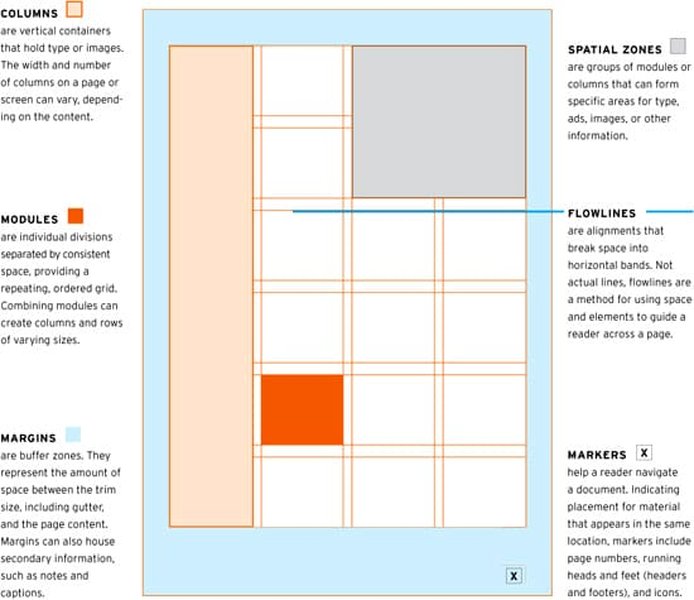
Components of a typical layout grid system.
Column Grids
Column grids divide the page width into a set number of columns with gutters (space) between them and margins on the sides. A 12-column grid is very common for web design because it's highly divisible (by 2, 3, 4, 6), offering flexibility in layout arrangements. The number of columns often adapts responsively (e.g., 12 for desktop, 8 for tablet, 4 for mobile).
Baseline Grids
A baseline grid helps align text vertically, ensuring consistent rhythm down the page. It consists of horizontal lines spaced according to your base unit or a related value (often tied to standard line height). Aligning text baselines to this grid creates vertical harmony, especially in text-heavy layouts.
Modular Grids
Modular grids combine columns and rows, creating a matrix of modules. They are useful for complex interfaces like dashboards or layouts requiring strict alignment in both dimensions, though they can be less flexible for standard responsive web content.
Step 4: Define Layout Rules and Component Spacing
Sizing and Positioning
Use the grid to guide element placement and sizing. Content should align to columns, and the space between elements (margins) and within elements (padding) should use values from your defined spacing scale (tokens).
Hierarchy and Rhythm
Use spacing strategically to group related items and separate unrelated ones. Larger spacing typically indicates a greater separation in hierarchy (e.g., space between sections vs. space between items in a list). Consistent application of spacing rules creates a visual rhythm that makes the interface feel structured and predictable.
Component Spacing
Define standard padding and margin rules for common UI components (buttons, inputs, cards, etc.) using your spacing tokens. Specify internal spacing (padding within the component) and external spacing (margin around the component). A common rule is that internal spacing should generally be less than or equal to external spacing to maintain clear component boundaries.
Typography Spacing
Integrate your spacing system with typography. Set line heights and paragraph spacing based on multiples of your base unit (or a related typographic scale) to align with the baseline grid and maintain vertical rhythm.
Visualizing Spacing Applications
Spacing Token Usage Table
This table provides examples of how different spacing tokens, based on an 8pt system, might be applied in a user interface. These are typical use cases and should be adapted to your specific design needs.
| Token Name | Value (px) | Typical Use Cases |
|---|---|---|
| xxs | 4 | Very tight spacing, e.g., between an icon and adjacent text within a button, fine adjustments. |
| xs | 8 | Small gaps, e.g., padding around small elements, space between list items (compact). |
| s | 12 | Padding inside smaller components like tags or chips, sometimes used for text element margins. |
| m | 16 | Standard padding within components (e.g., cards, inputs), margin between related items (e.g., form fields). |
| l | 24 | Margin between distinct components (e.g., cards), padding within larger containers, separating content blocks. |
| xl | 32 | Larger separation between content sections, padding in page-level containers. |
| xxl | 40 | Significant separation, often used for vertical spacing between major page sections. |
| xxxl | 48 | Very large spacing, defining major layout areas, ensuring ample touch target spacing (meets minimum accessibility guidelines). |
| xxxxl | 64 | Hero section padding, separating distinct page regions. |
Evaluating Layout System Attributes
Different approaches to layout and spacing systems have trade-offs. This radar chart visualizes hypothetical scores for key attributes comparing a strict 4pt system versus a more flexible 8pt system. Higher scores indicate better performance in that attribute.
This chart suggests that while a stricter 4pt system might offer higher consistency and finer control, an 8pt system often provides a better balance of flexibility, scalability, and ease of learning/implementation for many teams.
Implementing Responsive and Adaptive Layouts
Adapting to Different Screens
Your layout system must account for various screen sizes and orientations. Define breakpoints (specific screen widths where the layout changes) and specify how grids, spacing, and component arrangements should adapt.
- Fluid Grids: Use relative widths (percentages) for columns so they resize smoothly within containers.
- Adaptive Techniques: Adjust the number of grid columns (e.g., 12 to 8 to 4), stack elements vertically on smaller screens, and modify spacing values based on breakpoints.
- Content Prioritization: Ensure key content remains prominent and accessible on all devices.
- Touch Targets: Maintain adequate spacing (e.g., minimum 48x48px target size with spacing) for interactive elements on touch devices.
Video Guide: Responsive Grid Layouts
Understanding how to implement responsive grids is crucial. This video tutorial explains Material Design's approach to responsive grid layouts and demonstrates how to implement them in Figma, providing practical insights for your team.
Documenting and Sharing the System
Creating a Central Guide
A design system is only effective if it's well-documented and accessible to the entire team. Create a comprehensive guide that includes:
- Clear explanations of the base unit, spacing scale, and grid systems.
- Visual examples and usage guidelines for applying spacing tokens.
- Rules for component spacing and layout patterns.
- Responsive design specifications and breakpoint guidance.
- Code snippets or references to corresponding code tokens (e.g., CSS variables) for developers.
Team Onboarding and Adoption
- Training: Conduct workshops to educate designers, developers, and product managers on how to use the system.
- Integration: Integrate spacing tokens and grid settings directly into design tools (e.g., Figma libraries, styles) and development frameworks.
- Communication: Foster open communication channels for questions and feedback.
- Maintenance & Iteration: Treat the design system as a living product. Establish a process for regular reviews, updates, and improvements based on team feedback and evolving project needs.
Layout & Spacing System Mindmap
This mindmap provides a visual overview of the key components and considerations involved in setting up a layout and spacing design system for your team.
Design System"] id1["1. Core Principles"] id1a["Consistency"] id1b["Scalability"] id1c["Simplicity"] id1d["Hierarchy"] id1e["Accessibility"] id2["2. Spacing Foundation"] id2a["Base Unit (e.g., 8pt / 4pt)"] id2b["Spacing Scale / Tokens"] id2b1["Naming Convention"] id2b2["Value Definition"] id2b3["Usage Guidelines"] id3["3. Grid Systems"] id3a["Column Grids (e.g., 12-col)"] id3a1["Gutters"] id3a2["Margins"] id3b["Baseline Grid"] id3b1["Vertical Rhythm"] id3b2["Text Alignment"] id3c["Modular Grid (Optional)"] id4["4. Layout Rules"] id4a["Element Alignment"] id4b["Component Spacing (Padding/Margin)"] id4b1["Internal vs External"] id4c["Typography Spacing"] id4c1["Line Height"] id4c2["Paragraph Spacing"] id4d["Grouping & Hierarchy"] id5["5. Responsiveness"] id5a["Breakpoints"] id5b["Fluid / Adaptive Techniques"] id5c["Content Prioritization"] id5d["Touch Targets"] id6["6. Documentation & Adoption"] id6a["Central Guide"] id6b["Tool Integration (Figma, Code)"] id6c["Team Training"] id6d["Maintenance & Iteration"] id6e["Feedback Loop"]
Frequently Asked Questions (FAQ)
Why is the 8pt grid system so popular?
Should we use a 4pt or 8pt base unit?
How do we handle exceptions to the spacing rules?
How do we ensure developers follow the spacing system?
Recommended Reading
- Explore the pros and cons of 8pt versus 4pt grid systems for UI design consistency.
- Learn practical methods for implementing spacing tokens effectively in both CSS and Figma libraries.
- Discover best practices for creating responsive layouts that adapt seamlessly using grid systems.
- Find out how to effectively maintain and evolve your design system's layout and spacing rules over time.
References
Last updated May 6, 2025