
Unlocking the Mystery of High-Dimensional Data: Why Your Machine Doesn't "See" Images
Discover how 28×28 pixel images become 784-dimensional data points and why this matters for modern analytics
Key Insights on High-Dimensional Data
- Dimensionality in data is simply the number of features (columns) for each observation, which can range from dozens to millions
- t-SNE and other reduction techniques transform complex, high-dimensional data into visually interpretable patterns
- Understanding data structure is critical because machines process everything—even images and text—as numerical arrays
Understanding High-Dimensional Data Fundamentals
High-dimensional data refers to datasets where each observation contains many features or attributes. This concept is fundamental to modern data science and machine learning applications. When we talk about "high dimensions," we're referring to the number of variables or features that describe each data point.
What Makes Data "High-Dimensional"?
Data becomes high-dimensional when the number of features significantly exceeds what we can easily visualize or comprehend. Traditional data visualization tools like scatter plots work well for 2 or 3 dimensions, but become ineffective when dealing with tens, hundreds, or thousands of dimensions.
Common Examples of High-Dimensional Data
High-dimensional data is everywhere in modern analytics:
- Images: A standard 28×28 pixel grayscale image (like those in the MNIST dataset) contains 784 dimensions—one for each pixel value
- Customer profiles: Modern marketing databases might track 100+ attributes per customer
- Genomic data: Gene expression datasets often contain thousands of measurements per sample
- Text data: In natural language processing, documents are often represented as vectors with thousands of dimensions
- Sensor networks: IoT applications can generate readings from hundreds of sensors simultaneously
The Structure of Data: Features vs. Observations
Understanding the structure of data is crucial for effective analysis:
- Features (columns): These represent the variables or attributes measured for each data point. They're the questions we ask about our subjects.
- Observations (rows): Each row represents a single instance or example—one customer, one image, one patient, etc.
This distinction is crucial because machine learning algorithms analyze patterns across features to make predictions about observations. The relationship between these two components forms the foundation of data analysis.
| Dataset Type | Observation Example | Feature Example | Typical Dimensionality | Challenges |
|---|---|---|---|---|
| Image Data | Single image | Pixel value | Hundreds to millions | Spatial relationships, redundancy |
| Customer Data | Individual customer | Age, income, purchase history | Dozens to hundreds | Mixed data types, missing values |
| Genomic Data | Patient sample | Gene expression level | Thousands to millions | Noise, small sample sizes |
| Text Data | Document | Word frequency | Thousands (vocabulary size) | Sparsity, semantic meaning |
| Sensor Data | Time point | Sensor reading | Dozens to hundreds | Temporal correlation, noise |
How Images Become Tabular Data
One of the most counterintuitive aspects of working with high-dimensional data is understanding how seemingly non-tabular data like images are processed by machine learning algorithms.
The Flattening Process
When an image is used in machine learning, it undergoes a transformation called "flattening" where the 2D grid of pixels is converted into a 1D array:
- A grayscale image measuring 28×28 pixels starts as a 2D grid
- Each pixel has a value (typically 0-255) representing brightness
- The grid is "unwrapped" row by row to create a single row of 784 values
- Each value becomes a feature in the dataset
This process transforms what we perceive as a visual object into a point in 784-dimensional space. For color images with RGB channels, the dimensionality triples, as each pixel requires three values.
Why Flattening Matters
This transformation is crucial because standard machine learning algorithms work with feature vectors—they don't inherently understand 2D spatial relationships. Convolutional Neural Networks (CNNs) were later developed specifically to preserve these spatial relationships, but most traditional ML algorithms require flattened inputs.
Examples of Flattening in Practice
This radar chart illustrates the varying challenges across different image processing applications. Note how dimensional complexity scores high across all applications, but preprocessing complexity and dimensionality reduction needs vary. Video processing shows the highest overall complexity due to its temporal dimension in addition to spatial dimensions.
Dimensionality Reduction: Making Sense of Complex Data
Working with high-dimensional data presents significant challenges, including visualization difficulties, computational inefficiency, and the "curse of dimensionality" (where data becomes increasingly sparse as dimensions increase). Dimensionality reduction techniques help address these challenges.
Understanding t-SNE
t-Distributed Stochastic Neighbor Embedding (t-SNE) has become one of the most popular techniques for visualizing high-dimensional data. Unlike earlier methods like PCA (Principal Component Analysis), t-SNE excels at preserving local structure in data, making it particularly useful for visualization and cluster identification.
How t-SNE Works
At a high level, t-SNE:
- Calculates the similarity between points in the high-dimensional space
- Creates a probability distribution over pairs of data points
- Constructs a similar distribution in the low-dimensional space
- Minimizes the difference between these distributions using gradient descent
The result is a 2D or 3D representation that often reveals clusters and patterns invisible in the original high-dimensional space.
Visualizing High-Dimensional Data with t-SNE
Let's explore how t-SNE can help us visualize complex datasets like the MNIST handwritten digits. When applied to this dataset, t-SNE can transform 784-dimensional image data into a 2D visualization where similar digits cluster together—despite never being explicitly told which images represent which digits.
This StatQuest video provides an excellent explanation of how t-SNE works. It breaks down the mathematical concepts behind t-SNE into clear, understandable steps, showing how it creates meaningful visualizations from high-dimensional data. The video is particularly valuable for understanding why t-SNE is effective at preserving local structure while sacrificing some global structure.
The Mindmap of High-Dimensional Data Concepts
This mindmap illustrates the key concepts related to high-dimensional data, showing the relationships between data structure, example types, challenges, reduction techniques, and applications. It provides a visual framework for understanding how these concepts interconnect in the field of data science.
Visual Examples of High-Dimensional Data Reduction
These images demonstrate how t-SNE transforms complex high-dimensional data into intuitive visualizations:
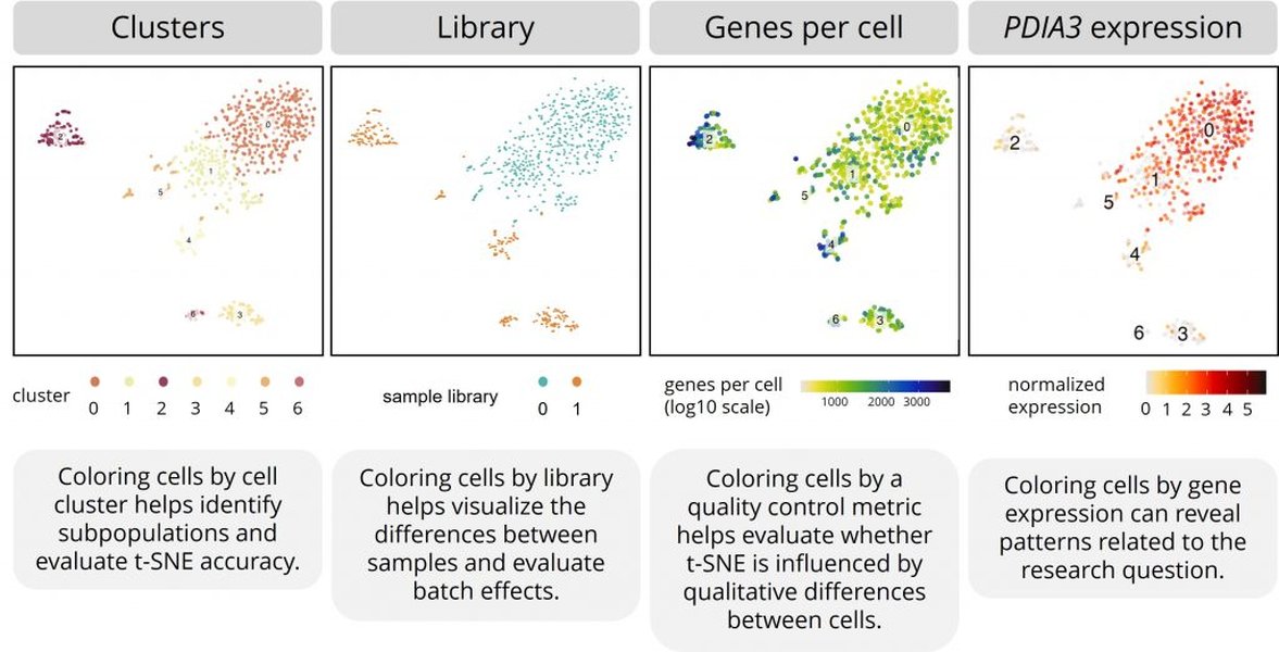
The image above shows how t-SNE can visualize single-cell RNA sequencing data, transforming thousands of gene expression measurements into a 2D map where similar cell types cluster together. Each dot represents a cell, and colors indicate different cell types or states.
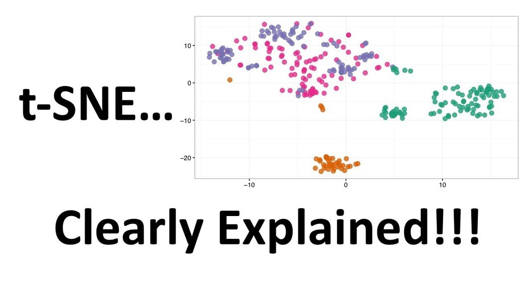
This visualization from StatQuest illustrates how t-SNE preserves local relationships in data while transforming it from high-dimensional space to a 2D representation. Notice how points that are close together in the original space remain grouped in the t-SNE visualization.
Why This Matters: Machine Learning's Perspective
Understanding that ML models process everything as arrays of numbers is crucial for effective data science work. This realization has several important implications:
Machine Perception vs. Human Perception
While humans perceive images holistically, recognizing objects, faces, and scenes intuitively, machines "see" only arrays of numerical values. This fundamental difference affects how we approach problems:
- Humans recognize patterns globally and contextually
- Traditional ML algorithms analyze patterns statistically across features
- Modern deep learning attempts to bridge this gap by learning hierarchical features
Implications for Data Preparation
This understanding affects how we prepare data for machine learning:
- Feature engineering: Creating meaningful transformations of raw features becomes critical
- Preprocessing: Scaling, normalization, and handling missing values must be done carefully
- Feature selection: Choosing which dimensions to keep can dramatically impact model performance
The Future of High-Dimensional Data Analysis
As data collection continues to expand in scope and detail, the dimensionality of datasets will likely increase. Advances in computing power, algorithmic efficiency, and visualization techniques will be necessary to keep pace with these developments.
Frequently Asked Questions
References
-
T-distributed Stochastic Neighbor Embedding - Wikipedia
- t-SNE Documentation - Scikit-learn
-
Visualizing High-Dimensional Data with t-SNE - Kaggle
- StatQuest: t-SNE, Clearly Explained - YouTube
- How to interpret a t-SNE plot - Single Cell Discoveries
- t-SNE Explained & Practical How To Get Started Guide - Spot Intelligence
- t-SNE Dimensionality Reduction with Scikit-Learn - YouTube
Recommended Explorations
Last updated April 6, 2025