
Unlock Market Secrets: Visualizing Order Flow with Bookmap, Pivots, and POC on the 1-Hour Chart
Combine real-time liquidity analysis with key price levels for sharper intraday trading decisions.
Highlights
- Visualize Liquidity: Bookmap's heatmap reveals hidden support/resistance zones formed by large resting orders, complementing traditional indicators.
- Identify Key Levels: Pivot Points and the Point of Control (POC) act as critical reference points for potential price reactions, calculated based on previous price action and volume.
- Synergistic Analysis: Combining Bookmap's real-time order flow with Pivot Points and POC provides a multi-dimensional view of market dynamics, enhancing trade entry and exit timing on the 1-hour timeframe.
Decoding the Trader's Toolkit: Order Flow, Bookmap, Pivots & POC
To effectively navigate the markets, especially on shorter timeframes like the 1-hour chart, traders often combine several powerful tools. Understanding each component individually is the first step towards integrating them for a more comprehensive market view.
What is Order Flow and How Does Bookmap Visualize It?
Order flow represents the real-time stream of buy and sell orders hitting the market. It provides insights into the immediate supply and demand dynamics, revealing the ongoing battle between buyers and sellers at different price levels. Unlike traditional charts that aggregate price action over time (like candlesticks), order flow analysis focuses on the microstructure – the actual transactions and pending orders.
Bookmap is a specialized trading platform designed to visualize this order flow data with exceptional clarity. Its core feature is the heatmap, which displays the limit order book (DOM - Depth of Market) dynamically over time. Here’s what you see:
- Heatmap: Colors represent the density of resting limit orders at specific price levels. Brighter colors (often reds/oranges for sell orders, greens/blues for buy orders) indicate larger concentrations of orders (liquidity), acting as potential support or resistance zones. Darker areas signify less liquidity.
- Volume Dots: These circles appear on the chart where trades are executed. The size of the dot often corresponds to the volume traded. Colors typically indicate whether the aggressor was a buyer (hitting the ask) or a seller (hitting the bid).
- Current Orders (Best Bid/Ask): Lines showing the current highest bid and lowest ask prices.
- Historical Data: Bookmap displays how the order book liquidity has changed over time, offering context to current market conditions.
By observing how price interacts with these liquidity zones and how volume transacts, traders gain insights into potential absorption (large orders soaking up aggression), exhaustion (fading momentum), and iceberg orders (large hidden orders).
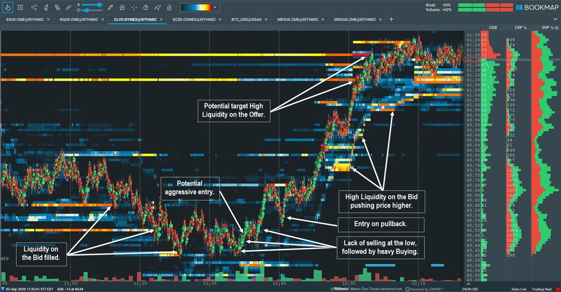
Example of a Bookmap chart visualizing liquidity and order flow.
Understanding Pivot Points on the 1-Hour Timeframe
Pivot Points are technical indicators used to identify potential support and resistance levels throughout a trading session. They are calculated based on the previous period's high, low, and closing prices. For intraday trading, especially on a 1-hour timeframe, these pivots are typically calculated based on the previous hour's data, providing dynamic levels that adjust as the market progresses.
Calculation (Standard Pivot Points):
Using the High (H), Low (L), and Close (C) from the previous 1-hour candle:
\[ \text{Pivot Point (P)} = \frac{H + L + C}{3} \] \[ \text{Resistance 1 (R1)} = (2 \times P) - L \] \[ \text{Support 1 (S1)} = (2 \times P) - H \] \[ \text{Resistance 2 (R2)} = P + (H - L) \quad \text{or} \quad P + (R1 - S1) \] \[ \text{Support 2 (S2)} = P - (H - L) \quad \text{or} \quad P - (R1 - S1) \] \[ \text{Resistance 3 (R3)} = H + 2 \times (P - L) \] \[ \text{Support 3 (S3)} = L - 2 \times (H - P) \]These calculated levels (P, S1, S2, S3, R1, R2, R3) act as reference points where price might stall, reverse, or break through. Traders watch for price reactions at these levels, often combining them with other signals.
Identifying the Point of Control (POC)
The Point of Control (POC) is the specific price level within a defined period (in this case, typically the current or previous 1-hour session) where the highest volume of trading occurred. It represents the price where the market found the most agreement or 'fair value' during that time.
POC is usually derived from a Volume Profile indicator, which displays traded volume horizontally across different price levels. The price level with the longest bar in the volume profile histogram is the POC. It often acts as a strong magnet for price or a significant support/resistance level.
Combining the Tools on a 1-Hour Bookmap Chart
The real power comes from layering these tools onto a single Bookmap chart configured for a 1-hour perspective. This allows you to see real-time order flow dynamics in the context of predetermined key levels.
Step-by-Step Setup and Visualization
- Configure Bookmap for 1-Hour View: Set your Bookmap chart to display the instrument you are trading. While Bookmap visualizes tick data in real-time, you'll focus your analysis on the context of 1-hour periods.
- Overlay Pivot Points: Calculate the pivot points based on the previous hour's High, Low, and Close. Plot these levels (P, R1, S1, R2, S2, etc.) as horizontal lines directly onto your Bookmap heatmap display. Many platforms, including Bookmap add-ons or external charting software used alongside, can automate this.
- Identify the POC: Enable the Volume Profile indicator within Bookmap (or use an add-on). Configure it to show the profile for the relevant 1-hour session (e.g., the current or previous hour). The POC will be highlighted as the highest volume node. You can also mark this level with a horizontal line.
- Observe the Heatmap & Order Flow: With Pivots and POC plotted, watch the Bookmap heatmap. Pay attention to:
- Large liquidity zones (bright areas) appearing or disappearing, especially near Pivot or POC levels.
- How Volume Dots (executed trades) interact with these levels – are buyers aggressively taking offers at resistance, or are sellers hitting bids at support?
- Signs of absorption (price stalling despite heavy volume) or exhaustion (liquidity pulling away as price approaches).
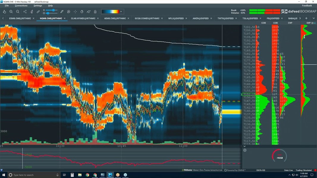
Advanced Bookmap visualization showing liquidity, trades, and potential areas of interest.
Interpreting the Combined Signals
The synergy of these tools allows for nuanced interpretations:
- Confirmation: If price approaches a Pivot Point (e.g., R1) and the Bookmap heatmap simultaneously shows a large block of resting sell orders (bright red/orange liquidity) at or just above that level, it strengthens the case for R1 acting as resistance. Similarly, strong buy-side liquidity near S1 or the POC can confirm support.
- Breakout Potential: If price approaches a Pivot Point or the POC, but the Bookmap heatmap shows very little opposing liquidity (darker areas), a breakout might be more likely. Aggressive Volume Dots (e.g., large green dots at resistance) could signal buyers are attempting to push through.
- Reversal Signals: Watch for absorption at key levels. If price hits S1, and large sell orders (red Volume Dots) appear but price fails to move lower, while buy-side liquidity (heatmap) holds firm or increases, it could signal seller exhaustion and a potential reversal.
- POC as a Magnet/Pivot: Price often gravitates towards the POC. If price moves significantly away and then returns to test the POC, observe the order flow. Rejection or acceptance at the POC, especially if it aligns with a Pivot Point, can provide strong trading cues.
Relative Importance in Trading Scenarios
While all three tools (Order Flow/Bookmap, Pivot Points, POC) are valuable, their relative importance can shift depending on the trading strategy and market context. The radar chart below illustrates a subjective assessment of their utility across different scenarios.
This chart suggests Order Flow/Bookmap excels in real-time analysis like scalping and gauging sentiment, while Pivot Points are strong for setting targets and confirming breakouts. POC is valuable for identifying fair value and potential consolidation zones. Combining them provides a well-rounded approach.
Visualizing the Workflow: A Mindmap
The process of integrating these tools can be visualized as a workflow. The mindmap below outlines the key steps from setup to analysis and decision-making when using Bookmap with Pivot Points and POC on a 1-hour timeframe.
This mindmap provides a structured overview of how to approach analysis using this combination of tools, guiding the trader through the necessary steps for informed decision-making.
Tool Synergy Summary Table
This table summarizes how each tool contributes to the overall analysis when used together on a 1-hour timeframe.
| Tool | Primary Function | What it Shows on 1-Hour Chart | How to Use in Combination |
|---|---|---|---|
| Bookmap (Order Flow) | Real-time Liquidity & Execution Visualization | Heatmap (resting orders), Volume Dots (executed trades), Order Book Imbalance. Shows immediate buy/sell pressure. | Observe how price/volume interacts with Pivot/POC levels. Confirm support/resistance validity based on real-time liquidity. Spot absorption/exhaustion at key levels. |
| Pivot Points | Potential Support/Resistance Levels | Calculated horizontal lines (P, S1-S3, R1-R3) based on the previous hour's price action. | Identify potential turning points or breakout zones. Use as reference levels for entries, stops, and targets. Validate with Bookmap's order flow. |
| Point of Control (POC) | Highest Volume Price Level | A single price level (derived from Volume Profile) indicating the 'fair value' or highest activity area for the hour. | Acts as a magnet or strong S/R level. Confirm its strength by checking liquidity on Bookmap heatmap. Use confluence with Pivot Points for high-probability zones. |
By understanding the specific role of each tool and observing their interplay, traders can develop a more robust framework for analyzing the market on the 1-hour timeframe.
Watch: Reading Order Flow on Bookmap
Visual demonstrations can greatly aid understanding. This video provides insights into interpreting order flow data specifically using the Bookmap platform, which is central to the strategy discussed.
The video explains how to interpret the heatmap, volume dots, and other Bookmap features to understand buying and selling pressure in real-time. Watching how experienced traders utilize the platform can help solidify the concepts of liquidity, absorption, and identifying key areas of interest which you can then combine with Pivot Points and POC analysis.
Frequently Asked Questions (FAQ)
Can I use this strategy on timeframes other than 1-hour? ▼
Is Bookmap necessary, or can I use other order flow tools? ▼
What are the main challenges when using this combination? ▼
References
- Why Bookmap - Bookmap
- Forex Pivot Points - BabyPips.com
- Pivot Points Explained - Linton White
- How To Trade The Point Of Control (POC) - Volume Profile Trading - Trader Dale
- A Deep Dive Into Order Flow & Liquidity Analysis - Bookmap Blog
- Pivot Point Indicator Explained - HowToTrade
- Using Pivot Points for Predictions - Investopedia
Recommended
Last updated April 17, 2025