
Visualizing Sales Data: Utilizing Histograms and Ogives for Retail Analysis
Enhancing Retail Strategies through Data-Driven Insights
Key Takeaways
- Histograms provide a clear distribution of sales data, enabling retailers to identify sales patterns and trends.
- Ogives facilitate the understanding of cumulative sales data, aiding in forecasting and inventory management.
- Integrating these visualization tools can significantly enhance decision-making processes in the retail sector.
Abstract
In the rapidly evolving retail industry, data visualization plays a pivotal role in deciphering complex sales data. This project focuses on employing histograms and ogives as primary tools for visualizing sales data, aiming to provide insightful analyses that drive strategic decision-making. By examining sales distributions and cumulative trends, retailers can optimize inventory management, forecast demand, and tailor marketing strategies effectively. This study explores the methodologies for creating these visualizations, analyzes their applications within the retail context, and presents practical examples to illustrate their significance.
Introduction
The retail landscape is inundated with vast amounts of sales data generated from various channels. Transforming this data into actionable insights is essential for maintaining competitiveness and achieving business objectives. Data visualization techniques, such as histograms and ogives, offer intuitive ways to represent sales information, making it easier to identify patterns, detect anomalies, and forecast future trends. This project delves into the application of these visualization tools in retail analysis, highlighting their benefits and practical implementations.
Need of the Study
Retailers often face challenges in managing and interpreting large datasets related to sales performance. Traditional data analysis methods may fall short in providing clear and immediate insights necessary for timely decision-making. There is a pressing need for effective visualization tools that can distill complex data into understandable formats, enabling retailers to swiftly identify key trends and make informed decisions that enhance operational efficiency and profitability.
Objective of the Study
The primary objectives of this study are:
- To explore the effectiveness of histograms in representing sales data distributions.
- To utilize ogives for analyzing cumulative sales trends over time.
- To demonstrate how these visualization tools can be integrated into retail analysis for improved strategic planning.
- To provide practical examples and graphical representations that illustrate the application of histograms and ogives in retail settings.
Scope of the Study
This study focuses on the application of histograms and ogives in visualizing sales data within the retail industry. It encompasses the methodologies for creating these visualizations, the interpretation of the resulting data patterns, and the implications for retail management practices. The study is confined to sales data analysis and does not extend to other forms of data visualization or analytics outside the retail sector.
Limitations
The study acknowledges several limitations:
- Dependency on the accuracy and completeness of sales data.
- Potential challenges in integrating visualization tools with existing retail data systems.
- The scope is limited to histograms and ogives, excluding other visualization techniques that may also offer valuable insights.
- Generalizability of findings may vary across different retail sub-sectors.
Research Methodology
Data Collection
Sales data was collected from various retail outlets over a specified period. The data included transaction volumes, sales amounts, product categories, and time frames.
Data Processing
The collected data was cleaned and organized to ensure consistency and accuracy. Outliers and erroneous entries were identified and addressed to maintain data integrity.
Visualization Techniques
- Histograms were created to represent the frequency distribution of sales across different ranges.
- Ogives were developed to depict the cumulative frequency of sales over time.
Analysis
The visualizations were analyzed to identify sales patterns, peak periods, and trends. Comparative analyses were conducted to correlate sales performance with marketing campaigns and seasonal variations.
Applications
The insights derived from histograms and ogives can be applied to various aspects of retail management, including inventory control, marketing strategy formulation, sales forecasting, and performance evaluation. By understanding sales distributions and cumulative trends, retailers can make informed decisions that align with consumer behavior and market dynamics.
Company Profile / Industry
This study focuses on the retail industry, specifically analyzing sales data from a mid-sized retail chain specializing in consumer electronics. The industry is characterized by rapid technological advancements, fluctuating consumer preferences, and intense competition, necessitating agile and data-driven decision-making processes.
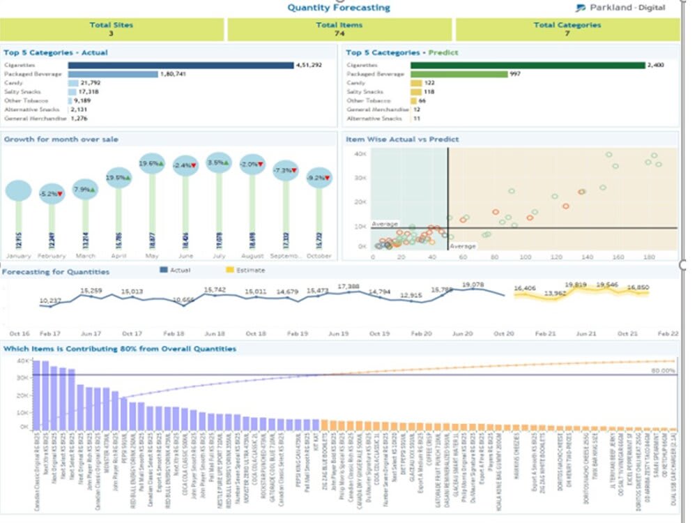
Data Analysis (Graph Representation) and Interpretation
Histogram of Monthly Sales
The histogram below illustrates the distribution of monthly sales over the past year. It highlights the frequency of sales within specified sales range intervals, enabling the identification of peak sales periods and common sales volumes.
Interpretation
The histogram reveals that the majority of monthly sales fall within the $50,000 to $70,000 range, indicating consistent performance. Notably, there are spikes in sales during November and December, likely attributable to holiday season promotions. Conversely, the lower sales frequencies in January and February suggest a post-holiday sales slump.
Ogive of Cumulative Sales
The ogive chart below presents the cumulative sales over the past year. This visualization aids in understanding the progression of sales and forecasting future performance based on historical trends.
Interpretation
The ogive indicates a steady increase in cumulative sales, with accelerated growth during the latter half of the year. The steep incline towards the year-end aligns with the heightened sales activity during the holiday season. The gradual slope at the beginning and middle of the year suggests stable but slower sales growth.
Findings
The analysis of sales data using histograms and ogives yielded several key findings:
- Sales distributions are centered around specific revenue ranges, indicating predictable sales behaviors.
- There are distinct seasonal patterns that significantly impact sales performance.
- Cumulative sales growth rate accelerates during peak sales periods, emphasizing the effectiveness of targeted promotions.
- Post-peak sales periods require strategic interventions to sustain revenue levels.
Suggestions
Based on the findings, the following suggestions are proposed:
-
Implement targeted marketing campaigns during identified peak sales periods to maximize revenue.
-
Enhance inventory management strategies to align with sales distributions, ensuring optimal stock levels.
-
Develop strategies to boost sales during traditionally low-performing months, such as introducing special offers or diversifying product lines.
-
Utilize predictive analytics in conjunction with historical data visualizations to forecast future sales trends accurately.
Conclusion
The utilization of histograms and ogives in visualizing sales data offers profound insights into retail performance. These tools enable retailers to decipher complex sales patterns, identify growth opportunities, and formulate strategies that enhance operational efficiency and profitability. By integrating data visualization into their analytical frameworks, retailers can navigate the dynamic market landscape with greater agility and informed decision-making capabilities.
References
For further reading and resources on sales data visualization techniques, please refer to the following links:
Last updated February 17, 2025