
Unlock Stunning Textures: 10 Watercolor Mixes That Magically Separate
Discover pigment pairings from your list that create mesmerizing granulation and separation effects.
Highlights: Key Insights into Pigment Separation
- Granulation is Key: Pigment separation often relies on mixing a granulating pigment (like Ultramarine Blue or Cobalt Blue) with a non-granulating or staining pigment.
- Pigment Properties Matter: Differences in pigment particle size, weight (specific gravity), and affinity for water cause heavier or larger particles to settle into the paper texture, separating from finer or lighter pigments.
- Technique Enhances Effects: Using ample water, textured paper (cold press or rough), and allowing washes to settle without over-mixing maximizes visible separation.
Watercolor painting offers unique opportunities for creating texture and depth, and one of the most captivating phenomena is pigment separation. This occurs when pigments mixed together in a wash don't blend uniformly but instead settle differently as the water evaporates. Heavier, larger, or less water-soluble pigment particles (often described as granulating or sedimentary) sink into the texture of the paper, while finer, lighter, or more staining pigments may remain suspended longer or stain the paper fibers more evenly. The result is a visually dynamic surface where the individual characteristics of the combined pigments become apparent, creating effects ranging from subtle mottling to dramatic color shifts and textures.
Achieving these effects intentionally involves understanding pigment properties. Combining pigments with significantly different characteristics—especially a strongly granulating pigment with a smooth, staining one—is the most common strategy. Factors like the amount of water used, the texture of the watercolor paper, and even the angle at which the paper dries can influence the final appearance.
Below are 10 pigment mix propositions, using only the pigments from your provided list, that are known to produce visible separation effects. Each includes a suggested starting proportion (typically 1:1 by volume, adjustable to taste) and a description of the separation you can expect.
10 Pigment Mixes for Visible Separation Effects
These combinations pair granulating pigments with others that contrast in behavior, maximizing the potential for visible texture and color differentiation. Remember that the exact result can vary based on paint brand, water ratio, paper, and technique.
Classic Separating Combinations
1. PB29 (Ultramarine Blue) + PR122 (Quinacridone Red/Magenta)
Proportions: 1:1
Effect: Creates a vibrant purple wash that visibly separates into distinct areas of granulating blue particles settling into the paper texture, alongside smoother passages of bright pink or magenta stain. This is a classic and highly effective separating mix.
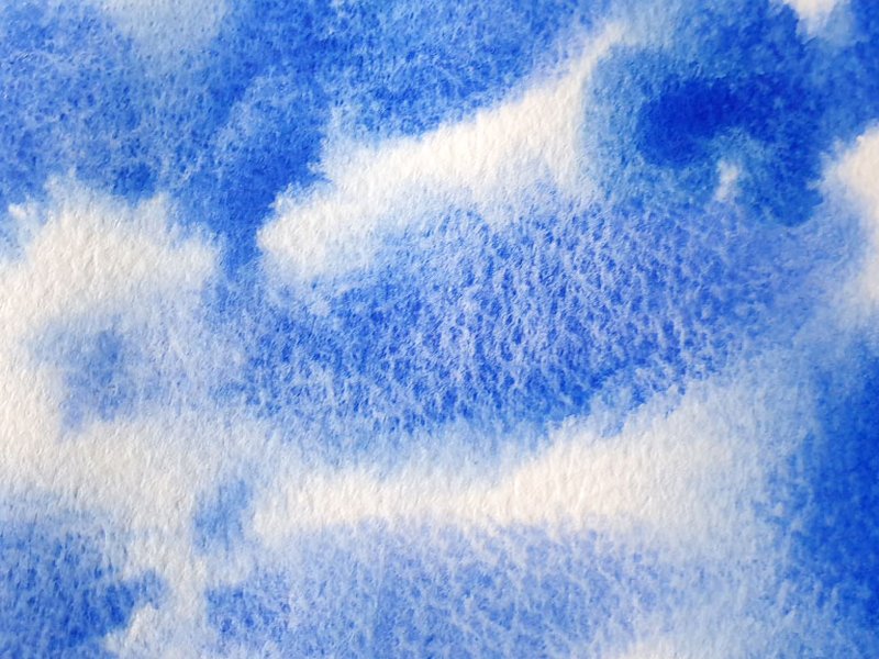
Example of Ultramarine Blue (PB29) showing its characteristic granulation.
2. PB29 (Ultramarine Blue) + PR101 (Burnt Sienna / Transparent Red Oxide)
Proportions: 1:1
Effect: Produces beautiful muted violets, grays, and browns. The heavy Ultramarine Blue granules separate distinctly from the warm, earthy tones of the PR101 pigment, creating textures reminiscent of stone or twilight skies.
3. PB29 (Ultramarine Blue) + PY42 / PY43 (Yellow Ochre)
Proportions: 1:1
Effect: Mixes to form muted, earthy greens. As it dries, the blue granules of PB29 settle out, separating from the smoother, often slightly opaque yellow ochre, resulting in a textured, variegated green perfect for landscapes.
Separation with Other Granulating Blues
4. PB36 (Cerulean Blue Chromium) + PR101 (Burnt Sienna / Transparent Red Oxide)
Proportions: 1:1
Effect: Yields complex grays and muted neutrals. The strong, distinct granulation of Cerulean Blue (PB36) separates clearly from the warm red-brown of PR101, creating a pronounced textural effect, often cooler and more opaque than the Ultramarine/Burnt Sienna mix.

Examples of watercolor granulation creating texture.
5. PB28 (Cobalt Blue) + PR101 (Burnt Sienna / Transparent Red Oxide)
Proportions: 1:1
Effect: Creates subtle, granulating muted violets and warm grays. Cobalt Blue offers a gentler granulation than Ultramarine, leading to a softer separation where blue particles dapple through the warm earth tone.
6. PB35 (Cerulean Blue) + PY150 (Nickel Azo Yellow)
Proportions: 1:1
Effect: Produces bright, granulating greens. The heavier Cerulean particles (PB35) settle out distinctly against the transparent, staining Nickel Azo Yellow, creating a lively separation between opaque blue texture and clear yellow undertones.
Exploring Green and Violet Granulation
7. PG17 (Chromium Oxide Green) + PR101 (Burnt Sienna / Transparent Red Oxide)
Proportions: 1:1
Effect: Forms deep, earthy olive greens or browns. The opaque, heavy particles of PG17 separate noticeably from the PR101, resulting in a dense, textured mix ideal for depicting moss, earth, or weathered surfaces.
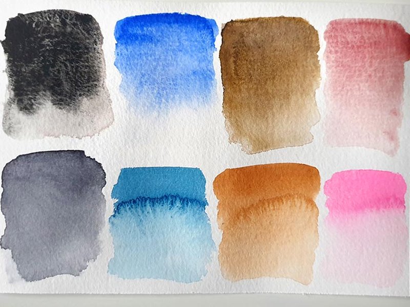
Visual difference between smooth (non-granulating) and textured (granulating) paint washes.
8. PB29 (Ultramarine Blue) + PV19 (Quinacridone Rose / Violet)
Proportions: 1:1
Effect: Yields rich violets where the granulating PB29 separates from the smooth, staining PV19. This creates a dynamic interplay between the textured blue settling and the vibrant rose or violet hue staining the paper.
Unique Textural Combinations
9. PB74 (Cobalt Turquoise) + PR176 (Quinacridone Burnt Orange)
Proportions: 1:1
Effect: Creates intriguing neutralized tones, leaning towards gray or brown. The granulating Cobalt Turquoise particles separate beautifully from the rich, earthy Quinacridone Burnt Orange, producing effects reminiscent of minerals or patinated metal.
10. PV16 (Manganese Violet) + PB29 (Ultramarine Blue)
Proportions: 1:1
Effect: Produces soft, muted violets. Both pigments can exhibit granulation, but often differ in particle size or settling rate, leading to a gentle, mottled separation where streaks or patches of the violet and blue become distinct within the wash.
Visualizing Pigment Properties for Separation
Understanding the characteristics of individual pigments helps predict how they might behave in mixtures. Properties like granulation tendency, staining power, transparency, and particle weight influence separation. This chart compares estimates of these properties for a few key pigments from your list, illustrating why certain pairings lead to strong separation.
Note: This chart provides qualitative estimates for comparison purposes. Actual properties can vary slightly by manufacturer. Higher values indicate stronger presence of the characteristic (e.g., 10 = very high granulation).
Summary Table of Proposed Mixes
Here is a quick reference table summarizing the 10 proposed pigment mixes for achieving visible separation effects:
| Mix # | Pigment 1 | Pigment 2 | Starting Proportion | Visible Separation Effect |
|---|---|---|---|---|
| 1 | PB29 (Ultramarine Blue) | PR122 (Quinacridone Red/Magenta) | 1:1 | Purple separates into blue granules and pink/red stain. |
| 2 | PB29 (Ultramarine Blue) | PR101 (Burnt Sienna / Trans Red Oxide) | 1:1 | Muted violet/gray separates into blue granules and warm brown. |
| 3 | PB29 (Ultramarine Blue) | PY42 / PY43 (Yellow Ochre) | 1:1 | Muted green separates into blue granules and earthy yellow. |
| 4 | PB36 (Cerulean Blue Chromium) | PR101 (Burnt Sienna / Trans Red Oxide) | 1:1 | Gray/neutral separates into granulating blue and warm brown/red. |
| 5 | PB28 (Cobalt Blue) | PR101 (Burnt Sienna / Trans Red Oxide) | 1:1 | Muted violet/gray separates into granulating blue and warm brown/red. |
| 6 | PB35 (Cerulean Blue) | PY150 (Nickel Azo Yellow) | 1:1 | Green separates into granulating blue and transparent yellow. |
| 7 | PG17 (Chromium Oxide Green) | PR101 (Burnt Sienna / Trans Red Oxide) | 1:1 | Earthy green/brown separates into green granules and warm brown/red. |
| 8 | PB29 (Ultramarine Blue) | PV19 (Quinacridone Rose / Violet) | 1:1 | Violet separates into blue granules and pink/violet stain. |
| 9 | PB74 (Cobalt Turquoise) | PR176 (Quinacridone Burnt Orange) | 1:1 | Neutral/brown separates into granulating turquoise and earthy orange. |
| 10 | PV16 (Manganese Violet) | PB29 (Ultramarine Blue) | 1:1 | Violet separates into granulating blue and distinct violet areas. |
Factors Influencing Watercolor Separation
Achieving the desired separation effect involves more than just choosing the right pigments. Several factors come into play, interacting to create the final textured appearance. This mindmap outlines the key elements involved:
(Particle Clumping)"] id1a2["Specific Gravity
(Particle Weight)"] id1a3["Particle Size & Shape"] id1a4["Hydrophilic/phobic Nature"] id1b["External Factors"] id1b1["Water Ratio
(Dilution)"] id1b2["Paper Texture
(Cold Press, Rough)"] id1b3["Application Technique
(Wash, Wet-in-Wet)"] id1b4["Drying Conditions
(Angle, Speed)"] id2["Achieving Separation"] id2a["Mixing Strategies"] id2a1["Granulating + Staining/Transparent"] id2a2["Granulating + Earth Pigment"] id2a3["Differential Granulation
(Two Granulating Pigments)"] id2a4["Using Separation Mediums"] id2b["Techniques"] id2b1["Wet-in-Wet Application"] id2b2["Minimal Mixing on Palette/Paper"] id2b3["Allowing Wash to Settle"] id2b4["Tilting Paper During Drying"] id3["Visual Effects"] id3a["Texture & Mottling"] id3b["Color Shifts & Variegation"] id3c["Increased Depth & Interest"] id3d["Simulating Natural Surfaces
(Stone, Bark, Clouds)"]
Understanding these relationships allows artists to manipulate mixes and techniques to enhance or control the separation effect for specific artistic goals.
Making Your Own Separating Mixes
While buying pre-mixed granulating watercolors is an option, creating your own separating mixes offers greater control and potential for unique results. Experimenting with different pigment combinations from your palette, varying proportions, and adjusting water content can unlock a wide range of textures. This video provides insights and demonstrations on creating custom granulating and separating watercolor mixes:
The key takeaway is often experimentation. Swatching potential mixes on your preferred paper is the best way to see how they will actually behave. Try mixing a known granulating pigment (like PB29, PB28, PB36, or PG17 from your list) with various other colors – staining quinacridones (PR122, PV19), transparent phthalos (PB15 variants, PG7), or earthy oxides (PR101, PY42/43, PBR7) – to discover your own favourite separating combinations.
Frequently Asked Questions (FAQ)
1. What exactly causes pigments to separate in watercolor?
2. How can I maximize the separation effect in my mixes?
3. Which types of paper work best for showing pigment separation?
4. Are there pre-mixed "super granulating" watercolors available?
Recommended
- How does paper texture affect watercolor granulation?
- What is the difference between staining and granulating watercolors?
- Techniques for applying granulating watercolor washes
- Compare Daniel Smith Primatek vs Schmincke Supergranulating watercolors
References
Last updated May 5, 2025