
Winsor & Newton Professional Watercolour: Greens and Blues Staining Chart
A detailed ranking of greens and blues based on their staining characteristics
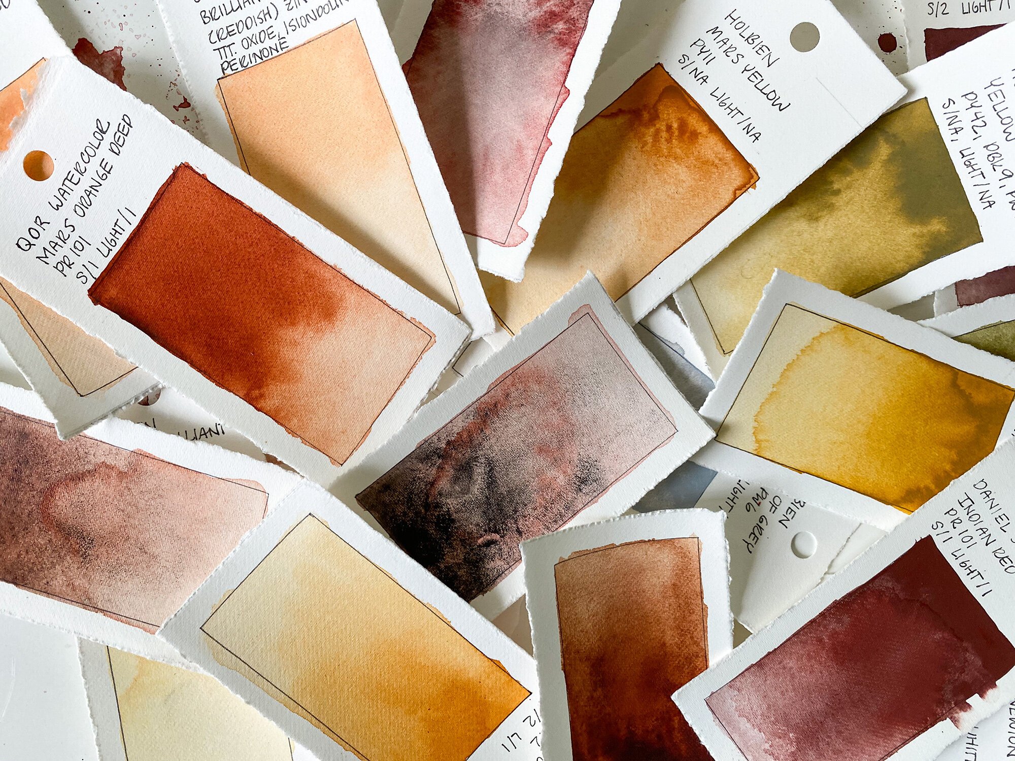
Key Insights
- Understanding Staining: Staining in watercolours refers to the pigment's ability to bind to paper fibers, making them difficult to remove.
- Color Categories: Watercolours are grouped into non-staining, low to moderate staining, and highly staining based on pigment composition and chemical properties.
- Application Impact: Choosing a colour based on its staining property is essential for layering techniques, colour mixing, and achieving desired transparency or permanence in paintings.
Overview of Staining Properties
The staining property of a watercolour pigment indicates how permanently a pigment adheres to paper once applied. Detailed knowledge of these characteristics allows artists to plan their techniques for lifting, layering, and creating textures in their work. There are three primary classifications regarding staining:
Non-Staining
Non-staining colours are easier to rework since the pigment does not bind strongly to the paper. They offer a higher degree of liftability, allowing artists to move or remove colour if mistakes are made or if adjustments are required.
Moderately Staining / Low Staining
These colours exhibit a balanced adherence whereby the pigment attaches more firmly than non-staining colours but still allows limited manipulation. They are ideal for controlled washes and when a certain level of reworkability is necessary without committing to the permanence of highly staining colours.
Highly Staining
Highly staining pigments bind very strongly to the paper fibers. Once applied, they are difficult to lift or alter, which makes them particularly valuable for creating lasting marks and ensuring deep, intense colour application. Artists use these colours when they need a robust, permanent mark on their work and when blending is intended to be minimal.
Comprehensive Chart Ranking
The following comprehensive chart ranks several of the popular greens and blues in Winsor & Newton’s Professional Watercolour line. This chart considers the staining characteristics ranging from non-staining to highly staining, along with a brief description of each pigment.
Ranking Table
| Color | Shade Type | Staining Category | Description |
|---|---|---|---|
| Cerulean Blue | Blue | Non-Staining | A warm, sky-blue pigment that retains a high degree of liftability. |
| Cobalt Teal | Blue/Green | Non-Staining | A vibrant teal which is known for its light adherence, making it easy to rework. |
| Indanthrene Blue | Blue | Low Staining / No Specific Mention | A deep blue with subtle properties; generally easier to manipulate due to lower staining. |
| Smalt (Dumont's Blue) | Blue | Low Staining | A historically significant pigment with granulating properties that exhibit less staining. |
| Cobalt Green | Green | Low Staining | This pigment offers natural tones with moderate mixing properties and greater liftability. |
| Winsor Green (Blue Shade) | Green | Moderately Staining | A brilliant, transparent green with a blue undertone; its staining is moderate, allowing some reworkability. |
| Turquoise | Blue/Green | Moderately Staining | A vibrant turquoise that balances staining and fluidity, ideal for washes and layering. |
| Winsor Blue (Green Shade) | Blue | Highly Staining | A deep, intense blue with a green undertone produced from Phthalocyanine; known for its lasting mark. |
| Phthalo Blue (Green Shade) | Blue | Highly Staining | A powerful, intense blue pigment that binds strongly to paper, perfect for bold applications. |
| Phthalo Green (Blue Shade) | Green | Highly Staining | An intense green pigment, also based on Phthalocyanine, noted for its strong staining and permanence. |
In-Depth Considerations for Artists
Each pigment's staining characteristic influences the technique and outcome of a watercolour painting. When selecting a green or blue, consider the following aspects:
Layering and Transparency
Non-staining colours such as Cerulean Blue and Cobalt Teal allow more flexibility in creating transparent layers. Because of their lower binding, you can rework or lightly brush over them without causing patchiness or oversaturation.
Mixing and Blending
While mixing pigments, opt for moderately staining colours when you need to merge hues while preserving some of the original pigment's luminosity. Winsor Green (Blue Shade) and Turquoise serve well in these situations, offering balance between fluidity and permanence.
Longevity and Durability
Highly staining pigments like Winsor Blue (Green Shade), Phthalo Blue, and Phthalo Green are particularly beneficial when you require your artwork to withstand environmental factors and maintain vibrancy over time. Their strong adhesion minimizes the risk of accidental lifting or fading.
Techniques for Lifting and Reworking
Artists might sometimes wish to lift off or alter layers. Non-staining and low-staining colours are easier to manipulate in this regard. On the contrary, highly staining colours demand extra caution. Techniques such as blotting with a sponge or using alkaline solutions must be employed carefully to adjust these pigments without disrupting the overall composition.
Methodology for Creating Your Personal Staining Chart
The ranking provided in the table is built upon commonly referenced data and standardized pigment descriptions. However, pigment behavior can vary based on various factors, including paper type, application water ratio, and individual artist techniques. If you wish to refine your own staining chart, consider the following steps:
Consult Official Colour Charts
The official Winsor & Newton colour charts provide detailed specifications for each pigment. Reviewing these charts closely will help you gain a better understanding of each colour’s inherent properties.
Analyze Technical Data Sheets
For each pigment, technical data sheets offer insights into lightfastness, mixing behavior, and chemical composition. By comparing data sheets for greens and blues, you can establish a reliable ranking based on staining.
Undertake Practical Testing
For in-depth experimentation, conduct your own application tests:
- Test each pigment on a uniform sheet of watercolour paper.
- Record ease of liftability and any differences after drying.
- Create a sample archive that documents results under different water-to-colour ratios.
Engage with the Community
Watercolour forums and communities often share personal insights on pigment behaviour. By engaging with other artists and reviewing their testing outcomes, you may gather valuable comparative data that can supplement official manufacturer information.
Using Your Chart in the Creative Process
This staining chart serves as a guide when planning your artwork. When working on a piece, determining which shades to apply can influence the painting’s final look. Here are some practical uses of the chart:
Planning Color Mixtures
When mixing watercolours, be aware that highly staining colours may dominate the mixture. Balancing these with non-staining colours allows more control over the final colour intensity and transparency.
Layering Techniques
The order of application is crucial. Artists may use non-staining colours as a base layer, followed by more intensely staining colours to add rich accents or details. This approach leverages the reworkability of non-staining pigments and the permanence of highly staining ones.
Corrective Measures
Understanding staining characteristics helps in decision-making if corrections are needed. If a mistake occurs, non-staining and low-staining colours allow for easier corrections without the risk of the overbearing permanence of a highly staining pigment.
Final Thoughts on Staining Characteristics
Winsor & Newton’s Professional Watercolour range offers some of the finest quality pigments available to artists. Understanding the nuances of how each pigment interacts with paper is key to achieving desired artistic effects. The chart provided here outlines an efficient ranking system based on available information. However, each painter’s experience and paper choice can subtly shift these dynamics. Exploring both practical applications in the studio and further reading from technical sources is essential for fully grasping each pigment’s properties.
References
- Winsor & Newton Colour Charts - Winsor & Newton
- Professional Watercolour - Winsor & Newton
- Winsor Blue (Green Shade) - Jackson's Art Supplies
- Winsor Green (Blue Shade) - Winsor & Newton UK
- Winsor Blue (Green Shade) - Winsor & Newton
Recommended Queries
 assets.ctfassets.net
 amazon.com
 janeblundellart.blogspot.com
Last updated March 8, 2025