
Exploring the Winsor Newton Professional Watercolour Chart
A detailed guide to pigment codes, color names, and material properties
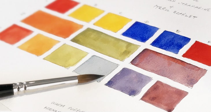
Key Highlights
- Pigment Codes and Color Identification: Each pigment is labeled with a standardized code (e.g., PB29) that indicates its chemical composition and series.
- Granulating and Opacity Characteristics: Distinguishes pigments by their granulating properties and opacity levels, crucial for artistic texture and layering.
- Ordering and Organizing Data: Organizing the chart by pigment codes allows for a systematic categorization from blues, greens, yellows, to other hues.
Understanding the Winsor Newton Professional Watercolour Range
Winsor Newton Professional Watercolours are renowned for their extensive palette that is formulated with pure pigments for enhanced performance and longevity. The range comprises over a hundred colors, each designed with specific attributes such as pigment codes, color names, granulating qualities, and opacity. These attributes not only help in identifying the pigments but also in predicting how each color will behave on paper.
Pigment Codes and Their Importance
Pigment codes such as PB29, PV19, or PW6 are standardized identifiers that symbolize the chemical composition of the pigment. These codes are vital for several reasons:
Accurate Identification
Each code provides a reliable reference that ensures consistency in color reproduction across batches. In professional artistic use, knowing the exact pigment helps in achieving the desired effects.
Color Matching and Mixing
Artists rely on the pigment codes to mix colors correctly. The codes indicate pure pigments that allow a more extensive range of color mixing before reaching muddiness.
Granulating Qualities and Opacity
Two additional important properties for watercolours are granulating qualities and opacity:
Granulating Qualities
Granulation refers to the tendency of a pigment to produce a textured, slightly speckled or mottled effect when applied on watercolor paper. For example, Ultramarine Blue (PB29) is known for its granulating properties. Artists might choose a granulating pigment to add visual texture to landscapes and abstracts.
Opacity Levels
Opacity is an essential factor depending on the desired level of transparency or coverage in a painting. Watercolours can range from transparent to opaque, which affects layering techniques:
Transparent Pigments
Transparent pigments, such as certain blues and reds, allow the underlying layers or paper texture to show through. They are ideal for glazing techniques.
Opaque Pigments
Opaque pigments, for example, Titanium White (PW6), are used when complete coverage is necessary. They are essential for highlights or corrections in a painting.
Organizing and Ordering by Pigment Code
In order to make efficient reference and comparison easier, organizing the watercolour chart by pigment code is recommended. Typically, the pigment codes are arranged alphabetically by their initial letters (e.g., PB, PG, PW, PV, PY) and sequentially by the numbers following the letter designation. This ordered approach aids in systematically locating and comparing specific pigments.
Developing a Personalized Chart
While the official Winsor Newton website provides detailed color charts, they might not be pre-organized by pigment code in the desired format. You can create your own comprehensive chart by following these steps:
Step 1: Data Collection
Gather detailed data from the following sources:
- Winsor Newton Professional Watercolour Dot Card
- Official Winsor Newton Colour Charts
- External pigment databases and art supply reviews
Collect for each color the pigment code, color name, granulating quality (whether it granulates or not), and opacity classification.
Step 2: Data Organization
Organize your data into a table format, ordering by pigment codes. Consider sub-categorizing by pigment family, such as blues (PB), greens (PG), whites (PW), reds (PV), and yellows (PY).
Step 3: Verification and Testing
Where possible, verify granulating qualities and opacity through practical swatch tests. This empirical approach confirms the official data and helps in understanding the behavior of each pigment under different conditions.
Sample Winsor Newton Professional Watercolour Chart
Below is a sample table to illustrate the structure of a comprehensive watercolour chart. Note that this is a simplified version and serves as a starting point for style and organization.
| Pigment Code | Color Name | Granulating | Opacity | Lightfastness |
|---|---|---|---|---|
| PB29 | Ultramarine Blue | Yes | Transparent | Excellent |
| PG7 | Phthalo Green | No | Transparent | Very Good |
| PW6 | Titanium White | No | Opaque | Excellent |
| PV19 | Quinacridone Red | No | Transparent | Excellent |
| PY43 | Yellow Ochre | No | Opaque | Good |
This table has been ordered based on the pigment codes starting with identifying letters and subsequently with numeric order. For example, the “PB” series (blue pigments) is grouped together, and then within that group, the codes are ordered numerically.
Additional Considerations When Using the Chart
While a personalized Winsor Newton Professional watercolour chart is very useful, there are several factors to consider for the best practical outcomes:
Practical Swatch Testing
Testing the pigments on watercolor paper not only confirms the manufacturer’s details on granulation and opacity, but also reveals the pigment's behavior when layered or mixed with other colours. Experimenting with varying dilution levels can unveil subtle nuances in hue and texture.
Lightfastness and Permanence
Each pigment also comes with ratings for lightfastness. Lightfastness measures how resistant a pigment is to fading when exposed to light. When creating your chart, you may include a column that notes the lightfastness rating (often provided in official documentation) to help in choosing the right pigment for long-lasting artwork.
Digital vs. Physical Charts
Physical charts, such as the Winsor & Newton Professional Watercolour Dot Card, give a tangible reference, which many artists find beneficial when making on-the-spot comparisons during creative work. However, a personalized digital chart can be updated regularly, refined with new observations, and shared among artist communities.
Integrating Data Sources and Resources
As there is no single comprehensive source providing a complete Winsor Newton chart in the exact format discussed, it is often necessary to combine data from multiple sources. The primary sources include:
- The official Winsor & Newton Colour Charts that detail pigment compositions and performance attributes.
- The Professional Watercolour Dot Card, which lists 109 colours along with additional performance data.
- Detailed reviews and swatch tests available on websites like Kim Crick's wine editor and various art supply blogs.
- Artist pigment databases and third-party reviews which further analyze granulation, opacity, and mixing capabilities.
- Community forums and digital archives of pigment swatches where practical experiences are shared.
By cross-referencing these sources, one can gather comprehensive and accurate details to fill in any gaps that exist in each individual resource.
Practical Application and Usage
Understanding the properties detailed in the chart is immensely practical:
- Using pigment codes when purchasing ensures that you are getting the exact hue you need.
- Knowledge of granulation and opacity informs your decisions on which pigments to pair, preventing muddy mixtures.
- Artists can develop a consistent approach to color mixing and layering, allowing easier replication of desired effects.
- It becomes simpler to organize and catalogue your own art supplies over time, building a personal reference library.
Recommendations for Further Learning
To deepen your understanding and practical skills with Winsor Newton Professional Watercolours, consider exploring a variety of resources:
- Experimenting with creating your own detailed swatch tests and recording your observations.
- Comparing official data from the Winsor & Newton website with artist reviews and experimental data.
- Staying updated with new releases and modifications in formulae by reading expert blogs and watching video tutorials.
- Joining artist forums and communities where traditional techniques and latest trends in watercolour painting are discussed.
- Utilizing digital tools for color management and cataloging your pigment information for easy reference when mixing colours.
References
- Winsor & Newton Colour Charts - Winsor & Newton
- Professional Watercolour - Winsor & Newton
- Winsor & Newton Professional Watercolors - FLAX Art
- Professional Watercolour Review - Kim Crick
- Professional Watercolour Dot Card Colour Chart - Winsor & Newton EU
Recommended Related Queries
 janeblundellart.blogspot.com
 d4of2brjuv1jo.cloudfront.net
Last updated March 25, 2025