
Forging Your Emblem: Crafting a Victorious Logo for "THE ELITES SINCE 2009"
Unlock the secrets to designing a powerful and memorable visual identity that embodies your team's legacy and distinction.
Creating a logo for your team, "THE ELITES SINCE 2009," is an exciting endeavor. A well-designed logo serves as a powerful symbol, encapsulating your team's identity, history, and aspirations. It's the visual cornerstone that unites players and fans, projecting an image of strength, prestige, and enduring spirit. This guide will walk you through conceptualizing and designing a logo that truly represents "THE ELITES."
Essential Insights for Your Elite Emblem
- Embrace "Elite" Symbolism: Your logo should visually communicate excellence and high caliber. Think symbols like crowns, stars, shields, or powerful, majestic animals.
- Honor Your Heritage: The "SINCE 2009" is crucial. Integrate this element to showcase your team's established history and legacy, lending credibility and a sense of tradition.
- Strive for Versatility and Impact: A great logo is timeless, scalable, and impactful across all applications – from jerseys and banners to social media profiles and merchandise.
Deconstructing Your Team's Identity: "THE ELITES SINCE 2009"
Before diving into design specifics, it's vital to understand the core message your team name conveys. This understanding will form the foundation of your logo's visual narrative.
The Essence of "ELITES"
The term "ELITES" immediately suggests a group of superior quality, top performers, and individuals who have achieved a high level of skill or status. Your logo should reflect these connotations:
- Excellence and Achievement: The design should evoke a sense of accomplishment and aspiration.
- Strength and Prestige: Visual elements should convey power, confidence, and a distinguished presence.
- Exclusivity: A feeling that this team is special, a select group dedicated to being the best.
The Significance of "SINCE 2009"
Including "SINCE 2009" is not just a date; it's a statement about your team's history, resilience, and experience. This element adds depth and credibility:
- Legacy and Tradition: It highlights the team's longevity and the story built over the years.
- Established Foundation: It suggests stability and a strong heritage.
- Trust and Experience: It implies a journey of growth and consistent performance.
Key Design Pillars for Your Logo
A successful logo balances several critical design elements. Let's explore how these apply to "THE ELITES SINCE 2009."
Symbolism: Visual Storytelling
Symbols are the heart of a logo, conveying meaning at a glance. Consider these options:
Representing "Elite" Status:
- Crowns: Directly symbolize royalty, top position, and supreme authority.
- Stars: Universally recognized symbols of excellence, achievement, and aspiration. Multiple stars can denote ongoing success.
- Shields or Badges: Convey strength, protection, unity, and a sense of officiality or tradition. Often used in sports to denote fortitude.
- Upward Arrows or Peaks: Signify progress, ambition, striving for greatness, and reaching the pinnacle.
- Majestic Animals: Eagles (vision, power), lions (courage, leadership), or other powerful creatures can embody elite characteristics.
- Abstract Geometric Shapes: Clean, sharp lines and sophisticated forms can suggest precision, modernity, and high performance.
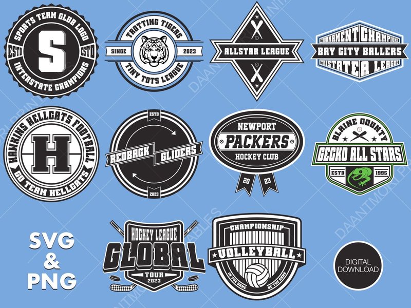
A collection of sports logo badge designs, often incorporating shields, stars, and strong textual elements, similar to what could be adopted for "THE ELITES."
Highlighting "SINCE 2009":
- Banners or Ribbons: A classic way to integrate dates or mottos, adding a touch of heritage.
- Subtle Integration: The year can be subtly incorporated within the main design, perhaps at the base or encircling an element.
- Distinct Font: Using a slightly different, perhaps more traditional font for "SINCE 2009" can differentiate it while maintaining harmony.
Typography: The Voice of Your Brand
The choice of font significantly impacts the logo's feel and readability.
Font Styles:
- Bold Sans-Serif: Often preferred for sports logos due to their clarity, strength, and modern appeal (e.g., Bebas Neue, Gotham Bold).
- Strong Serif: Can add a touch of tradition, authority, and elegance (e.g., Trajan Pro), suitable for emphasizing the "elite" aspect.
- All Uppercase: Commonly used to convey power, impact, and enthusiasm.
Text Layout:
- "THE ELITES": This should be the most prominent text element, clearly legible and impactful. It can be arched, straight, or integrated with a symbol.
- "SINCE 2009": Typically smaller and placed below, within a banner, or subtly integrated, so it complements rather than competes with the main team name.
Color Palette: Evoking Emotion and Identity
Colors play a crucial role in brand perception and recognition.
Primary Colors:
- Navy Blue or Royal Blue: Suggests trust, authority, and sophistication.
- Black: Conveys power, elegance, and a serious, premium feel.
- Deep Red or Burgundy: Represents energy, passion, and determination.
Secondary/Accent Colors:
- Gold or Silver (Metallic): Directly associated with achievement, prestige, and elite status. Excellent for highlights and key elements.
- White: Provides contrast, cleanliness, and can make other colors pop.
Aim for 1-2 primary colors with an accent. Ensure good contrast for visibility across various backgrounds and applications (e.g., light jerseys vs. dark jerseys).
Overall Design Style: Defining Your Aesthetic
The overall aesthetic should align with the team's personality.
- Modern & Clean: Sleek lines, minimalist symbols, contemporary fonts.
- Classic & Timeless: Traditional elements like shields, wreaths, and established font styles.
- Bold & Aggressive: Dynamic shapes, strong imagery (like fierce mascots), and impactful typography, common in competitive sports.
- Sophisticated & Elegant: Refined details, graceful lines, and a polished look befitting the "elite" title.
A shield or badge style often conveys tradition and strength. A mascot-based logo can create a strong persona. A purely typographic logo can be powerful if the font and arrangement are distinctive. An abstract mark can be modern and unique.
Visualizing Success: Logo Attribute Comparison
A successful logo for "THE ELITES SINCE 2009" should balance several key attributes. The radar chart below illustrates an idealized profile, showcasing how different characteristics might be prioritized. A high score in 'Prestige' and 'Strength' would be paramount for a team named "The Elites," while 'Timelessness' ensures the logo remains relevant, supported by the 'Since 2009' heritage. 'Readability' and 'Versatility' are crucial for practical application across various media.
This chart helps visualize the balance of different qualities. For "THE ELITES SINCE 2009," emphasizing prestige, strength, and timelessness, while ensuring modern appeal and versatility, would be key to a successful design.
Conceptual Approaches for Your Logo
Here are a few conceptual directions your team logo could take, combining the elements discussed:
| Concept Name | Symbolism Focus | Typography Style | Color Scheme Idea | Overall Feel |
|---|---|---|---|---|
| The Sovereign Shield | A prominent shield, perhaps topped with a stylized crown or star. Could incorporate an abstract eagle motif within. "SINCE 2009" on a banner at the base. | "THE ELITES" in a bold, classic serif or strong sans-serif, arched over the shield. "SINCE 2009" in a smaller, complementary font. | Navy Blue or Black as primary, with Gold or Silver accents for the crown/star and text highlights. White for contrast. | Traditional, Authoritative, Prestigious, Strong. |
| The Modern Apex | A sleek, abstract symbol suggesting upward movement, a peak, or a stylized 'E'. Could be formed from dynamic lines or geometric shapes. "SINCE 2009" integrated subtly along an edge or below the main mark. | "THE ELITES" in a clean, modern sans-serif font, possibly integrated with the abstract mark. "SINCE 2009" in a minimalist sans-serif. | Monochromatic (e.g., black and white with a single bold accent like electric blue or vibrant red) or a sophisticated metallic pairing (e.g., gunmetal grey and silver). | Contemporary, Dynamic, Sophisticated, Forward-thinking. |
| The Legacy Mascot | A powerfully rendered mascot (e.g., head of a lion, profile of a hawk) looking determined. Could be encased in a circular or uniquely shaped emblem. "THE ELITES" encircling or boldly placed near the mascot. "SINCE 2009" below or on a small tag. | "THE ELITES" in a custom, impactful display font. "SINCE 2009" in a clear, legible supporting font. | Deep, rich primary color (e.g., forest green, burgundy) paired with a contrasting accent (e.g., old gold, cream). | Powerful, Spirited, Enduring, Confident. |
This table offers a starting point for envisioning different stylistic directions. Each concept aims to capture the essence of "THE ELITES SINCE 2009" while offering a distinct visual identity.
Mapping Your Logo's DNA
The mindmap below illustrates the interconnected components that contribute to a cohesive and impactful logo design for "THE ELITES SINCE 2009." It branches from the core team identity into crucial areas like defining characteristics, essential design elements, stylistic choices, and the practical steps for bringing the logo to life.
Logo Design"] id1["Core Identity"] id1a["Name Meaning:
'ELITES'"] id1a1["Excellence"] id1a2["Prestige"] id1a3["Top-Tier"] id1b["Heritage:
'SINCE 2009'"] id1b1["Legacy"] id1b2["Experience"] id1b3["Established"] id2["Design Elements"] id2a["Symbolism"] id2a1["Crowns, Stars, Shields"] id2a2["Majestic Animals
(Eagle, Lion)"] id2a3["Abstract Shapes"] id2b["Typography"] id2b1["Font Choice:
Bold, Sans-Serif, Serif"] id2b2["Text Hierarchy:
'THE ELITES' prominent"] id2b3["'SINCE 2009' integration"] id2c["Color Palette"] id2c1["Primary: Navy, Black, Red"] id2c2["Accents: Gold, Silver, White"] id2c3["Contrast & Impact"] id3["Style & Application"] id3a["Overall Aesthetic"] id3a1["Modern & Clean"] id3a2["Classic & Timeless"] id3a3["Bold & Aggressive"] id3b["Versatility"] id3b1["Jerseys & Apparel"] id3b2["Digital Media"] id3b3["Print Materials"] id4["Creation Process"] id4a["Brainstorming & Sketching"] id4b["Digital Tools"] id4b1["AI Logo Makers (Looka, Canva)"] id4b2["Professional Software (Illustrator)"] id4c["Professional Designer"] id4d["Feedback & Refinement"]
This mindmap serves as a visual checklist, ensuring all critical aspects are considered during the logo design journey.
The Design Journey: From Concept to Creation
Bringing your logo from an idea to a finished design involves several steps:
1. Brainstorming and Inspiration
- Gather ideas: Look at logos of teams you admire, especially those with a similar "elite" or established feel.
- Sketch concepts: Even rough drawings can help visualize ideas for symbols, layouts, and text placement.
- Define keywords: List words associated with "THE ELITES SINCE 2009" (e.g., power, victory, legacy, premium, champions).
2. Choosing Your Design Path
There are several ways to create your logo:- DIY with Online Tools: Platforms like Canva or Looka offer templates and AI-powered logo makers. You can input your team name, preferred styles, colors, and symbols to generate options.
- Hire a Professional Designer: Freelance designers or design agencies can create a unique, custom logo based on your brief. Platforms like 99designs or DesignCrowd host design contests or connect you with individual designers.
- Use Graphic Design Software: If you have design skills, software like Adobe Illustrator allows for complete creative control to build a vector logo from scratch.
3. Development and Refinement
- Iterate: Don't settle on the first idea. Develop multiple concepts and variations.
- Get Feedback: Share promising designs with your team members and trusted individuals to get diverse perspectives.
- Check Versatility: Ensure the logo looks good in black and white, at various sizes (small for icons, large for banners), and on different background colors.
- Finalize Files: Obtain your final logo in vector formats (SVG, EPS, AI) for scalability, as well as raster formats (PNG, JPG) for web and print use.
Insights from the World of Design
Understanding the principles behind impactful design can elevate your logo. The following video discusses the AGI (Alliance Graphique Internationale), an elite club of graphic designers, offering a glimpse into high-level design thinking which can be inspiring when creating a logo for a team named "THE ELITES." While not directly about sports logos, the focus on excellence and design philosophy is highly relevant.
Watching how top-tier designers approach their craft can provide valuable insights into creating a symbol that is both meaningful and visually compelling, reflecting the very essence of what it means to be "elite."
Frequently Asked Questions (FAQ)
What makes a sports logo particularly effective?
Effective sports logos are typically memorable, timeless, versatile, and relevant to the team's identity. They often use strong symbols, bold colors, and clear typography that resonate with fans and project the team's desired image (e.g., strength, speed, tradition). Simplicity is key for recognition across various applications, from jerseys to digital media.
How important is it to feature "SINCE 2009" prominently in the logo?
The prominence of "SINCE 2009" depends on how much emphasis you want to place on your team's heritage. It's a valuable element for communicating longevity and experience. It can be integrated subtly as a supporting element or more visibly within a banner or as part of a crest. The key is balance, ensuring it doesn't overshadow the main "THE ELITES" name but still contributes to the overall story.
What are common mistakes to avoid when designing a team logo?
Common mistakes include:
- Overly complex designs: Too many details can make the logo hard to recognize, especially at small sizes.
- Trendy elements: Designs that rely heavily on current trends can quickly become outdated. Aim for timelessness.
- Poor font choices: Illegible or inappropriate fonts can undermine the logo's impact.
- Color issues: Too many colors, or colors that don't contrast well, can make the logo look messy or unprofessional.
- Not considering scalability: The logo must work well whether it's tiny on a social media icon or large on a banner.
- Copying other logos: Your logo should be unique to your team.
How can I ensure my "THE ELITES" logo is unique and memorable?
To ensure uniqueness and memorability:
- Understand your team's specific story: What makes "THE ELITES" different? Infuse that into the design.
- Research competitors (if any) but don't copy: Be aware of existing visual styles to avoid unintentional similarities.
- Aim for a distinctive symbol or typographic treatment: A unique visual hook can make the logo stand out.
- Keep it relatively simple: Simple, well-executed designs are often more memorable than complex ones.
- Test it: Get feedback on whether the logo is distinctive and easy to recall.
Recommended Further Exploration
- What are the key principles of timeless sports logo design?
- How to effectively use color psychology in team branding and logos.
- Explore examples of successful sports logos that incorporate historical elements.
- Tips for creating a versatile logo that works across different merchandise and digital platforms.
References
Last updated May 12, 2025