
Reimagining Ethiopian Airlines: A Fresh Logo Concept Steeped in Heritage
Exploring a new visual identity for Ethiopian Airlines, blending tradition with modernity using the iconic colors of white, green, yellow, and red.
Developing a logo concept for Ethiopian Airlines involves a deep appreciation for its rich history and strong national identity, which is intrinsically linked to the colors green, yellow, and red—the colors of the Ethiopian flag. Introducing white into this palette offers an opportunity to enhance the design with a sense of clarity, modernity, and versatility. This exploration will delve into how these four colors can be harmoniously combined to create a compelling and contemporary logo that respects tradition while looking towards the future.
Key Highlights of the Logo Concept
- Heritage and Modernity: The concept aims to balance the deep-rooted symbolism of Ethiopia's national colors (green, yellow, red) with the clean, modern feel that white introduces, creating a logo that is both timeless and forward-looking.
- Symbolic Color Integration: Each color plays a crucial role: green for land and hope, yellow for optimism and energy, red for passion and resilience, and white for peace, purity, and clarity, ensuring the logo is rich in meaning.
- Versatile Design Elements: The proposed logo concepts incorporate dynamic symbols like stylized wings or feathers, modern typography in English and Amharic, and adaptable layouts suitable for diverse applications, from aircraft livery to digital platforms.
The Symbolic Power of the Chosen Palette
The selection of white, green, yellow, and red for an Ethiopian Airlines logo concept is deeply intentional, drawing upon layers of cultural and symbolic meaning. These colors are not merely aesthetic choices; they tell a story of heritage, aspiration, and national pride.
Understanding Each Hue
Green: The Verdant Landscape and Hope
Green is profoundly symbolic of Ethiopia's lush, fertile lands, its evergreen forests, and vast savannas. It represents growth, natural beauty, and the agricultural backbone of the nation. In the context of the airline, green can signify prosperity, environmental consciousness, and the hope for a flourishing future. Historically, it has been a consistent element in Ethiopian Airlines' branding, often representing approximately 48% of the color scheme in some analyses.
Yellow/Gold: Optimism, Energy, and Distinction
Yellow, often manifesting as gold, evokes the warmth of the African sun, the nation's vibrant culture, and a sense of optimism. It symbolizes energy, confidence, and intellectual creativity. In past logos, golden letters added a touch of regality and distinction. This color can bring a bright, inviting quality to the logo, reflecting the airline's positive brand image and its role in connecting Ethiopia to the world. Yellow has typically constituted around 30% of the visual identity.
Red: Passion, Resilience, and Dynamic Spirit
Red is a powerful color representing passion, strength, courage, and the rich, often tumultuous, history of the Ethiopian people. It signifies the nation's resilience and its dynamic development. For the airline, red conveys energy, stability on a global scale, and a bold presence. It has been a prominent color in the wordmark and emblem elements, often making up about 22% of the logo, and is crucial for immediate visual impact.
White: Purity, Peace, and Modern Clarity
The introduction of white as a more deliberate primary or accent color offers several advantages. White symbolizes purity, peace, and clarity. It can provide a clean, modern backdrop that makes the other vibrant colors pop, enhancing legibility and visual impact, especially in digital media and print. White space, when used effectively, can lend an airy sophistication to the design and improve its versatility across different backgrounds, such as aircraft tails or marketing materials.
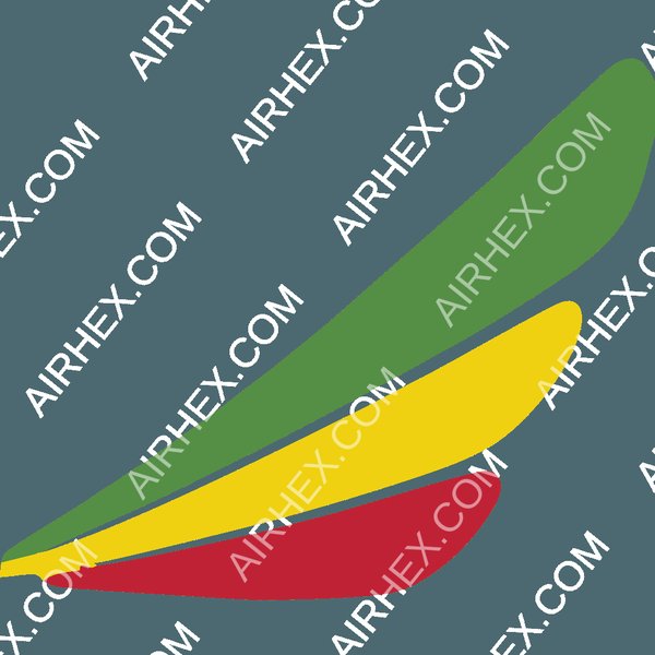
The current Ethiopian Airlines logo, showcasing the iconic red, yellow, and green.
A Legacy in Color: Ethiopian Airlines' Logo Evolution
Ethiopian Airlines, founded in 1945, has a logo that has evolved over the decades, consistently reflecting the nation's identity. The colors green, yellow, and red, derived from the Ethiopian flag, have been mainstays, symbolizing cultural pride and the airline's role as the flag carrier.
Early Beginnings to Modern Emblem
Early designs from the 1940s and 1950s often featured emblematic styles, with stylized wings or crests. A 1946 version, for instance, used a contoured crest with "EAL" (Ethiopian Air Lines) and red and white elements. By the 1950s, red uppercase lettering in English and Amharic became prominent.
The logo introduced around 2003, and still in use, features the word "Ethiopian" in a red serif typeface, with its Amharic equivalent. A distinctive emblem of three feather-like shapes in red, yellow, and green sits in the upper right corner. White is often used as a background, enhancing the vibrancy of the national colors.
This video provides a visual history of the Ethiopian Airlines logo, illustrating its evolution over time and the consistent use of national colors.
Conceptualizing a New Logo: Blending Tradition and Innovation
Designing a new logo for Ethiopian Airlines using white, green, yellow, and red requires a thoughtful approach that honors its rich heritage while embracing a modern aesthetic. The goal is to create a visual identity that is instantly recognizable, culturally resonant, and globally appealing.
Core Design Pillars
1. Emphasizing National Colors with White Accents
The logo should prominently feature green, yellow, and red. These can be arranged in stripes, layers, or flowing shapes that evoke the national flag or the existing three-feather motif. White can be strategically used for the airline's name, as a background to enhance contrast, or as subtle outlines or negative space within the design to add sophistication and ensure the logo stands out against diverse backgrounds.
2. Integrating Symbolic Imagery
Symbols associated with flight and Ethiopian culture can be woven into the design. This could include:
- Stylized Wings or Birds: An abstract wing or bird motif, rendered in green, yellow, and red, symbolizing freedom, movement, and aspiration. White can be used for highlights or to define shapes.
- Modernized Feathers: The iconic three-feather emblem could be reinterpreted in a more contemporary, streamlined form, perhaps with white accents or outlines for crispness.
- Cultural Motifs: Subtle incorporation of Ethiopian artistic patterns or symbols, carefully modernized to fit a global brand.

An Ethiopian Airlines Boeing 787 Dreamliner, showcasing the current livery where the national colors are prominent on the tail fin.
3. Typography: Elegance and Readability
The airline's name, "Ethiopian Airlines," in both English and Amharic, should be a key element. A clean, modern serif or sans-serif typeface is recommended. The existing serif font offers a sense of tradition, but a modernized version could enhance legibility. The text color could be red or a dark olive green, with potential white outlines or subtle shadow effects to ensure readability across various applications. The Amharic script should be complementary in style and weight.
4. Layout Versatility
Several layout options can be considered to ensure adaptability:
- Horizontal Layout: Symbol to the left, wordmark to the right. This is a classic and balanced approach.
- Stacked Layout: Symbol on top, with the bilingual airline name beneath it (e.g., English, then Amharic). This can be effective for vertical spaces.
- Circular Badge/Emblem: A round logo incorporating the iconography, with the airline's name integrated within or around the circle. This format is often useful for social media profiles and smaller applications. White space within the badge would be key for clarity.
Visualizing Logo Design Priorities: A Radar Chart
To better understand the balance of different aspects in a potential new logo for Ethiopian Airlines, the following radar chart visualizes key design priorities. This chart conceptualizes how elements like heritage, modernity, symbolism, color harmony, and readability might be weighted. The scores are illustrative, representing a subjective assessment of their importance in achieving a successful redesign.
This chart illustrates that while all aspects are important, achieving a strong harmony of the four specified colors and ensuring the logo resonates with Ethiopian heritage are paramount. Modern appeal and versatility are also critical for a global airline brand.
Mapping the Logo Concept: Key Considerations
The mindmap below outlines the interconnected elements involved in developing a new logo concept for Ethiopian Airlines. It branches out from the central idea to cover colors, symbolism, typography, layout possibilities, and the overall desired impression of the brand identity.
(White, Green, Yellow, Red)"] id1["Color Palette & Symbolism"] id1a["White
(Purity, Peace, Clarity, Modernity)"] id1b["Green
(Land, Hope, Nature, Prosperity)"] id1c["Yellow/Gold
(Optimism, Energy, Warmth, Distinction)"] id1d["Red
(Passion, Strength, Resilience, History)"] id2["Symbolic Elements"] id2a["Stylized Wings/Bird
(Flight, Freedom, Aspiration)"] id2b["Modernized Feathers
(Iconic, Contemporary)"] id2c["Abstract Aerodynamic Shapes
(Movement, Dynamism)"] id2d["Subtle Cultural Motifs
(Ethiopian Heritage)"] id3["Typography"] id3a["Font Style
(Modern Serif or Sans-serif)"] id3b["Bilingual Text
(English & Amharic)"] id3c["Color
(Red, Dark Green, or White accents)"] id3d["Readability & Scalability"] id4["Layout Options"] id4a["Horizontal
(Symbol + Wordmark)"] id4b["Stacked
(Symbol above Wordmark)"] id4c["Circular Badge/Emblem
(Integrated Design)"] id5["Overall Impression"] id5a["Culturally Resonant"] id5b["Modern & Clean"] id5c["Globally Recognizable"] id5d["Versatile & Adaptable"]
This mindmap provides a structured overview of the thought process behind creating a holistic and meaningful logo that captures the essence of Ethiopian Airlines while incorporating the specified color palette.
Design Element Breakdown and Impact
The following table summarizes potential design elements for the new Ethiopian Airlines logo, their symbolic meaning, and the impact they could have on the brand's perception. This structured approach helps in considering various facets of the logo design.
| Design Element | Description/Consideration | Symbolic Meaning | Potential Impact |
|---|---|---|---|
| Primary Colors | Green, Yellow, Red (National Flag Colors) | Heritage, National Pride, Land, Hope, Energy, Passion | Reinforces connection to Ethiopia, strong brand recognition. |
| Accent Color | White | Purity, Peace, Clarity, Modernity | Enhances contrast, provides a clean look, improves versatility. |
| Core Symbol | Stylized Wing, Feather Motif, or Abstract Aerodynamic Shape | Flight, Movement, Progress, Freedom, Aspiration | Dynamic and memorable visual anchor for the brand. |
| Typography (English) | Modern Serif or Clean Sans-serif | Elegance, Professionalism, Readability | Ensures clear communication and a contemporary feel. |
| Typography (Amharic) | Complementary style to English font | Inclusivity, Cultural Respect | Strengthens national identity and local connection. |
| Color Application | Layered shapes, gradients, or flat colors; strategic use of white space | Unity, Flow, Vibrancy | Creates visual interest and a sophisticated aesthetic. |
| Overall Style | Balanced, dynamic, culturally resonant, yet globally modern | Progressive yet rooted in tradition | Appeals to both domestic and international audiences. |
This table outlines how different components can contribute to a cohesive and impactful logo. The careful combination of these elements will be crucial in developing a final design that effectively represents Ethiopian Airlines.
Frequently Asked Questions (FAQ)
Why are green, yellow, and red so important for Ethiopian Airlines' branding?
These three colors are the national colors of Ethiopia, featured prominently on the country's flag. For Ethiopian Airlines, as the flag carrier, using these colors is a powerful way to express national identity, heritage, and pride. Green typically symbolizes the land and hope, yellow represents optimism and energy (sometimes peace and harmony), and red stands for strength, courage, and sacrifice. Their consistent use connects the airline deeply to its roots.
What is the role of white in this new logo concept?
White is introduced to bring modernity, clarity, and versatility to the logo. It can be used as a background color to make the vibrant green, yellow, and red stand out, or as an accent in outlines or negative space to add sophistication. Symbolically, white often represents peace, purity, and new beginnings, which can complement the traditional meanings of the other colors and give the logo a fresh, contemporary feel suitable for a global airline.
How can the logo balance tradition with a modern look?
The balance can be achieved by retaining core symbolic elements like the national colors and possibly a stylized version of the iconic feathers, while employing modern design principles. This includes using clean lines, contemporary typography (for both English and Amharic text), and a thoughtful use of white space. The imagery itself can be abstracted or streamlined to feel current yet respectful of historical motifs.
What kind of symbols could be used in the new logo?
Potential symbols include abstract wing or bird shapes to denote flight and freedom, a modernized interpretation of the current three-feather emblem, or dynamic, flowing lines that suggest movement and progress. Subtle Ethiopian cultural patterns could also be integrated in a contemporary manner. The key is to choose a symbol that is unique, memorable, and relevant to the airline's identity and aspirations.
Recommended Further Exploration
- What are the key elements of modern airline branding strategies?
- How does color psychology influence logo design in the aviation industry?
- Explore examples of successful airline logo redesigns that balanced heritage and modernity.
- What are the best practices for incorporating bilingual typography into a global brand logo?
References
Last updated May 14, 2025