
Iconography in Retail Poster Design
Enhancing brand communication through visual symbols
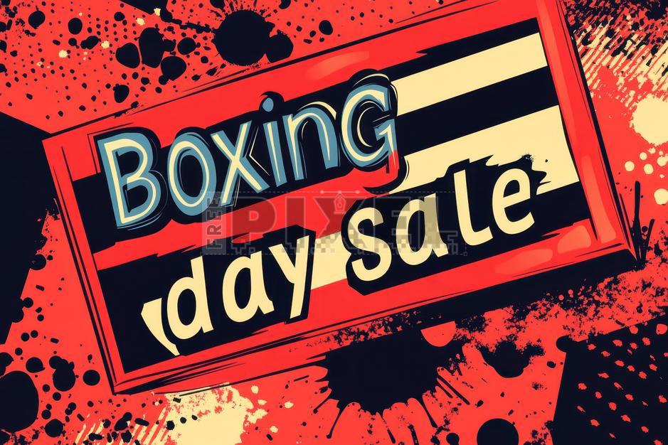
Key Highlights
- Visual Communication: Simplifying complex information with well-designed icons.
- Brand Identity: Creating a cohesive visual language that reinforces consistency.
- Strategic Design: Using icon placement, color, and style to guide customer attention.
Role of Iconography in Retail Poster Design
Iconography has become an integral part of retail poster design by transforming how messages are conveyed. In a marketplace overflowing with visual stimuli, cleverly chosen icons serve as shorthand to communicate complex ideas quickly and effectively. From enhancing brand identity to providing succinct visual cues that boost customer engagement, icons are indispensable in modern retail design.
Visual Communication and Swift Message Delivery
Icons are essentially symbolic images that encapsulate ideas, products, or promotions with clarity and immediacy. In retail environments, where rapid comprehension of information is crucial, iconography allows for immediate recognition. Instead of relying on lengthy text descriptions, icons can instantly signal product categories, promotional deals, or specific features, thereby eliminating language barriers and appealing to a broad, diverse audience.
Universal Language of Symbols
The universal nature of many icons means they transcend cultural and linguistic differences. By using universally recognized symbols (like a shopping cart to signal an e-commerce offer), designers can ensure that their posters are accessible and understood by consumers from varied backgrounds. This element of the design is particularly crucial in global retail markets where visual consistency can help bridge communication gaps.
Establishing and Reinforcing Brand Identity
One of the most significant aspects of iconography in retail poster design is its contribution to brand identity. Consistent use of specific icons, colors, and styles allows a brand to become instantly recognizable. When every visual element reflects uniformity, it reinforces the overall brand message, making the marketing collateral more memorable.
Consistency is Key
Developing a set of guidelines that dictate the use of icons helps in maintaining brand consistency across different promotional materials. These guidelines specify attributes such as size, color palette, and style, and ensure that all icons appear as part of a coherent visual system. This approach not only enhances aesthetic appeal but also builds consumer trust and recognition over time.
Enhancing the User Experience
Beyond aesthetics, icons serve as navigational and informational aids. In retail poster design, icons can be employed to guide the viewer's eye, highlight key promotional messages, and delineate sections of the poster for better clarity. This strategic placement of icons results in a visual hierarchy, where the most important information is immediately noticeable.
Guided Visual Navigation
Effective use of iconography helps to arrange visual elements in a manner that directs the viewer’s attention to what matters most. Using size, contrast, and color differentiation, designers create focal points that lead the consumer from the initial glance to exploring the poster in more detail. In this way, icons act as signposts, enhancing the overall user experience.
Design Principles and Best Practices
Simplicity and Clarity
Icons must embody simplicity and clarity. Complex or over-designed icons can confuse the viewer, detracting from the intended message. Instead, opting for clean lines and minimalism can make icons both compelling and instantly recognizable. The principles of minimal design ensure that each icon performs its function with no unnecessary distractions.
Minimal Design Approach
A minimal design approach not only contributes to modern aesthetics but also maintains clarity. In retail poster design, minimalistic icons often utilize a limited color palette and simple geometric shapes that resonate with contemporary trends. Such clarity is pivotal in conveying the necessary message within seconds.
Contextual Relevance
The choice of icons should always be contextually relevant to the product or service being advertised. An icon, apart from being visually appealing, should have a direct connection with the narrative of the poster. For example, a retail poster promoting a technology store might incorporate icons of gadgets, while a poster for a fashion brand might prefer sleek, modern symbols that evoke style and elegance.
Aligning with Brand Messaging
Iconography should align with the essence and values of the brand. This alignment is achieved when the icons not only match the product or promotion but also mirror the overall brand aesthetic. Consistent iconography reinforces the brand message at every customer touchpoint, leading to enhanced consumer perception and loyalty.
Strategic Placement and Visual Hierarchy
How icons are placed within a retail poster directly influences viewer engagement. By establishing a visual hierarchy, designers can ensure that the most critical elements are observed first. This practice involves using varied sizes, bold colors, and strategic positioning to guide the customer’s gaze. Icons that denote special offers, new product alerts, or limited-time discounts should be prominent and clearly noticeable.
Balancing Text and Graphics
The interaction between text and icons is vital. While icons capture attention quickly, supportive text may be necessary to provide additional context. A balanced approach where icons and text complement each other can ensure that the poster efficiently communicates the full spectrum of information. Ideally, icons should help break up large blocks of text and make the advertisement more engaging.
Integrating Iconography: Tools, Resources, and Techniques
Digital Tools and Platforms
Modern design resources make it easier than ever for retail marketers and designers to integrate iconography into their posters. Many platforms offer user-friendly interfaces with customizable templates that streamline the design process. Professional-grade tools allow for the easy incorporation of icons, with features that let designers tweak color schemes, sizing, and arrangement effortlessly.
Popular Design Platforms
Some of the most popular platforms in this realm include Canva, PosterMyWall, Vistaprint, and Freepik. These websites offer a wide range of icons and templates specifically tailored for retail poster design, ensuring that even those with minimal design experience can produce professional-level work. Additionally, many of these platforms provide options for both free and premium assets, giving users the flexibility to choose based on their budget and design needs.
Adapting Icons Across Different Media
Retail poster designs are rendered across multiple media—from large in-store posters to digital displays on social media and websites. Therefore, icons must be adaptable to various formats without losing their clarity or impact. The scalability of vector graphics, for example, allows icons to be resized to fit different mediums without any degradation in quality. This uniformity is crucial for maintaining brand integrity across all platforms.
Scalable Graphic Formats
The use of scalable formats like SVG ensures that icons remain crisp and clear regardless of the size at which they are displayed. This aspect becomes particularly important when transitioning between print and digital applications, as it preserves the visual impact and consistency of the design.
Incorporating Color Psychology
The colors used in iconography are not merely for aesthetic purposes—they play a strategic role in eliciting emotional responses and conveying certain messages. For instance, vibrant hues might trigger excitement or indicate a special promotion, while more subdued colors may evoke a sense of reliability and trust. By leveraging color psychology, designers can create a mood that complements the overall message of the poster.
Choosing a Color Palette
It is essential to harmonize the iconography's color palette with the overall design and brand identity. Whether the poster is meant to draw attention to a sale or establish a premium brand image, every color choice should serve a purpose. Often, designers will select accent colors that align with corporate branding, ensuring that every element of the poster works in concert to support the campaign’s goals.
Comparative Analysis Through a Visual Table
This table provides a comparative look at the key aspects of using iconography in retail poster design, as noted by various experts:
| Aspect | Description | Best Practice |
|---|---|---|
| Visual Communication | Uses universal symbols to quickly convey messages. | Adopt simple, clear icon designs that reduce ambiguity. |
| Brand Identity | Establishes and reinforces a recognizable, cohesive look. | Develop consistent design guidelines for icons across media. |
| User Experience | Improves navigation and highlights key information. | Strategically place icons to create a visual hierarchy. |
| Contextual Relevance | Icons must resonate with the promotion or product. | Choose icons that directly relate to the message and audience. |
| Adaptability | Ensures symbols work well in both print and digital formats. | Utilize scalable vector formats and flexible design tools. |
| Color Psychology | Uses color to influence emotional responses and brand perception. | Select colors that align with both the mood and corporate palette. |
Resources and References
To help you dive deeper into iconography and its application in retail poster design, consider exploring these valuable resources. They provide guidelines, templates, and additional insights to refine your designs and ensure that your iconography truly resonates with your target audience.
- Poster Maker - Design.com
- Retail Posters Templates - Vistaprint
- Retail Posters - PosterMyWall
- Retail Poster Templates - Canva
- Retail Iconography Vectors - Freepik
Additional Techniques and Insights
Establishing a Comprehensive Design System
Developing a robust design system that incorporates iconography involves more than just selecting a few images. It requires a thorough understanding of the brand’s values, target audience, and marketing goals. Once these elements are identified, a systematic approach to designing icons—taking into account size, spacing, and color nuances—is vital. A comprehensive design system ensures that all icon elements function in harmony, reinforcing the overall brand identity and delivering a consistent user experience across all retail touchpoints.
Integration Across Media
Retail marketers increasingly face the challenge of sustaining a unified visual approach across multiple channels. By leveraging a design system that includes scalable and adaptable icons, businesses can seamlessly transition their designs from physical posters to digital formats without loss of clarity or impact. This integration is particularly important as consumer interactions increasingly shift towards online and mobile platforms.
Leveraging Iconography for Promotions and Special Offers
The strategic use of iconography can also be pivotal in emphasizing special promotions, seasonal offers, or unique product features. By utilizing icons that clearly indicate discounts or new arrivals, businesses can capture consumer attention and drive engagement. Such icons, when well-placed within the visual hierarchy, guide users to vital call-to-action areas, enhancing the overall effectiveness of the promotional poster.
Case Example: Promotional Flow
Imagine a retail poster promoting a seasonal sale. A well-designed icon representing an offer – such as a tag or discount symbol – can be situated near the top portion of the poster, immediately drawing the viewer's attention. Subsequent icons, in a consistent style, further detail the categories or products on offer. This layered approach to design not only maintains visual harmony but also ensures that crucial information is communicated effectively without overwhelming the viewer.
Ensuring Cultural and Contextual Sensitivity
When designing for a global audience, it is important to consider the cultural connotations of certain symbols. An icon that works perfectly in one region might be misinterpreted in another. Therefore, designers must occasionally adapt their iconography to meet regional or cultural sensitivities. This practice not only respects diverse audiences but also enhances the overall efficacy of the design by ensuring that the message is appropriate and well-received across different markets.
Customizing Icons for Target Demographics
Customization of icon sets in alignment with the target audience's preferences is another effective strategy. For instance, contemporary retail posters aimed at younger consumers might feature dynamic, bold icons, whereas posters targeting a more professional segment might utilize minimalistic and refined symbols. The key is in maintaining consistency while allowing flexibility to adapt to local tastes and cultural preferences.
Recommended Related Searches
- How to Design Retail Posters with Iconography
- Best Practices for Visual Communication in Retail
- Integrating Brand Identity into Graphic Design
- Using Color Psychology in Retail Design
- Case Studies on Effective Retail Poster Design
References
Last updated March 5, 2025