
Discover the Magic of Background Colors for Your Stunning Cat Painting
Enhance white fur vibrancy with expertly chosen contrasting palettes.
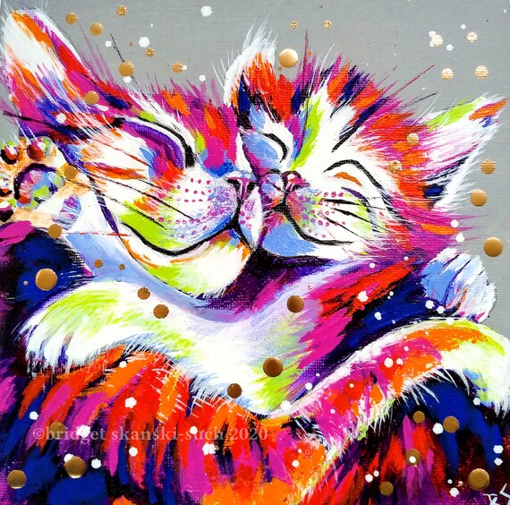
Key Highlights
- Contrast is Crucial: Darker and cooler hues create striking contrasts that enhance white fur.
- Complementary and Analogous Tones: Use shades that balance the warmth of orange and depth of black.
- Texture and Mood: A textured or subtly patterned background can further draw attention to the subject.
Understanding the Role of Contrast
When it comes to enhancing the brightness of white fur in your painting, contrast plays a fundamental role. Contrast is defined as the difference in brightness, color, or texture that makes an element of your composition stand out against its background. In a painting featuring a cat with rich white fur, creating a background that is significantly darker or cooler than the subject can drastically improve visual impact.
Using Dark Backgrounds
Darker backgrounds, such as deep navy blue, charcoal, or even dark greens and browns, provide an excellent contrast against white fur. This technique works by making the bright areas (the white fur) appear even more luminous and dramatic in comparison to the surrounding area. For instance:
Dark Blue Background
A dark blue or midnight blue background can offer a striking contrast that makes the white fur pop. This is especially useful considering that blue is often perceived as a cool, calming color, which can provide balance against the warmth of the cat’s orange patches and the intensity of the black markings.
Deep Navy and Charcoal Hues
Similar to dark blue, deep navy or charcoal backgrounds intensify the brightness of the white fur. The darker hues cause your white to seem more vibrant because of the stark contrast created. These backgrounds also add an element of sophistication and can convey a sense of drama or mystery in the overall mood of the painting.
Selecting Complimentary Colors
For paintings that incorporate patches of black and orange along with white fur, it is essential to make deliberate choices regarding complementary and analogous color schemes. The goal is to select a background that not only contrasts with the white fur but also harmonizes with the black and orange patches for a balanced visual effect.
Cooler Tones and Neutral Shades
Cooler tones like soft blues and muted purples can effectively elevate the brightness of the white fur while balancing the warm orange patches. These cooler shades have the effect of toning down excessive warmth and ensuring that no one color overwhelms the composition.
Neutral Greys
A light or medium grey background offers a subtle contrast that can augment the natural luminosity of the white fur. Grey, by definition, is a balanced neutral color that doesn’t compete with the focal points in your painting, making it an ideal choice for canvases where you want the subject—in this case, your cat—to be the primary focus.
Warm Neutrals: Off-Yellow and Cream
Warm neutrals such as off-yellow, cream, or beige can also work exceptionally well. These colors provide enough contrast to let the white pop, while simultaneously complementing the orange patches on the cat. These warmer backgrounds evoke an inviting, soft ambience that enhances the overall warmth of the painting.
Balancing Color and Texture for Depth
Adding texture or subtle patterns to the background is another strategic method to emphasize the white fur without overwhelming the subject. Textured backgrounds can create a sense of depth which draws the viewer’s attention directly to the features of the cat.
Incorporating Texture
Using techniques such as layering or brush strokes in the background that are distinct from those used in rendering the fur can enhance the three-dimensionality of your painting. For instance, you might use broader, softer brush strokes in the background while applying finer, more detailed work on the cat’s fur. This subtle difference in texture helps in separating the subject from the background.
Subtle Patterns and Gradients
Consider employing gradients or geometric patterns that change subtly across the canvas. Gradients that transition from a darker shade at the bottom to a slightly lighter shade at the top can create a soft, immersive environment that accentuates the white fur. These patterns should be gentle enough to maintain focus on the subject while still adding a nuanced depth to the composition.
Evaluating Mood and Atmosphere
Your choice of background not only influences the technical execution of contrast but also sets the mood and atmosphere of the artwork. A dramatic background might convey an intense emotional tone, while softer hues could evoke a playful or serene feeling.
Mysterious vs. Playful
If you are aiming for a mood that is dramatic and mysterious, consider using darker or more saturated colors like deep blue or dark green. Such colors naturally lend an air of sophistication and seriousness that lends weight to the subject.
Lighter Backgrounds for a Playful Feel
Conversely, using lighter or softer backgrounds, such as pale blue, mauve, or cream, can create a brighter and more playful ambiance. While these colors do not provide the highest contrast compared to darker backgrounds, they still offer sufficient differentiation that helps the white fur stand out in a balanced composition.
Practical Techniques and Experimentation
Experimentation is key to discovering what background color best complements the white fur under different lighting conditions. It is recommended to test several colors on a small area of your canvas before finalizing your background.
Test and Adjust
By testing various hues—such as dark blue, neutral grey, off-yellow, and even textured variants—you can observe real-time interactions between your chosen background and the white fur. This process of test and adjust allows for calibration based on how your materials interact with the colors.
Layering and Blending
When applying multiple layers, consider the following steps:
| Technique | Description | Advantages |
|---|---|---|
| Test Patches | Apply small areas of different background hues on the canvas. | Observe how the colors interact with white fur. |
| Layering | Use multiple coats to build depth and texture. | Enhances three-dimensionality and contrast. |
| Blending | Blend adjacent colors to transition smoothly. | Creates a harmonious transition that avoids harsh lines. |
| Texture Application | Add subtle patterns or strokes. | Accentuates white fur without being too distracting. |
These methodologies not only help in choosing the optimal background but also contribute to the overall textural quality and depth of your work.
Advanced Considerations: Light Source and Color Nuances
In many artistic endeavors, the way light impacts the subject significantly influences color selection. The reflections on the white fur may contain hints of the surrounding environment. It is vital to acknowledge that white fur is rarely a pure white; it can contain subtle undertones that mirror the background’s light.
Color Reflection and Environmental Influence
When painting, remember that the fur’s white areas can reflect the colors of the chosen background. For example, a cool background may impart a faint blue tint on the white fur, while a warm, neutral backdrop might highlight a creamier, soft glow. Adjust your application of details and highlights on the fur accordingly to reflect these interactions.
Achieving Realism and Luminosity
To maintain realism, observe your subject carefully and adjust the tonal values of your highlights and shadows based on the background color. This ensures the white fur does not appear flat or overly isolated. The interplay between the ambient background and the subject can be manipulated by:
- Altering light source directionality
- Modifying brush stroke intensity
- Blending subtle washes of complementary colors
These techniques will help in achieving a balance where the white fur remains the central focus amidst an environment that harmonizes the entire composition.
Summary Table of Optimal Background Options
| Background Color | Effect on White Fur | Additional Benefits |
|---|---|---|
| Dark Blue / Midnight Blue | High contrast; intensifies white luminosity | Creates dramatic, sophisticated mood |
| Charcoal / Deep Navy | Enhances brightness through contrast | Provides a refined, somber atmosphere |
| Neutral Grey | Soft, subtle contrast that preserves detail | Maintains focus on the cat while balancing color dynamics |
| Off-Yellow / Cream | Warm, inviting contrast that makes white pop | Complements orange patches without overwhelming |
| Pale Blue / Mauve | Subtle cool contrast that brightens white fur | Provides a gentle, playful ambience |
| Dark Green / Brown | Strong contrast for vivid white highlights | Establishes a natural, earthy tone |
References
- Painting Realistic Curly Fur in Oil - Shelley Hanna Fine Art
- How to Paint Realistic White Fur a Quick Guide - Studio Wildlife
- How To Paint White Fur - Shelley Hanna Fine Art
- Painting White Fur - WetCanvas Forum
- How to Draw White Fur - Carrie L. Lewis, Artist
Recommended Queries for Deeper Insights

Last updated March 24, 2025